Dokan Brand Resources
Welcome to Dokan’s Brand Resources Page, your one-stop destination for everything related
to our brand identity. Here, you’ll find our logos, brand colors, logo sizes, and more, ensuring
a seamless alignment of our brand strategy with our stakeholders.
Downloads
Dokan is a global brand from weDevs, and we provide
vector versions of all our logos and marks for certain uses
listed below. Please respect it and use it with care.
Full Logos
Monochrome Logos
Logo Icon
Safe Space
The Dokan logo should only be used in a clear space. Ensure that there is no clutter surrounding the logo when it is used on your website or any other material. When determining the minimum safe space surrounding the logo, use half of the logo’s width.
Dokan Icon
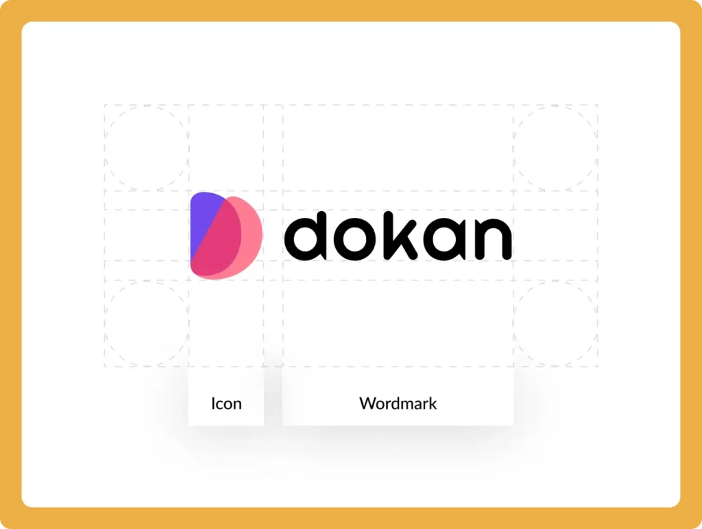
The logo consists of three ‘D’ letters, which
represent the multi-vendor solutions
offered by the brand.
Minimum Size
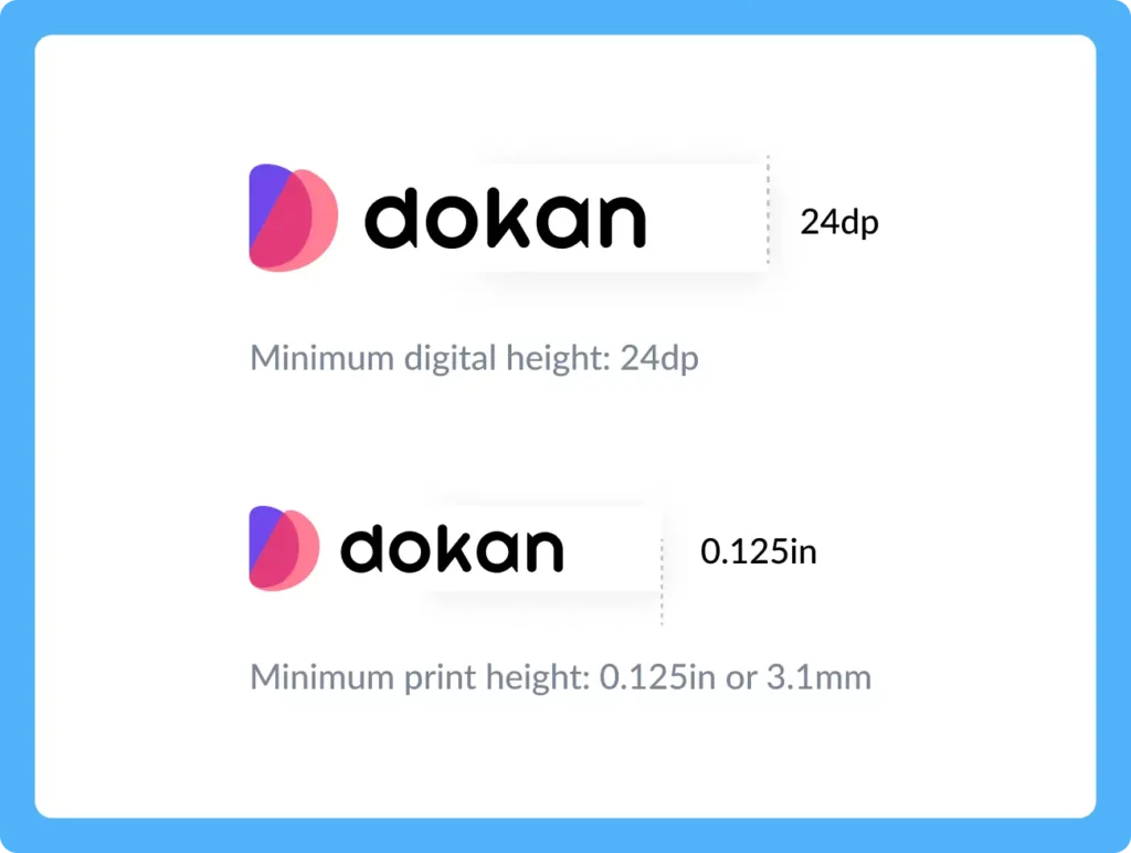
The logo Dokan should always be easy to read. So, in digital content, the logo should never appear smaller than 24dp in height.
The minimum size for applying the logo in print is 0.125 in/3.1 mm in height.
Logo Size
The minimum digital height must be 24dp. It
cannot be shorter than this.
What Not to Do with the Logo
The Dokan Logo is a symbol people recognize, so it should always be the same. Here are some
examples of what you should avoid doing with the Dokan logo.
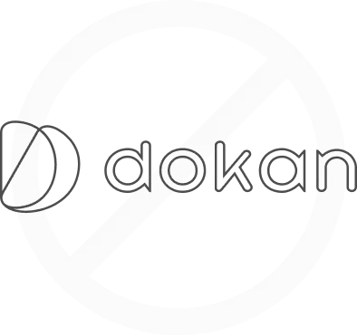
Do not outline
Do not rotate

Do not distort proportions
Do not shear or skew
Do not apply effects
Do not alter letter spacing
Do not use a gradient
Do not use any off-brand color
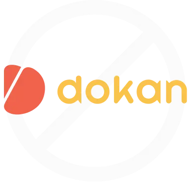
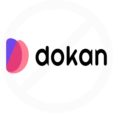
Do not use any background color behind the logo
Using The Logo on
Solid Backgrounds
Here are some examples that demonstrate the proper use of the Dokan Logo on various solid backgrounds. To
ensure clarity and visibility, it is recommended to use the black full-color Logo on backgrounds that are brighter
than 15% gray (In some cases, the black version of the logo can be used). Conversely, the white full-color Logo
should be used on backgrounds that are darker than 50% gray.
Monochrome Logo
If the full-color logo is difficult to see against a background color, it is recommended to use a
monochrome logo instead. The monochrome logo with an black color code of #000000 has a white
triangle in the icon and is suitable for use on light, multi-colored images. On the other hand, the
monochrome logo with a white color code of #FFFFFF has a triangle with no fill and is ideal for use
on dark, multi-colored images.
Brand Colors
Here are some brand colors of the Dokan Theme, Logo, and website. There is the handpicked
combination of colors we’d love to see while promoting Dokan!
Primary
Blue Lotus
#7047EB
Secondary
Aztec
#A244FF
Cerise
#E23B7B
Atomic Tangerine
#FF9B53
Brink Pink
#FF698F
Neutral
Gray
#828282
Mercury
#E9E9E9
Athens Gray
#F1F1F4
Gray Nurse
#F8F9F8
Supportive
Champagne
#E6FBD9
Butterscotch
#D4FBEF
Antique White
#00BC8B
Mandy
#D8D8FE
Illusion
#2947BF
Champagne
#E6FBD9
Butterscotch
#D4FBEF
Antique White
#00BC8B
Mandy
#E64B5F
Illusion
#ECA6C0
Gradient
Gradient 1
#7047EB – #A244FF
Gradient 2
#FF9B53 – #FF698F