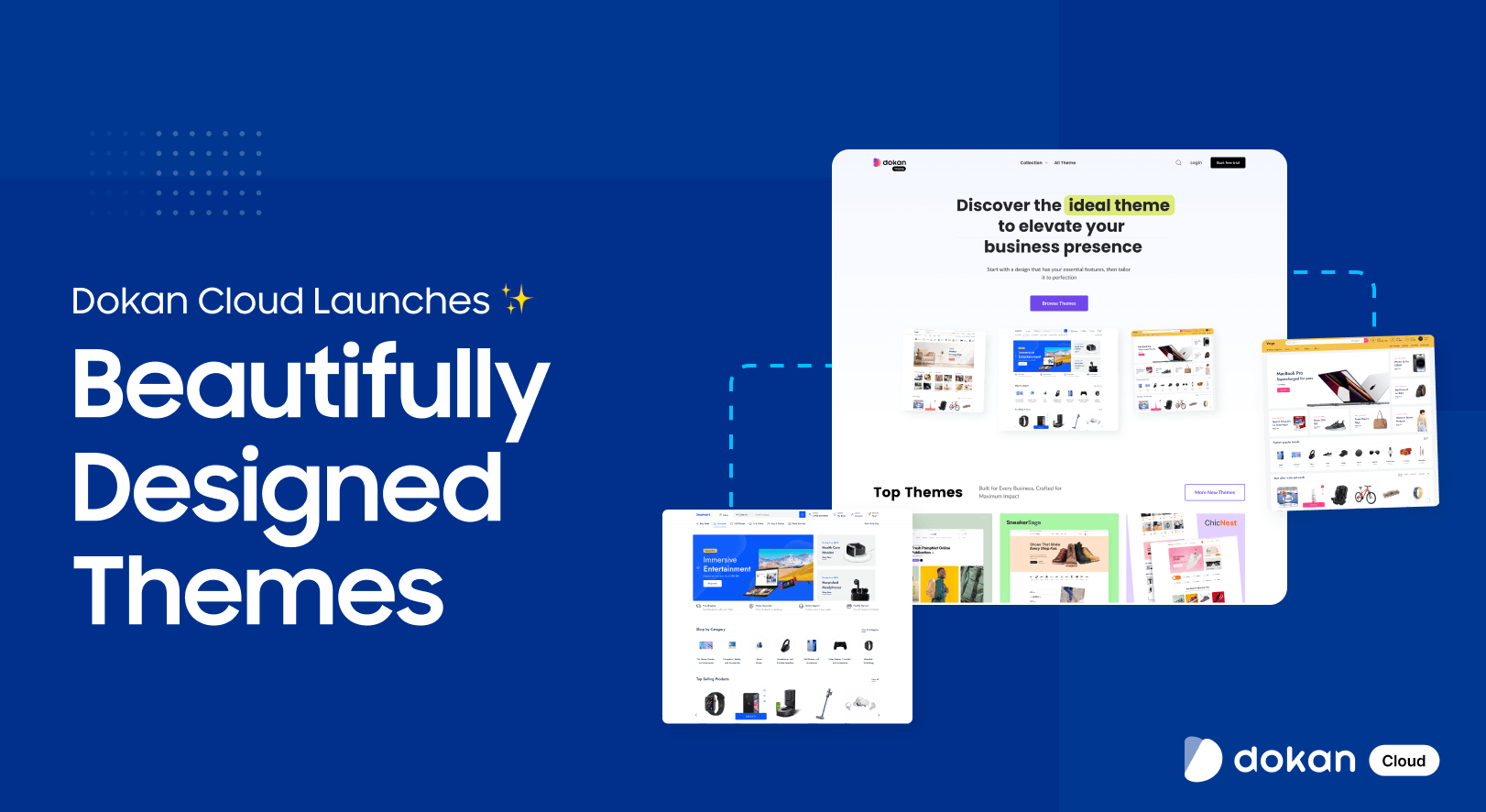
We have launched Dokan Cloud new themes!!
Yes, you have heard it right. Dokan Cloud platform now has 40 new themes to give your eCommerce store and marketplace a whole new look. And they all are free!!!
These new themes are designed with the latest trends in mind. They look great, work on any device, and give users a fresh and modern experience.
Ready to find out more about these themes? Let’s not wait anymore.
Why Theme is an Important Element for any eCommerce Store
In a SaaS-powered or any eCommerce store and marketplace, the theme plays a vital role in shaping user experience, branding, and overall platform efficiency.
Since SaaS-based platforms support multiple businesses and vendors, having a well-designed theme ensures seamless functionality, scalability, and ease of use for both sellers and buyers.
A high-quality theme directly impacts engagement, conversions, and customer satisfaction by providing a visually appealing, fast, and intuitive interface.
Here’s how a SaaS-powered eCommerce theme helps:
- Seamless User Experience: A clean, responsive design with intuitive navigation ensures that buyers and sellers can easily browse products, manage their stores, and complete transactions efficiently.
- Multivendor Optimization: A marketplace-friendly theme that supports vendor storefronts, product listings, and commission structures while maintaining a consistent customer shopping experience.
- Scalability & Performance: SaaS platforms need themes that can handle high traffic and growing vendor bases without slowing down or requiring extensive technical maintenance.
- Branding & Customization: Customizable themes allow businesses to align the platform’s look and feel with their brand identity, offering color schemes, typography, and layout flexibility.
- Mobile-First Approach: Since many transactions happen via mobile, a SaaS eCommerce theme must be fully responsive to ensure a smooth shopping experience on all devices.
- Built-in Security & Updates: Regular updates and security patches keep the platform secure, reducing vulnerabilities and ensuring compatibility with new SaaS features.
- Conversion-Focused Design: Features like optimized product pages, fast-loading interfaces, and clear call-to-action buttons help improve customer engagement and sales.
- SEO & Marketing Readiness: A well-structured theme includes SEO-friendly coding, schema markup, and integration with marketing tools like email automation and analytics.
- Plugin & Integration Support: Since SaaS platforms rely on various third-party integrations, a good theme ensures compatibility with payment gateways, shipping providers, and CRM tools.
- Global Accessibility: Multi-language and multi-currency support help expand the marketplace’s reach, making it easier for international vendors and customers to engage with the platform.
For a SaaS-based eCommerce store and marketplace, choosing the right theme is essential to delivering a fast, scalable, and seamless shopping experience. It also ensured smooth operations for vendors and administrators.
Dokan Cloud New Themes: Give Your eCommerce Platform an Elegant Look
We are going to take a look at the Dokan Cloud new themes one by one to give you an idea of how they look and work.
To find the new themes, go to Design –> Themes and click on the Explore New Themes button. There you will find all the new themes-
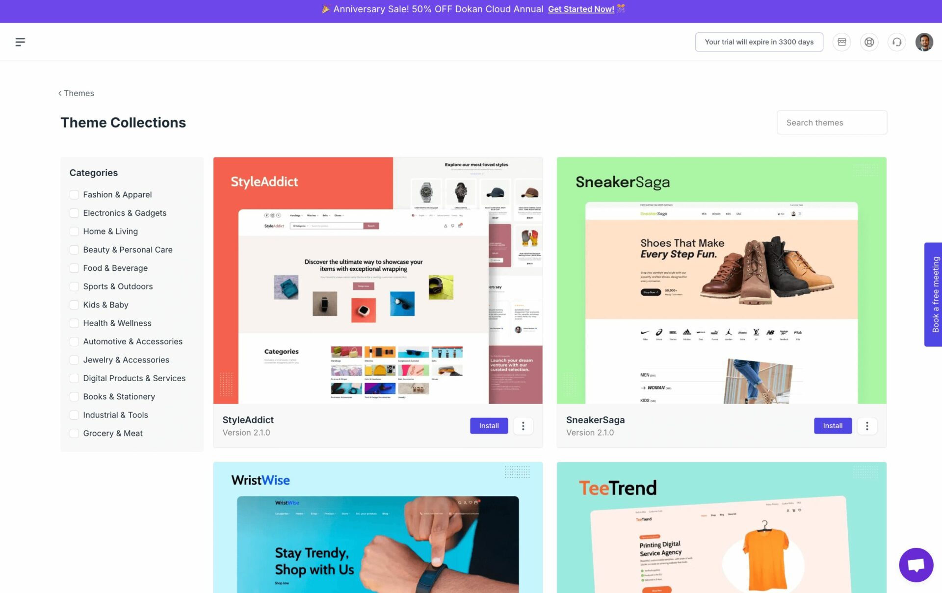
Now, let’s see the themes in detail-
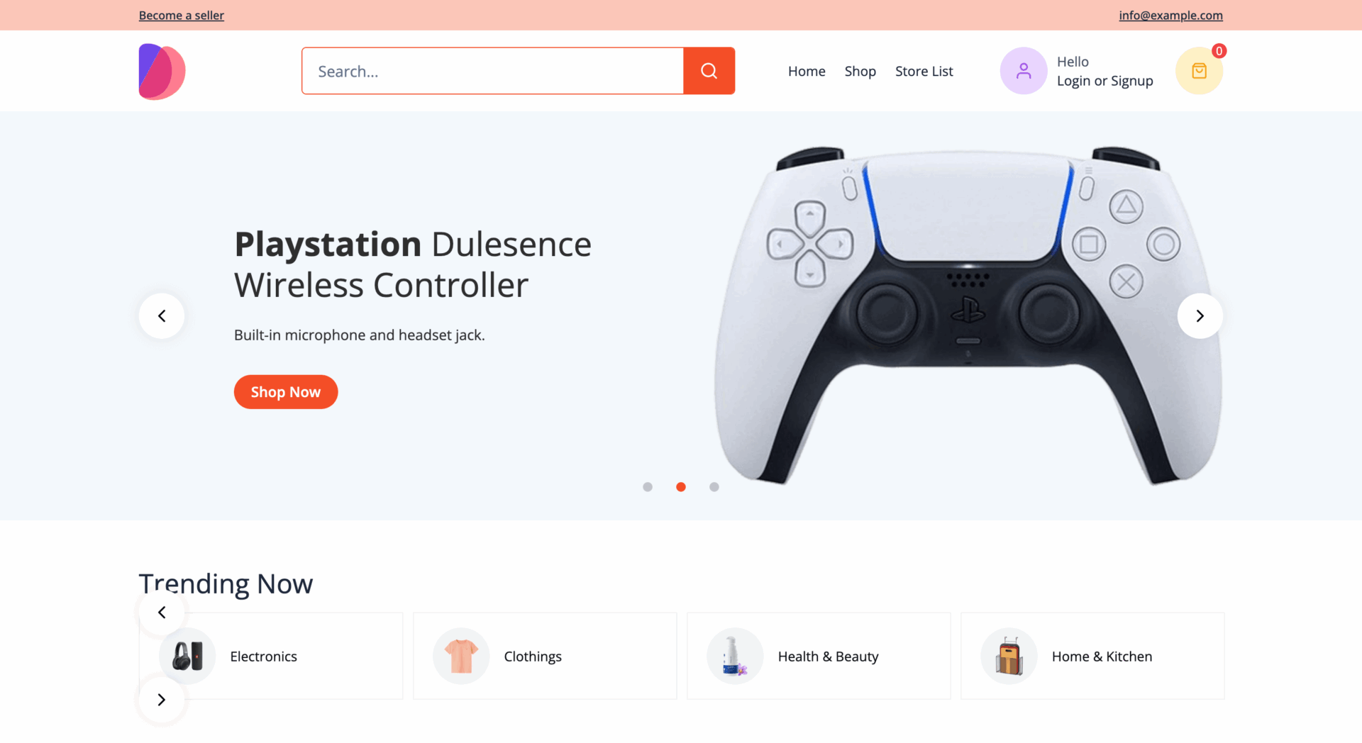
1. Pulse
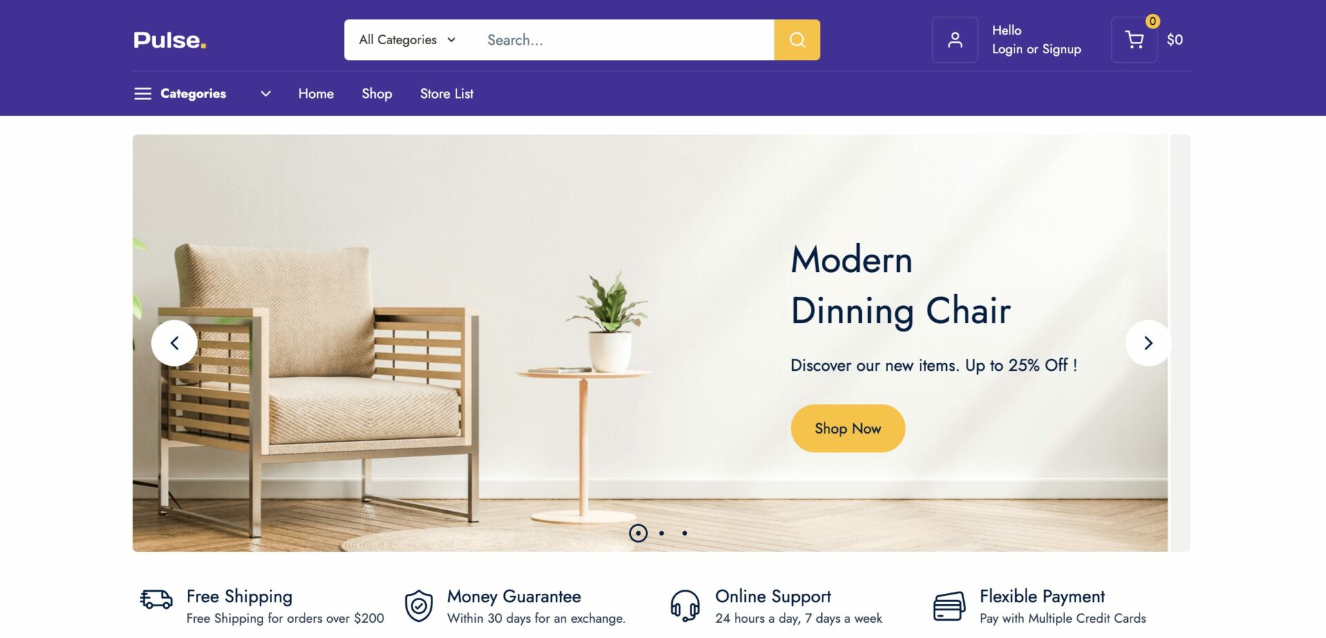
This theme features a clean, modern, and user-friendly design with a purple and yellow color scheme for a professional look. The top navigation bar includes essential elements like a search bar, cart, and category menu for easy browsing.
A large hero banner showcases a featured product with a clear call-to-action (CTA), while the icons below highlight benefits like free shipping and 24/7 support. Products are displayed in a structured carousel format with thumbnails, prices, and add-to-cart buttons, making shopping seamless.
Category icons and promotional banners enhance engagement, while a footer with brand logos and quick links builds trust. The grid-based, responsive layout ensures smooth navigation on all devices, balancing aesthetics and functionality for a great user experience.
2. Storefront
This theme design is clean, modern, and well-structured, uses a green and white color scheme for a fresh, minimalistic look. The top navigation bar includes a search bar, category menu, user account, and cart icon, ensuring easy access to key features.
A large hero banner highlights a promotional message with a call-to-action (CTA) button, while below, sale banners emphasize discounts. The trending categories section uses circular icons for easy browsing, and the best-selling products are displayed in a grid layout with images, prices, and ratings, enhancing the shopping experience.
The store list section showcases multiple sellers, reinforcing the marketplace feel. The footer is well-organized with quick links, trust signals like fast delivery, secure payments, money-back guarantees, and company information.
The responsive grid layout, structured white space, and engaging visuals make for a smooth and user-friendly experience.
3. MegaMall
This eCommerce theme has a modern, sleek, and structured design, and uses a white and orange color scheme for a fresh and energetic look. The top navigation bar features a search bar, category menu, user account, and cart icon, ensuring seamless browsing.
A large hero banner highlights a featured product with a bold CTA button, while a trending section showcases popular categories.
The best-selling and featured products are displayed in an organized carousel format with thumbnails, prices, and ratings, enhancing user engagement. Promotional elements like discount banners and recommended products improve conversion potential.
A grid-based layout for product categories offers clear navigation, and the footer includes essential quick links, trust signals like free delivery and secure payment, and company information. The clean interface, responsive design, and strategic placement of CTAs make the shopping experience intuitive and visually appealing.
4. Lumen
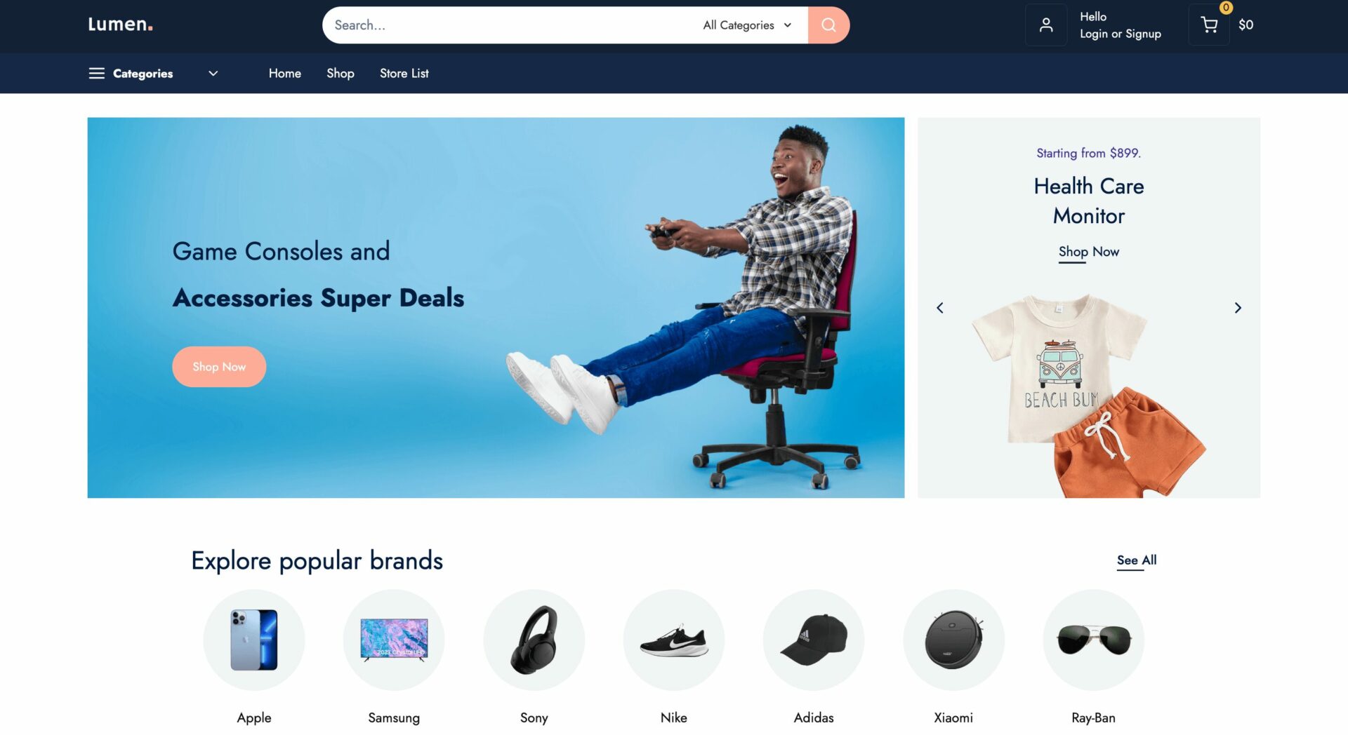
This theme has a modern and sleek design, featuring a dark blue and white color scheme for a premium feel. The top navigation bar includes a search bar, category drop-down, cart, and user account, ensuring easy browsing.
A large hero banner highlights gaming accessories with a bold CTA button, while a brand section showcases popular stores like eBay, Walmart, and Temu, enhancing credibility. The top-selling and featured products are displayed in a grid and carousel format with thumbnails, prices, and ratings, improving user engagement.
Category sections are neatly arranged, making it easy to explore different product types. Promotional elements like sale banners and best-seller highlights attract attention, while the latest and top-rated product sections enhance discoverability.
The footer includes trust signals like free shipping, money-back guarantees, and online support, along with essential links for navigation. The structured layout, responsive design, and well-placed CTAs ensure a seamless and engaging shopping experience.
5. Nova
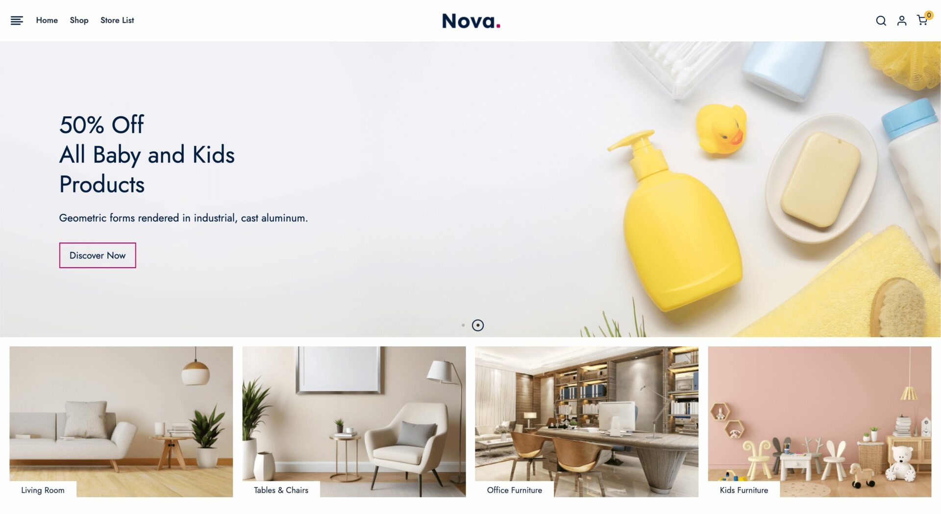
This Dokan Cloud theme features a clean, elegant, and minimalistic design, with a white and beige color scheme that gives it a sophisticated and airy feel. The top navigation bar is simple, with a logo, search bar, and essential links for easy navigation.
A large hero banner highlights a promotional offer with a subtle CTA button, while category previews below showcase different furniture and home decor sections. The product collection section is well-organized, displaying various categories like dairy, meat, and fruits, making browsing effortless.
A trust section with icons for free shipping, money-back guarantees, and online support builds credibility. The trending, new arrivals, and best-selling products are displayed in a carousel format with thumbnails, prices, and ratings, improving user engagement.
The footer features well-known brand logos, a gallery section, company links, and contact information, reinforcing trust and professionalism. The clean layout, ample white space, and responsive design create a premium and user-friendly shopping experience.
6. Verge
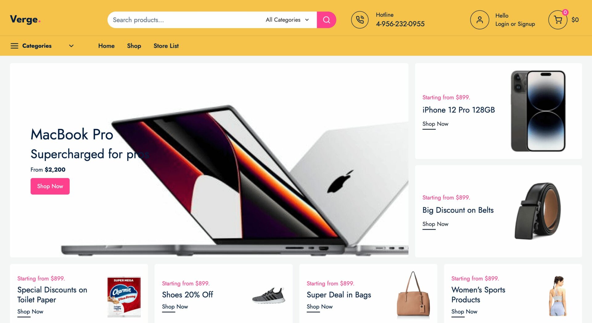
Verge has a bold and dynamic design, featuring a yellow and white color scheme that creates a vibrant and engaging look. The top navigation bar includes a search bar, category dropdown, user profile, and cart icon, ensuring easy navigation.
A large hero banner highlights a featured product with a clear CTA button, while smaller promotional banners showcase discounts on various items. The popular brand section enhances trust with logos from major retailers like eBay, Walmart, and Temu.
The best-selling, electronics, furniture, and clothing products are displayed in well-structured carousel and grid formats, with thumbnails, prices, and ratings for a seamless shopping experience.
The explore categories section uses visual icons for intuitive browsing, while the footer includes trust signals like free shipping, money-back guarantees, and 24/7 support, reinforcing reliability.
The clean layout, responsive design, and strategic CTAs make it highly user-friendly and conversion-focused.
7. Vivid
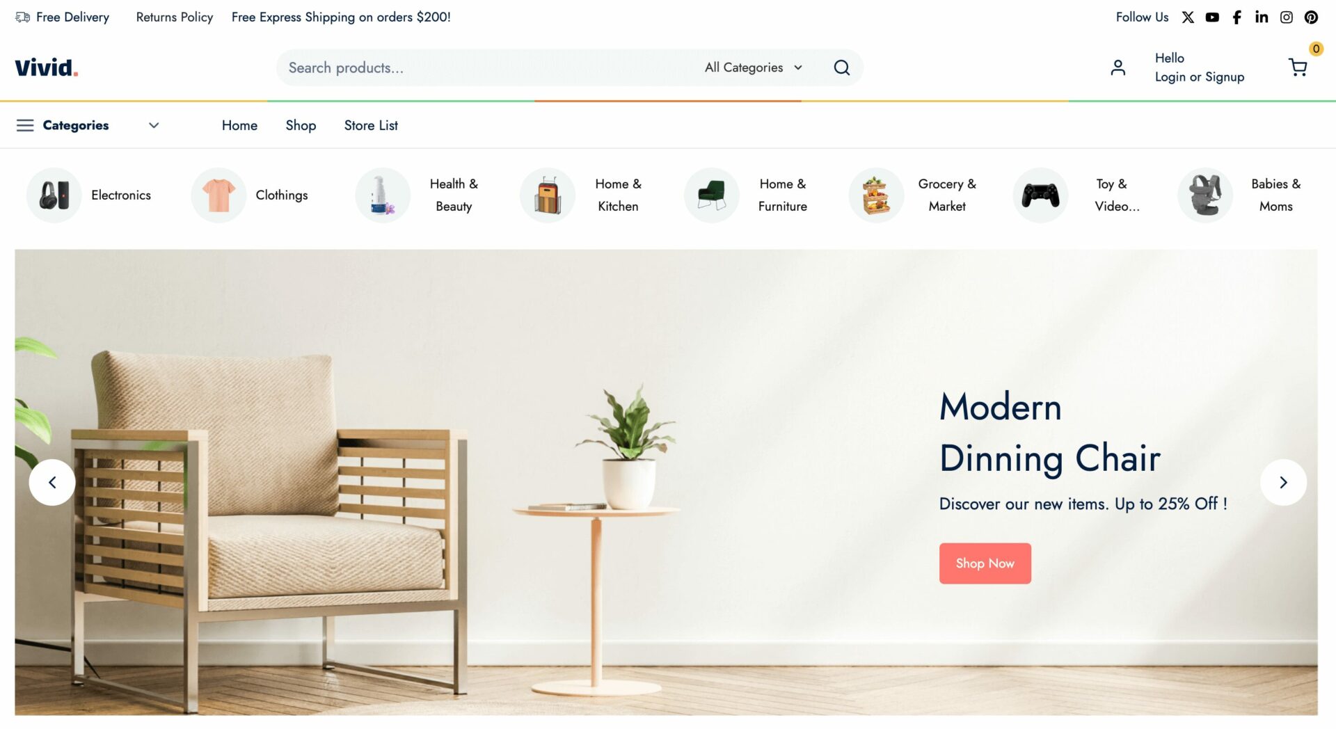
Vivid has a modern and stylish design, featuring a white and light pastel color scheme for a clean and professional look. The top navigation bar includes a search bar, category dropdown, and user account, making navigation smooth.
A “Trending Now” section with category icons allows users to explore popular items quickly.
A large feature banner highlights winter coats, while other sections showcase electronics, jewelry, and home decor. Products are displayed in carousel and grid formats, with thumbnails, prices, and ratings, improving the shopping experience.
The blog section adds an editorial touch, enhancing engagement. The footer includes trust signals like free shipping, secure payments, and helpful links, reinforcing credibility.
The clean layout, structured categories, and responsive design make it user-friendly and visually appealing.
8. WristWise
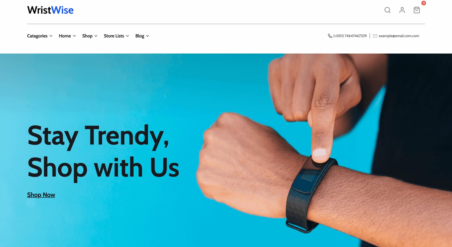
This eCommerce theme has a modern, sleek, and vibrant design, featuring a blue and white color scheme that creates a fresh and stylish feel. The hero section prominently showcases a wearable tech product with a bold CTA button, immediately drawing attention.
Below, trust-building icons highlight secure payments, 24/7 support, and worldwide shipping, reinforcing reliability. The top categories section uses minimalist icons for easy navigation, while featured products are displayed in a clean grid format with thumbnails, prices, and ratings for a seamless shopping experience.
The blog section adds editorial value, offering insights into wearable tech trends. The footer is well-structured, featuring brand logos, customer service links, and social media icons. The bold typography, clean layout, and responsive design make it both engaging and user-friendly.
9. TeeTrend
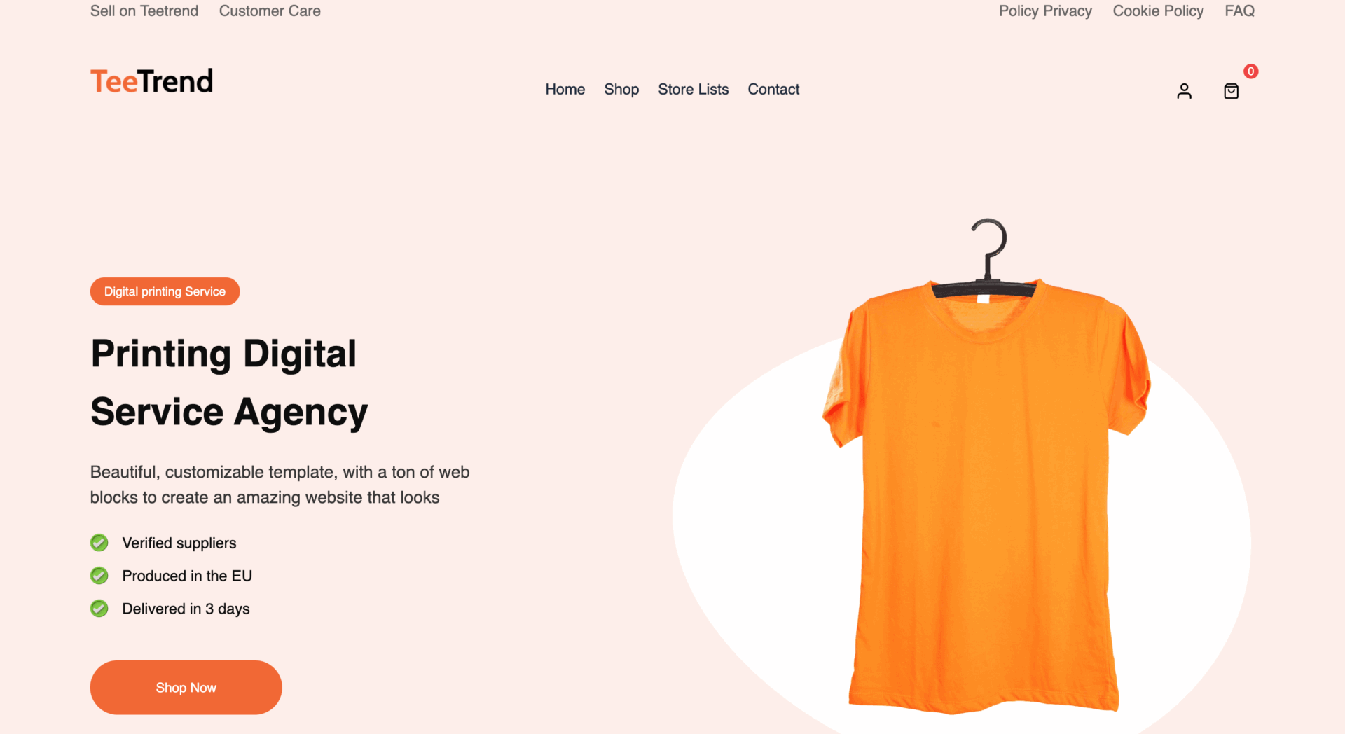
TeeTrend has a soft, modern, and inviting design, using a peach and white color scheme for a warm, friendly aesthetic. The hero section highlights a custom t-shirt printing service with a clean product display and CTA button, immediately drawing attention.
Below, product categories and brand logos like eBay, Walmart, and AliExpress add credibility. The “How it Works” section visually explains the service process, making it easy to understand. Featured products are neatly displayed in a grid format with thumbnails, prices, and ratings, ensuring a smooth shopping experience.
A customer testimonial slider builds trust, while the store list and packaging services section reinforce the brand’s offerings. The footer is well-structured, including trust icons, contact information, and a newsletter sign-up, making it both user-friendly and engaging.
10. PerfectFit
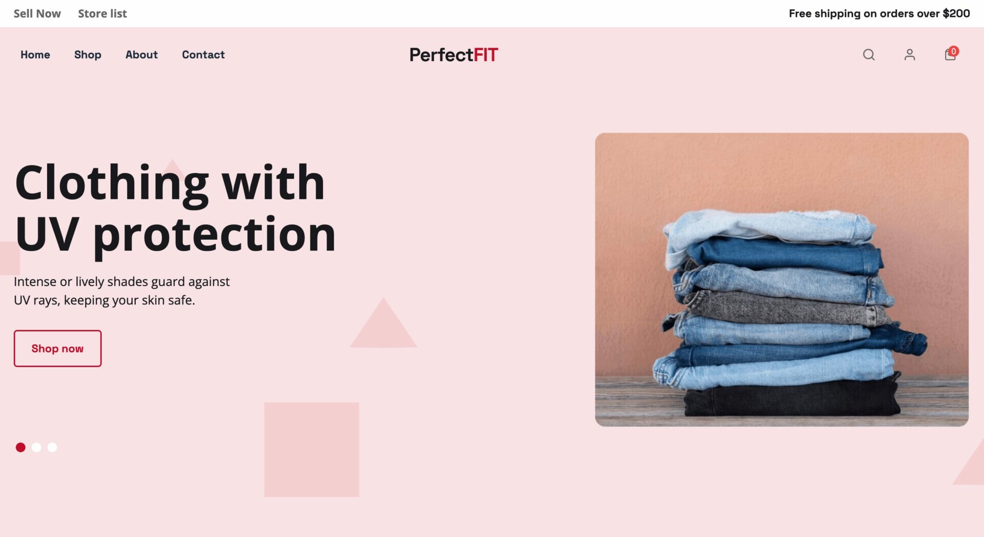
PerfectFit has a bold and trendy design, featuring a pink, red, and black color scheme that creates a stylish and modern aesthetic. The hero section highlights UV-protected clothing with a clean CTA button, while product categories are displayed as interactive filters for quick browsing.
The featured and new collection sections use contrasting colors to grab attention, making navigation visually engaging. Products are neatly displayed in grid and carousel formats, with clear thumbnails, prices, and discount labels to enhance user experience.
A video section adds an interactive touch, while the trending and new arrivals sections showcase the latest fashion trends. The footer is well-structured, featuring trust signals, essential links, and contact details, making the site user-friendly and conversion-focused.
11. QuickMart
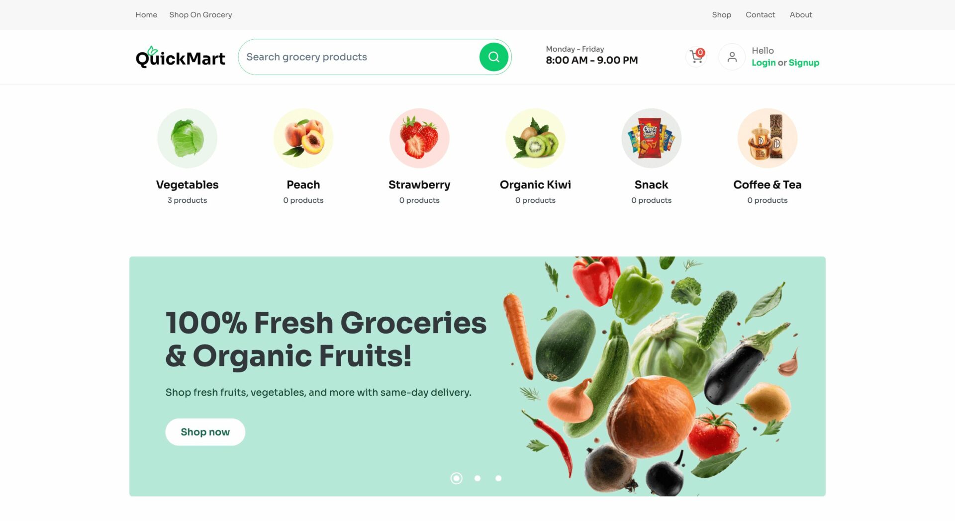
This Dokan Cloud theme has a fresh and vibrant design, featuring a green and white color scheme that reflects its focus on groceries and organic products. The hero section highlights fresh produce with a clean CTA button, while category icons at the top ensure easy navigation.
The bestseller and daily product sections display items in a grid format with clear thumbnails, prices, and “Add to Cart” buttons, enhancing the shopping experience. Promotional banners and trust badges like “On-Time Delivery” and “Quality Assurance” reinforce credibility.
A testimonial slider adds social proof, while the store list section showcases multiple vendors, emphasizing marketplace diversity.
The footer is well-organized, including essential links, payment methods, and customer service details, making the site user-friendly and engaging.
12. GlareGuard
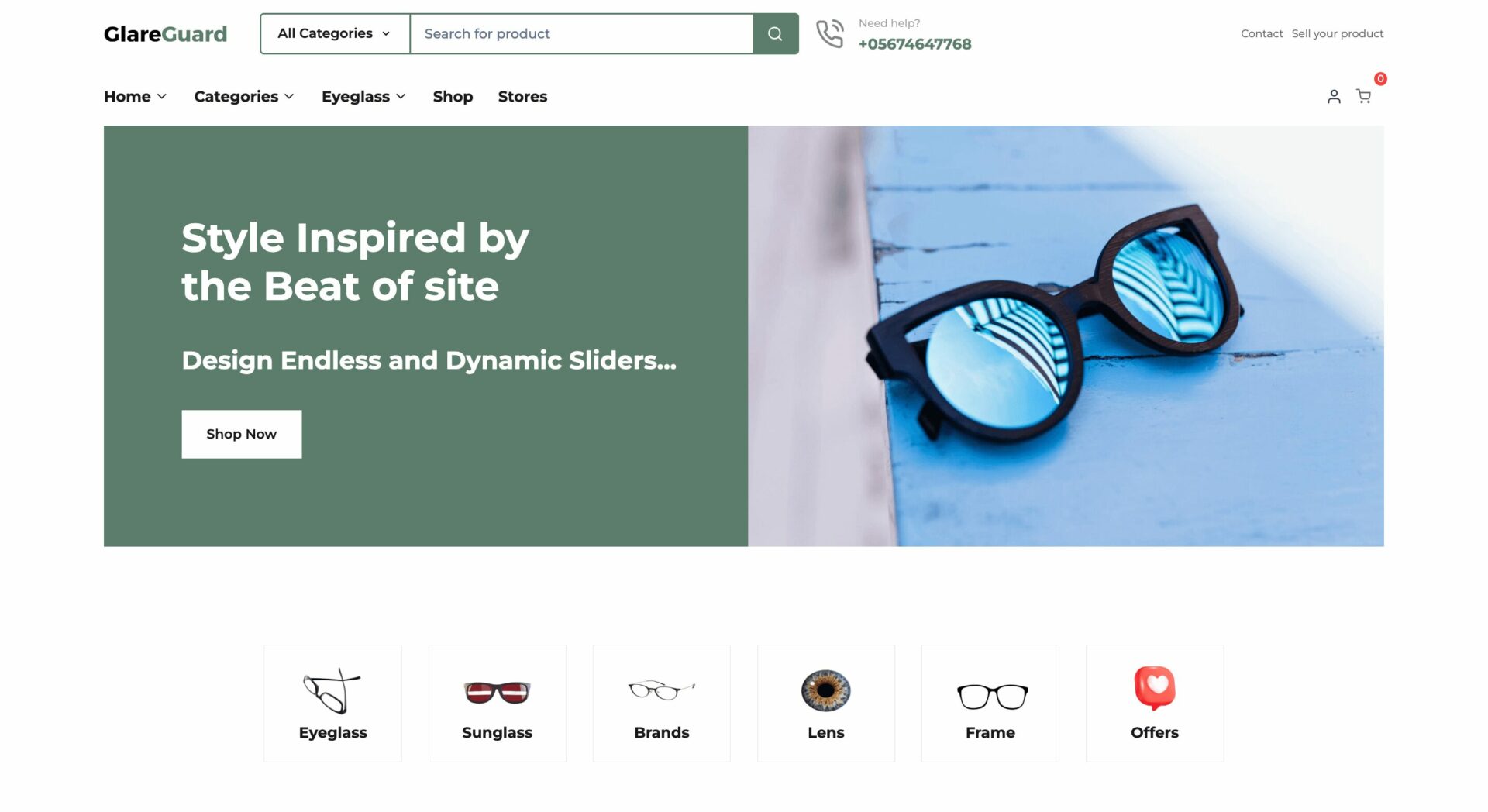
GlareGuard has a modern and stylish design, featuring a green and white color scheme that gives it a sleek and premium feel. The hero section showcases a bold fashion statement with a clean CTA button, while category icons ensure smooth navigation.
The Fresh Selections and New Arrivals sections display products in grid format with clear images, prices, and ratings, enhancing the shopping experience. Promotional banners with urban fashion themes and lifestyle imagery add a trendy touch.
The Popular Store section highlights top vendors, reinforcing marketplace diversity. The footer is well-structured, including a newsletter sign-up, essential links, and social media integration, making the site visually engaging and user-friendly.
13. SoundSphere
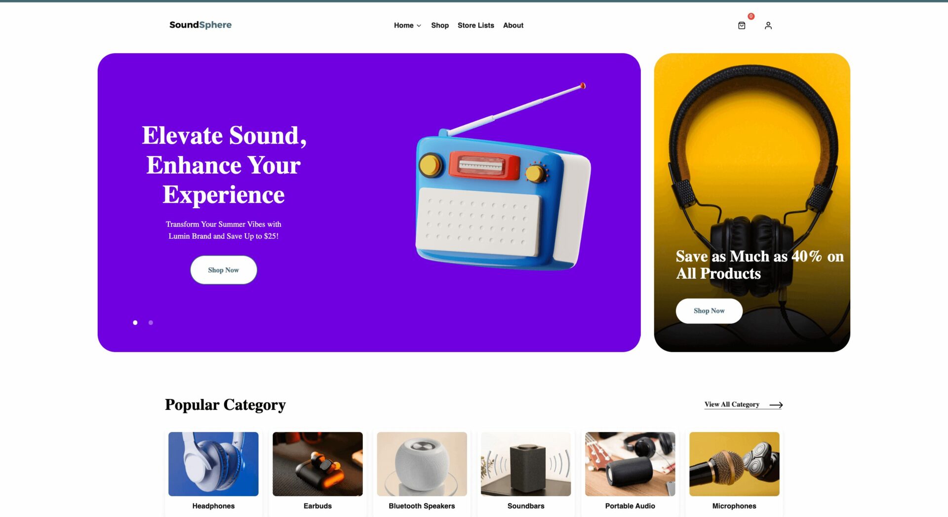
SoundSphere has a modern and dynamic design, featuring a bold mix of purple, black, and white for a tech-focused aesthetic.
The hero section highlights an audio product promotion with a striking CTA button, while category icons provide seamless navigation.
The best and top-selling products are displayed in grid and carousel formats, with clear images, prices, and ratings, improving the shopping experience. A featured section with a countdown timer adds urgency for deals, while promotional banners emphasize audio accessories and discounts.
Testimonials, brand logos, and a seller section build trust, while a newsletter sign-up in the footer encourages engagement.
The clean layout, interactive elements, and responsive design create a user-friendly and visually engaging experience.
14. PackPro
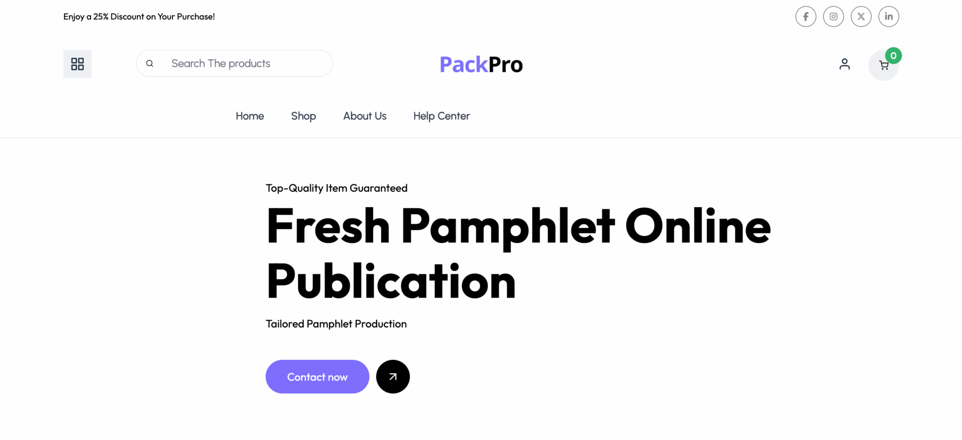
PackPro has a modern and minimalistic design, using a black-and-white theme with accent colors for a sleek and professional look. The hero section features bold imagery and a clear CTA button, while category icons provide quick navigation.
The popular products and best-selling sections are displayed in grid and carousel formats, showcasing thumbnails, prices, and ratings for a seamless shopping experience. A “How It Works” section explains the process, adding clarity for users.
The Instagram-inspired gallery and featured store section enhance visual appeal and credibility. The footer includes essential links, trust signals, and a newsletter sign-up, making the site engaging, informative, and user-friendly.
15. PageTurner
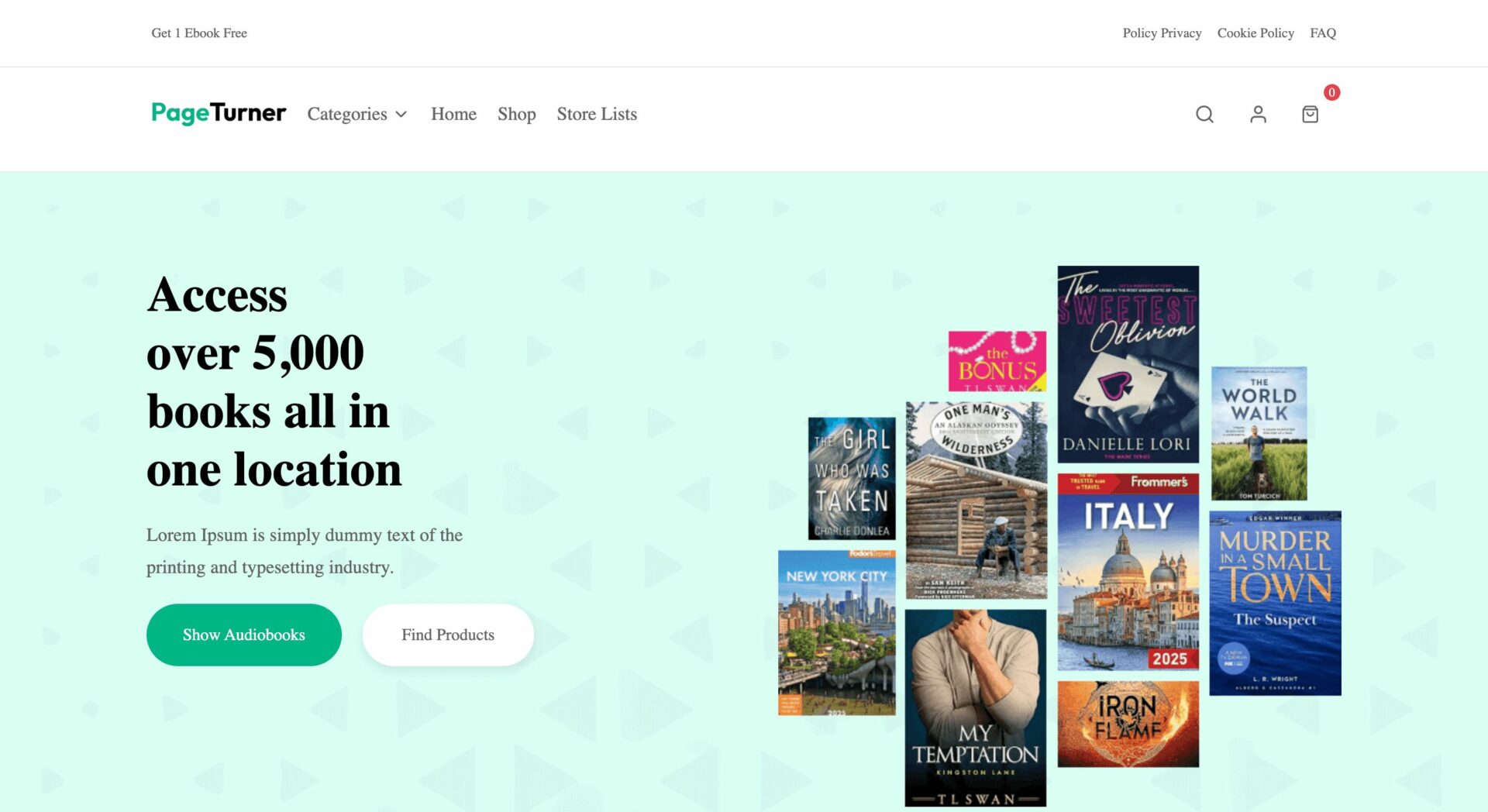
PageTurner has a clean and book-centric design, using a soft green and white color scheme for a calm and inviting feel. The hero section promotes a large book collection with a clear CTA button, while a newsletter subscription banner offers a discount, encouraging engagement.
Categories are displayed with minimalist icons, ensuring smooth navigation.
The multi-books and featured books sections use grid and carousel formats, with thumbnails, prices, and ratings, enhancing the browsing experience.
A dedicated section for audience-based book recommendations adds personalization.
Testimonials, a store list, and a second newsletter prompt build credibility and encourage conversions. The footer includes essential links and social media integration, making the site both functional and engaging.
16. StyleCove
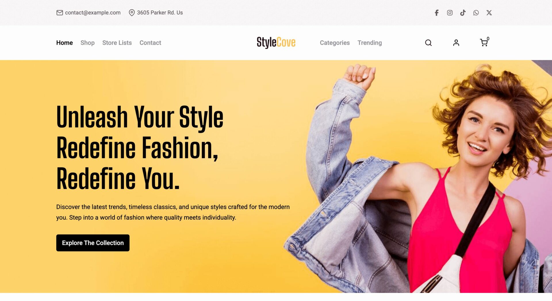
StyleCove has a modern and stylish design, using a bold yellow and white color scheme that reflects a trendy fashion-focused aesthetic. The hero section features a dynamic promotional banner with a strong CTA button, while icons for free delivery, flexible payment, and money guarantees build trust. Product sections are divided for men and women, making browsing intuitive.
The best-selling and popular product sections are displayed in grid and carousel formats, with clear images, prices, and ratings, ensuring a smooth shopping experience.
A seasonal sale banner enhances engagement, while an Instagram feed section adds a social element.
The store list highlights marketplace diversity, and the footer includes essential links, social media icons, and a newsletter sign-up, making the site user-friendly and conversion-focused.
17. TasteBite
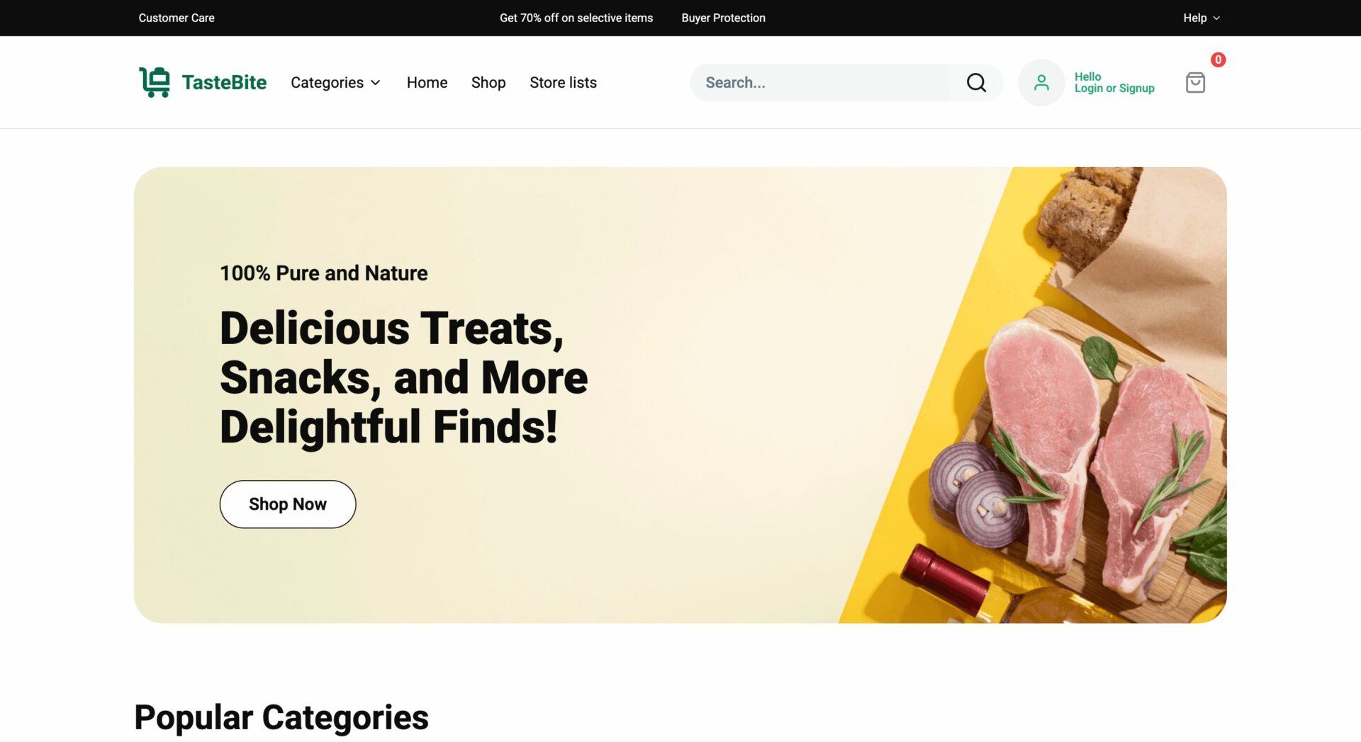
TasteBite has a fresh and vibrant design, using a green and white color scheme that aligns with a natural and organic theme. The hero section features a bold promotional banner with a clear CTA button, while popular categories are displayed with colorful icons for easy navigation.
The top products, best sellers, and hot deals sections are well-structured in grid and carousel formats, with thumbnails, prices, and “Add to Cart” buttons, enhancing the shopping experience.
Discount banners and special deals add urgency, encouraging conversions.
A newsletter signup section offers engagement, while the store list highlights vendor diversity. The footer includes essential links, trust signals, and secure payment options, making the site user-friendly and conversion-focused.
18. CrownFit
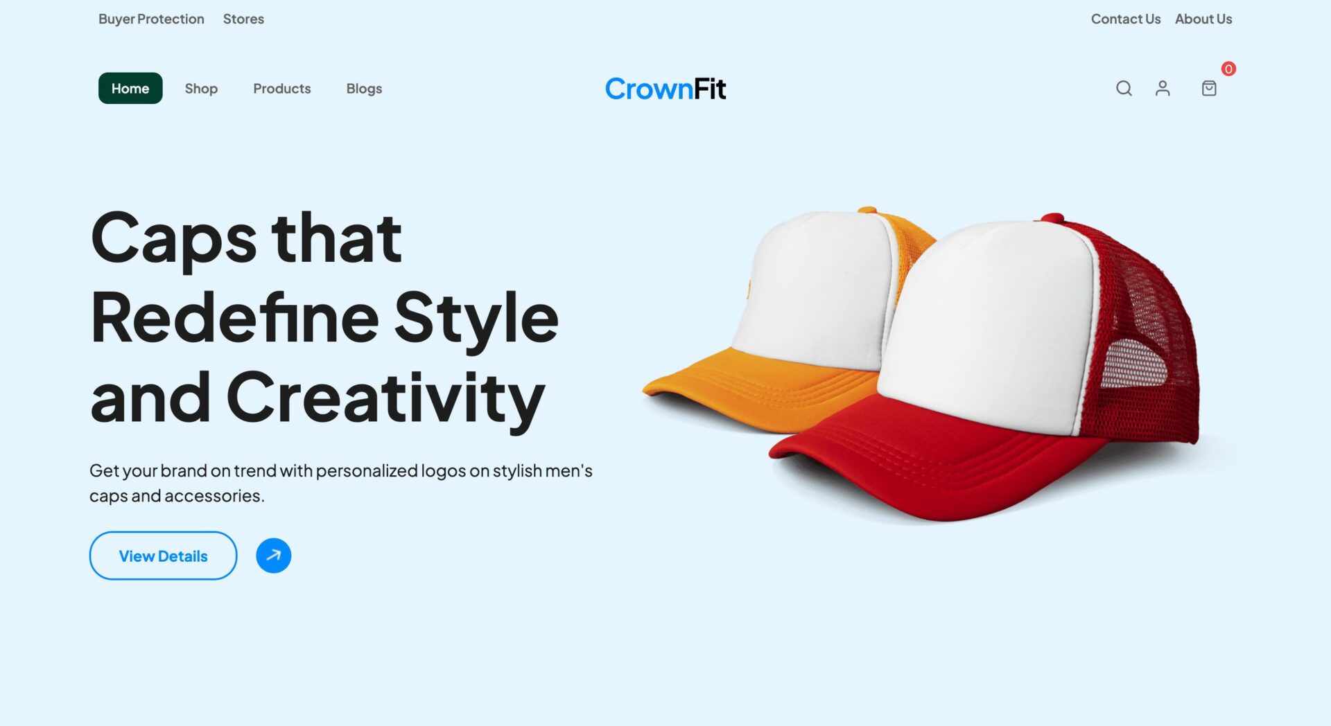
CrownFit has a modern and stylish design, using a blue and white color scheme that enhances its clean and professional look. The hero section features a bold promotional banner with a clear CTA button, focusing on caps and headwear.
Category icons provide easy navigation, while the shop product range is displayed in a grid format with clear images, prices, and ratings, improving the browsing experience. A “How It Works” section visually explains the customization process, adding clarity for users.
Testimonials and trending cap designs add credibility and engagement. The footer includes essential links, a mobile app download section, and trust signals, making the site user-friendly and conversion-focused.
19. ElectroHub
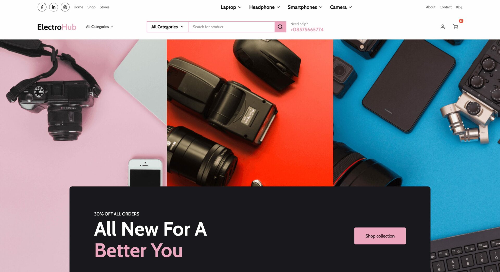
This Dokan Cloud Theme has a modern and tech-focused design, using a bold mix of black, pink, and white for a sleek, premium feel. The hero section features a striking promotional banner with a CTA button, emphasizing discounts on electronics.
Category icons ensure easy navigation, while featured product sections use grid and carousel formats with clear images, prices, and “Add to Cart” buttons, enhancing the shopping experience. Multiple highlighted deals and discounts create urgency, encouraging conversions.
A store list section showcases vendor diversity, while trust signals like free delivery, returns, and 24/7 support reinforce reliability. The footer includes essential links, social media icons, and a newsletter sign-up, making the site user-friendly and visually engaging.
20. ComputerEase
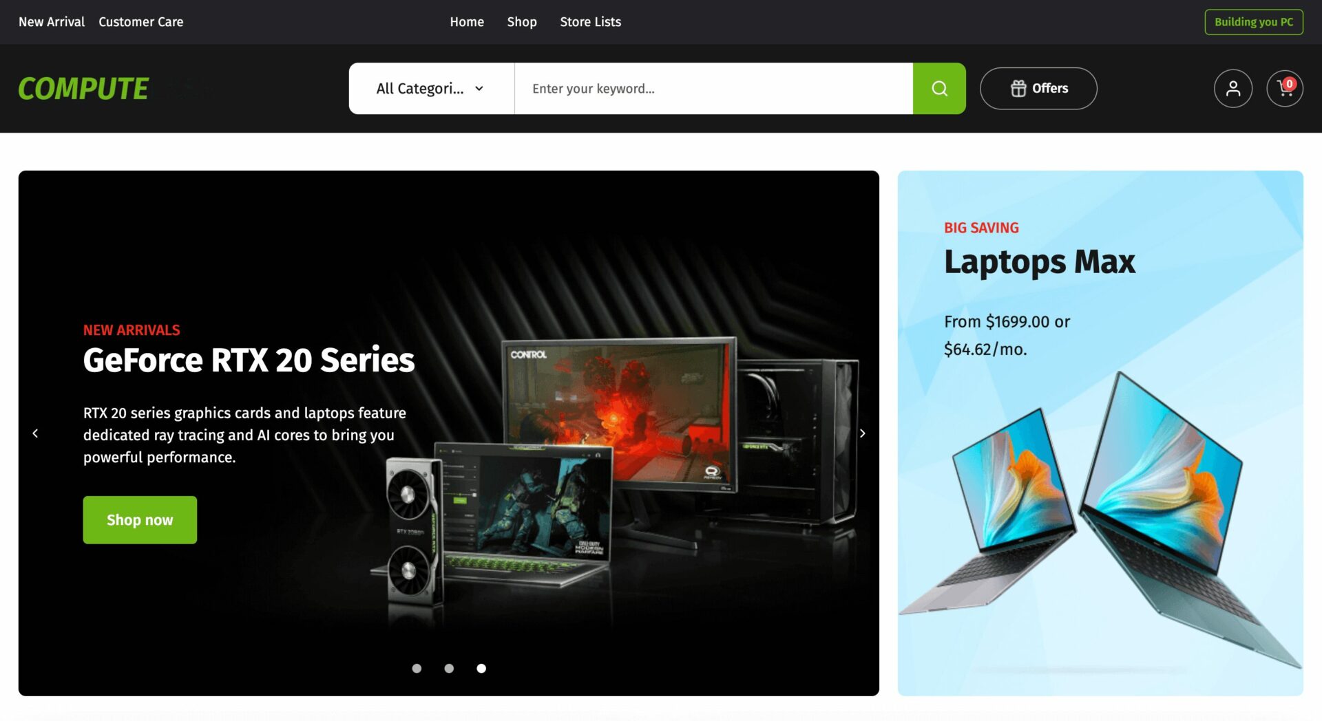
ComputerEase has a sleek and high-tech design, using a black and green color scheme that gives it a premium and futuristic feel. The hero section features a bold promotional banner with CTA buttons, highlighting deals on gaming laptops and GPUs.
Category sections and featured products are well-organized in grid and carousel formats, displaying clear images, prices, and ratings for an engaging shopping experience.
Tech-focused deal banners emphasize discounts on components and accessories, while a “Build Your Dream PC” section enhances interactivity.
The store list and top brands sections add credibility, while trust signals like free shipping, 24/7 support, and flexible payments build confidence. The footer includes essential links, social media icons, and a newsletter sign-up, making the site both user-friendly and conversion-focused.
21. StyleAddict
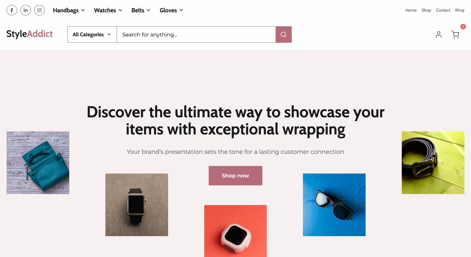
StyleAddict has a modern and elegant design, using a soft pastel and earthy color scheme for a stylish and sophisticated feel. The hero section features a minimalist promotional banner with CTA buttons, highlighting premium packaging and fashion accessories.
Categories are neatly displayed with icons for easy navigation, while featured discounts and sustainable fashion promotions enhance engagement. The most-loved styles and best-selling sections are presented in a grid format with clear images, prices, and ratings, ensuring a seamless shopping experience.
Customer testimonials and curated selections add credibility and personalization.
The footer includes essential links, social media icons, and trust signals, making the site visually appealing and user-friendly.
22. SneakerSaga
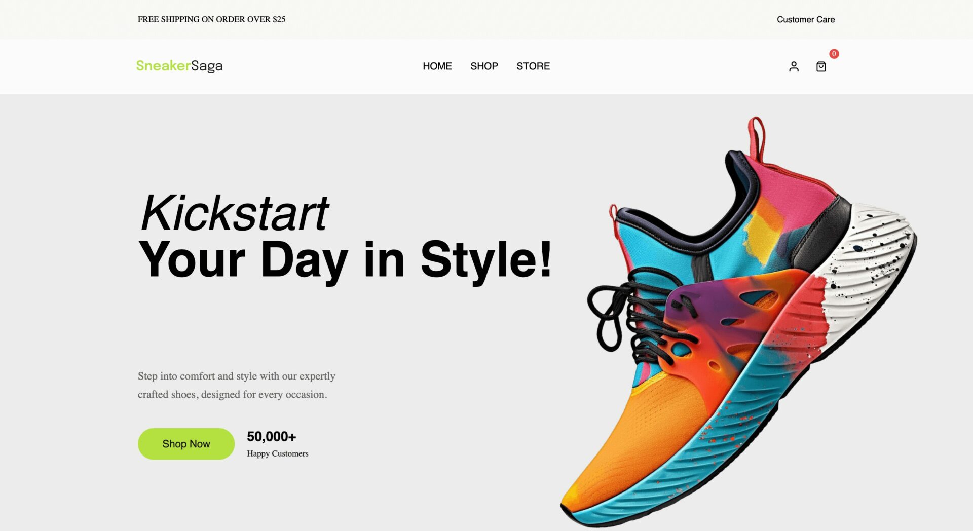
SneakerSaga has a modern and energetic design, featuring a clean white background with bold pops of color, creating a stylish and sporty feel. The hero section highlights a dynamic sneaker promotion with a strong CTA button, while category icons ensure easy navigation.
The trending sneakers and featured products sections are arranged in a grid format with clear images, prices, and ratings, offering a smooth shopping experience.
Special additions and promotional banners increase engagement, while the popular shoes section showcases bestsellers. An Instagram Story feature adds a social and interactive touch.
The footer includes essential links, store lists, and a newsletter sign-up, making the site user-friendly and conversion-driven.
23. ChicNest
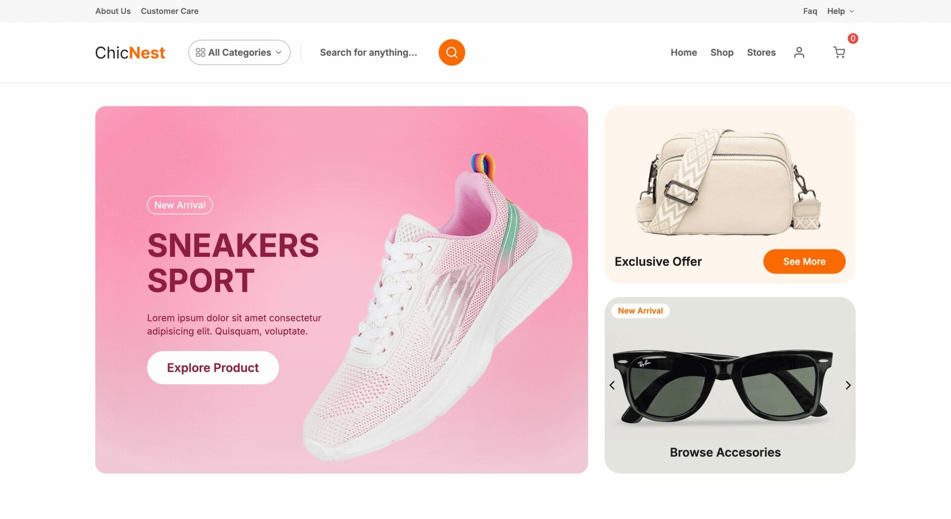
ChicNest has a modern and energetic design, featuring a clean white background with bold pops of color, creating a stylish and sporty feel. The hero section highlights a dynamic sneaker promotion with a strong CTA button, while category icons ensure easy navigation.
The trending sneakers and featured products sections are arranged in a grid format with clear images, prices, and ratings, offering a smooth shopping experience. Special additions and promotional banners enhance engagement, while the popular shoes section showcases bestsellers.
An Instagram Story feature adds a social and interactive touch. The footer includes essential links, store lists, and a newsletter sign-up, making the site user-friendly and conversion-driven.
24. TrendHive
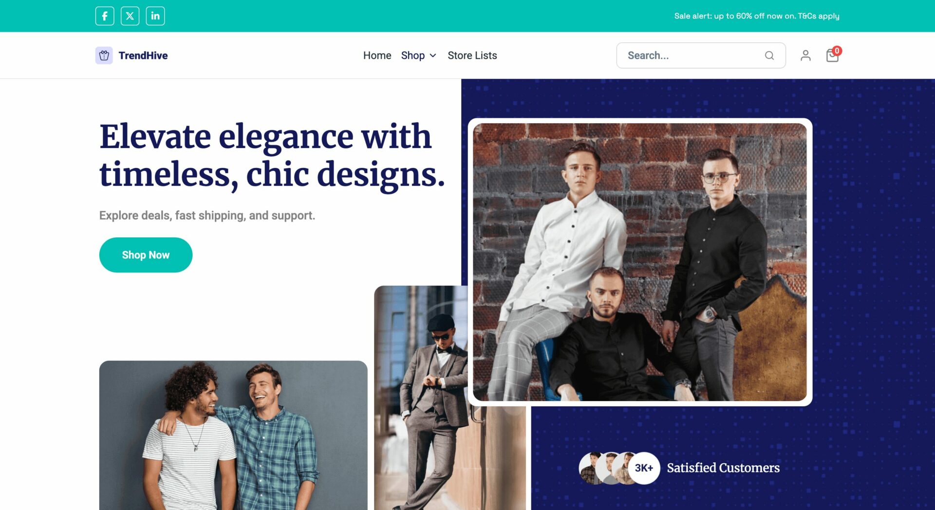
This eCommerce theme has a modern and elegant design, using a blue and teal color scheme for a stylish and premium feel. The hero section showcases fashionable clothing with a bold CTA button, while trust badges highlight global buyers and product variety.
The category and featured product sections are neatly arranged in grid and carousel formats, with clear images, prices, and ratings, ensuring a seamless shopping experience. A countdown timer for daily offers adds urgency, while the “Shop the Looks” section enhances engagement.
Customer testimonials, exclusive deals, and curated fashion collections build credibility. The footer includes essential links, social media icons, and store listings, making the site user-friendly and visually appealing.
25. CarryClass
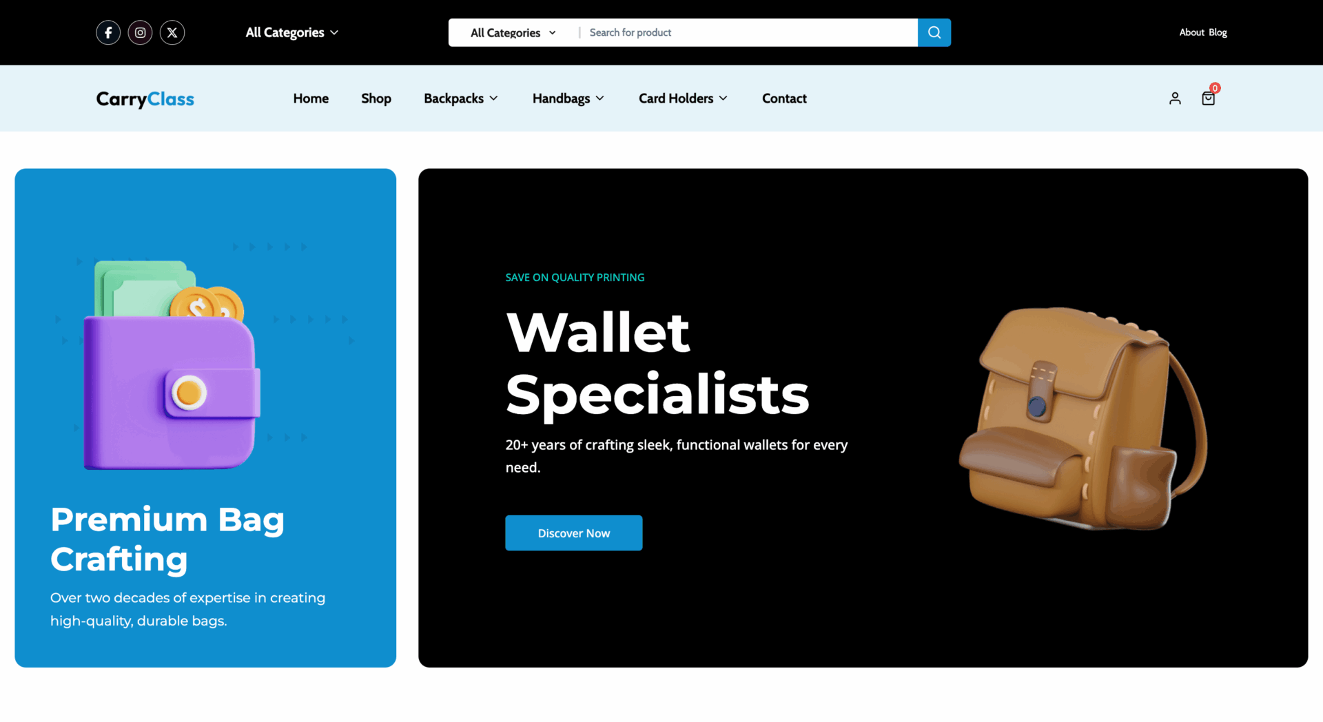
This eCommerce theme has a sleek and stylish design, using a black, blue, and white color scheme for a premium and modern look. The hero section features wallet and bag promotions with bold CTA buttons, while category icons ensure easy navigation.
The popular bags and wallets section is displayed in grid format with clear images, prices, and ratings, creating a seamless shopping experience. A highlighted section with a fashion-forward tagline enhances engagement, while customer assistance, trust signals, and care tips build credibility.
The blog section provides insights on trends and styling, and the store list showcases top vendors. The footer includes essential links, trust badges, and social media icons, making the site user-friendly and conversion-driven.
26. Snackly
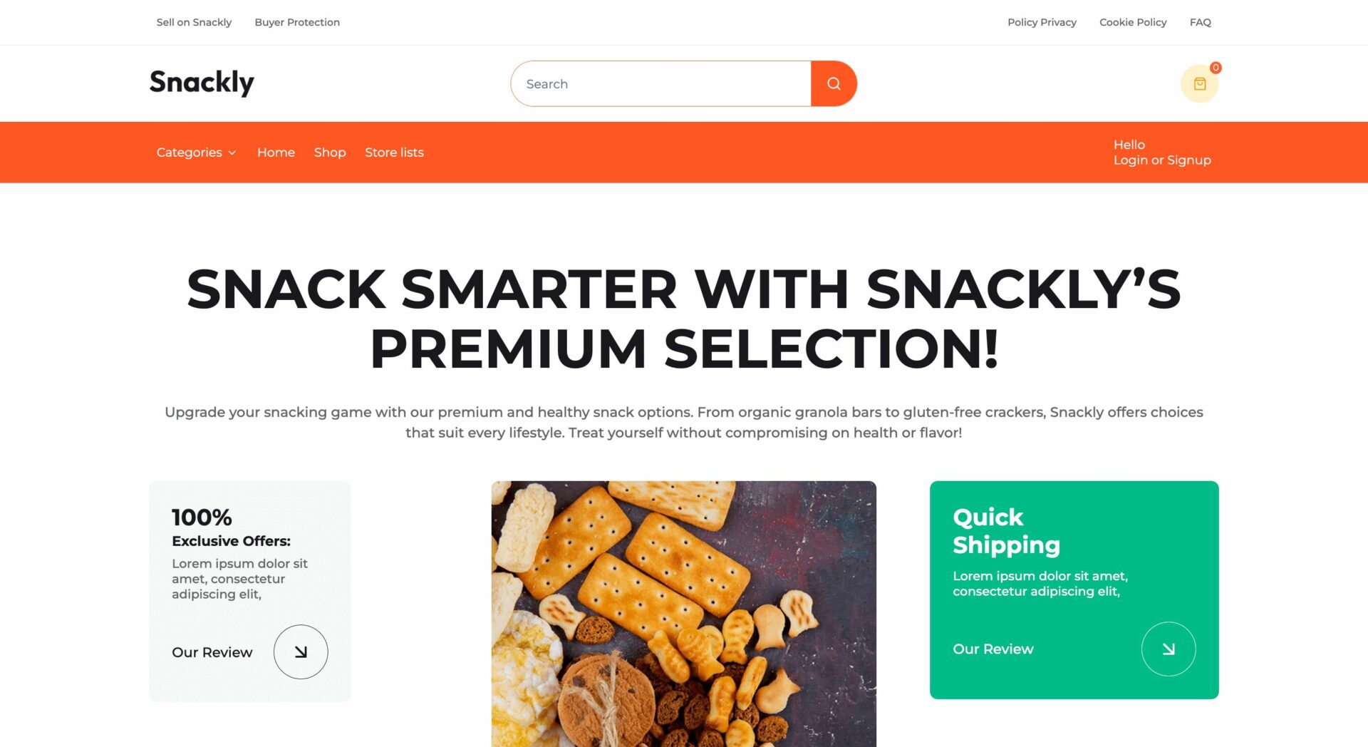
Snackly has a bold and vibrant design, using a bright orange and white color scheme that reflects a fun and energetic snacking theme.
The hero section highlights premium snack selections with engaging visuals and CTA buttons, while trust signals like quick shipping and 100% satisfaction guarantees build credibility.
The product sections are structured in grid and carousel formats, with clear images, prices, and “Add to Cart” buttons, making shopping seamless.
Featured and new collection banners enhance engagement, while a quick product search, fast delivery, and secure payment section improves user experience.
The seller list showcases marketplace diversity, and the footer includes essential links, social media icons, and a newsletter sign-up, making the site user-friendly and conversion-optimized.
27. BlyZia
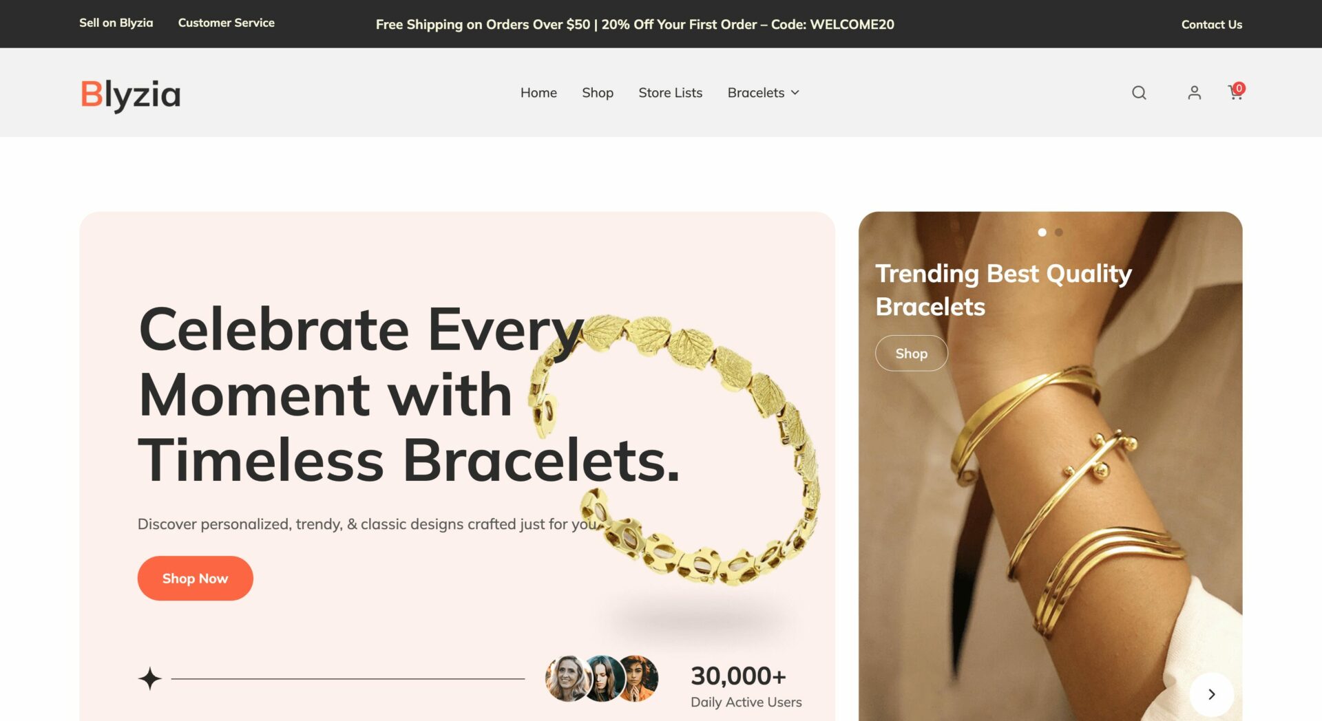
This theme has a soft and elegant design, using a pastel pink and white color scheme that complements its focus on jewelry and bracelets. The hero section showcases timeless bracelets with a stylish CTA button, while trust signals like customer reviews and trending collections build credibility.
The product sections are neatly arranged in grid and carousel formats, displaying new arrivals, personalized gifts, and premium jewelry pieces with clear images and pricing. A dedicated section for customer promises, including fast shipping and quality assurance, enhances trust.
The testimonials and Instagram gallery add social proof, while the footer includes essential links, a store directory, and a newsletter sign-up, making the site both user-friendly and visually appealing.
28. Kitchura
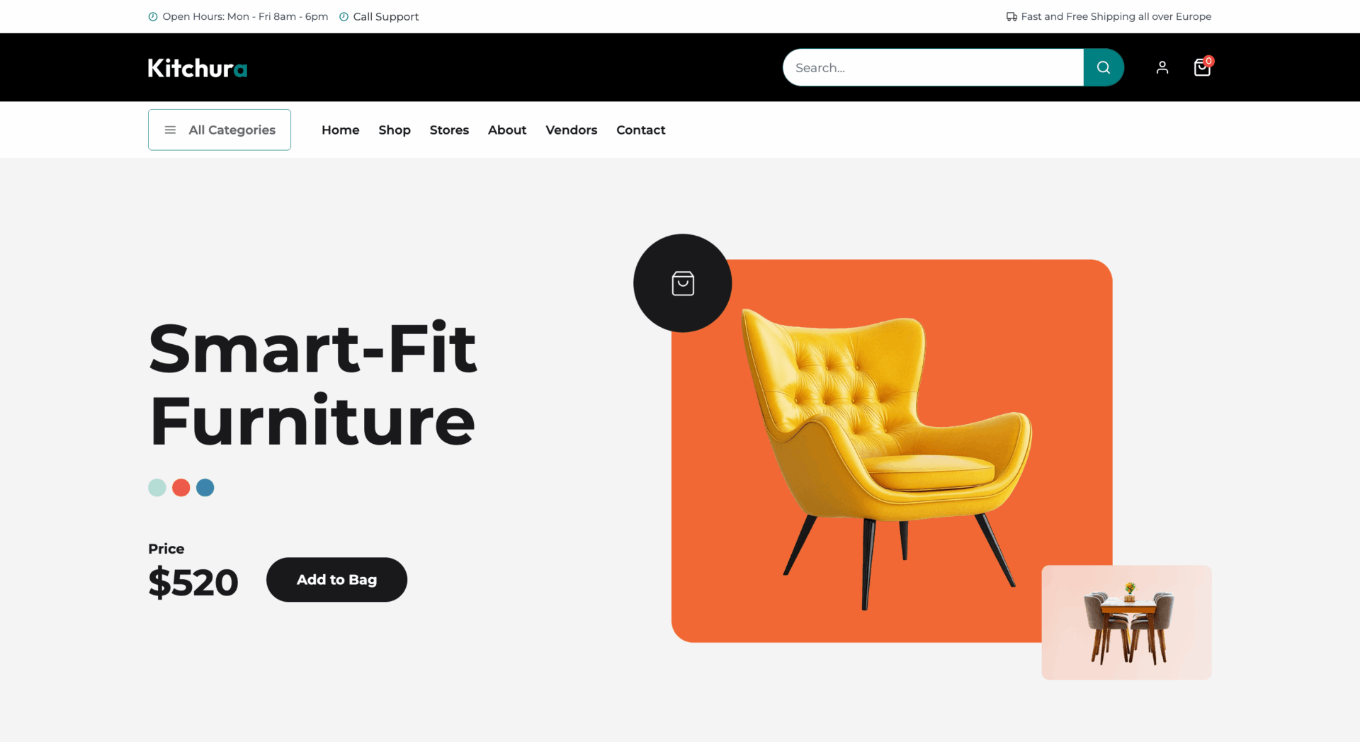
This theme has a modern and stylish design, using a clean white background with bold accent colors to create a premium shopping experience. The hero section highlights a featured furniture product with pricing and an “Add to Bag” button, making it easy for users to purchase.
Category icons are displayed in vibrant blocks, ensuring smooth navigation. The product sections are well-structured in grid and carousel formats, showcasing furniture, apparel, and accessories with clear images, prices, and quick-buy options.
A discount banner for newsletter sign-ups encourages engagement, while the popular seller section highlights marketplace diversity. The footer includes essential links, social media icons, and an app download option, making the site user-friendly, visually engaging, and conversion-optimized.
29. Kitchora
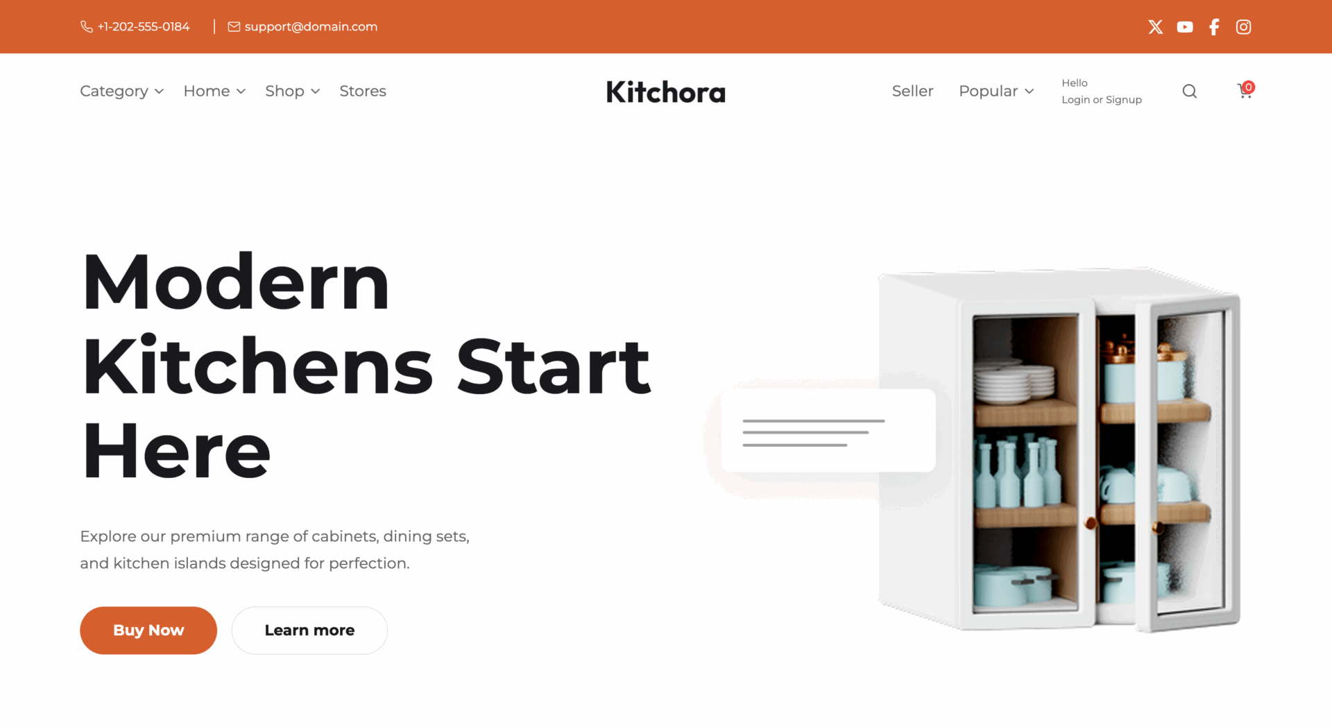
This theme has a clean and modern design, using a white and earthy-toned color scheme that aligns with its kitchen-focused theme. The hero section highlights custom kitchen solutions with a CTA button, while trust badges promote customizable options, free design consultations, and easy returns.
Category icons provide smooth navigation, and featured products are showcased in a grid layout with clear images, prices, and ratings, ensuring an easy shopping experience.
A countdown timer on a promotional banner adds urgency, while user testimonials and a gallery of kitchen designs build credibility.
The popular seller section highlights marketplace diversity, and the footer includes essential links, social media icons, and a newsletter sign-up, making the site user-friendly and conversion-optimized.
30. BabyLace
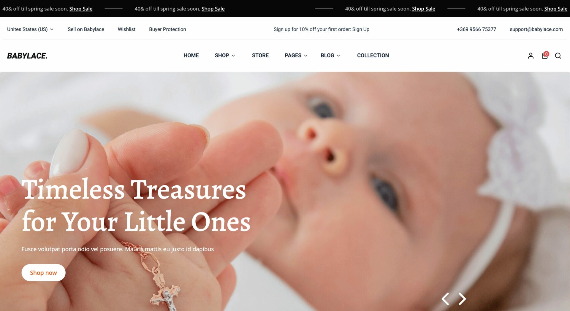
This theme features a clean, modern, and user-friendly design with a purple and yellow color scheme for a professional look. The top navigation bar includes essential elements like a search bar, cart, and category menu for easy browsing.
A large hero banner showcases a featured product with a clear call-to-action (CTA), while the icons below highlight benefits like free shipping and 24/7 support. Products are displayed in a structured carousel format with thumbnails, prices, and add-to-cart buttons, making shopping easy.
Category icons and promotional banners enhance engagement, while a footer with brand logos and quick links builds trust. The grid-based, responsive layout ensures smooth navigation on all devices, balancing aesthetics and functionality for a great user experience.
31. ConnectPro
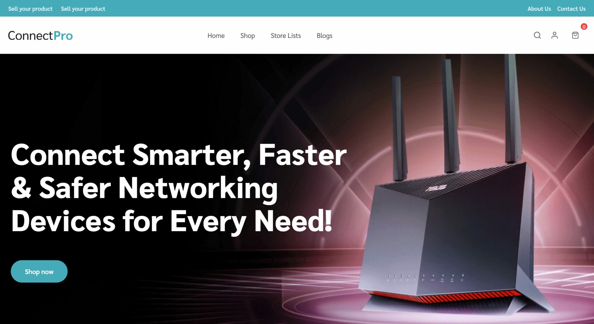
This eCommerce theme has a modern, professional, and user-friendly design, ensuring a smooth shopping experience.
At the top, the navigation bar includes essential links, a search bar, and a shopping cart for easy access. A large hero banner with a bold call-to-action (CTA), emphasizing speed, security, and smart connectivity.
Below, the Explore Categories section organizes products. The Most Popular Picks and Featured Products sections highlight bestsellers with high-quality images, ratings, and pricing for quick browsing.
A dedicated promotions section displays the best deals, encouraging conversions. The customer testimonials and statistics build trust, showcasing the brand’s reach and reliability.
The Retailers List provides options for purchasing from various vendors, while the footer includes quick links, support information, and social media integration.
The responsive grid layout ensures smooth navigation across all devices, balancing functionality and aesthetics.
32. CircleCharm
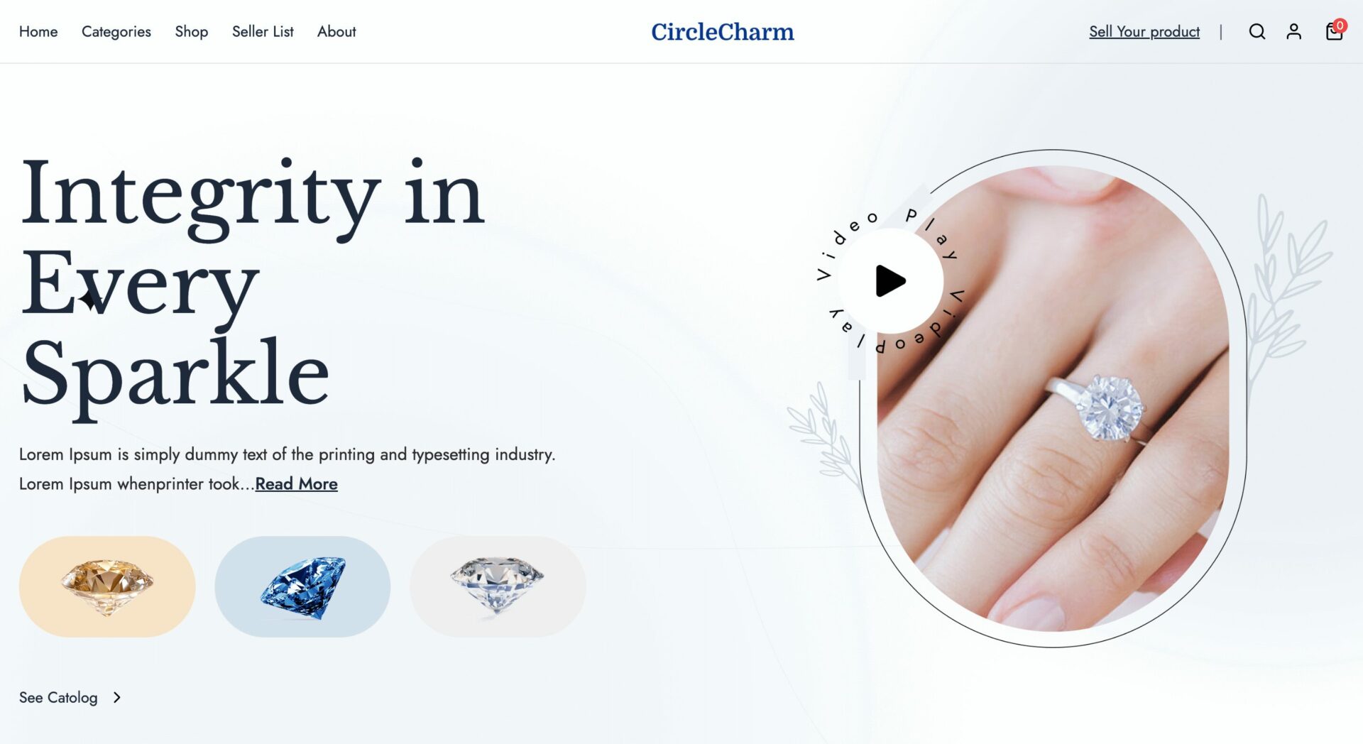
CircleCharm has a clean, modern, and user-friendly design. The white and pastel color scheme enhances the premium feel, while a well-structured layout ensures clean navigation.
At the top, the navigation bar includes essential links, a search bar, and a shopping cart for easy browsing—a large hero banner with a clear call-to-action (CTA), drawing attention. Below, key tabs highlight categories.
The Top Rated Products area, where bestsellers are displayed with high-quality images, ratings, and prices. A highlighted collection feature showcases exclusive designs, like the New Arctic Dragon Collection.
A customer testimonials section builds trust, displaying real user experiences. The Vendor List provides options to shop from different sellers, while the News and Career section keeps visitors updated on trends and opportunities.
At the bottom, a subscription banner invites users to sign up for exclusive offers, and a well-structured footer provides quick access to company information, policies, and social media links.
33. CurryZoo
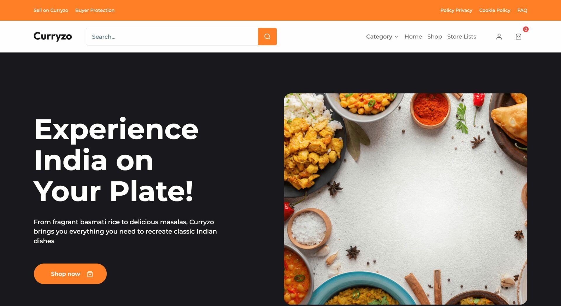
CurryZoo features a clean, modern, and user-friendly design with a vibrant orange and black color scheme.
At the top, the navigation bar includes a search bar, a shopping cart, and essential category links for easy browsing.
Below, the Explore Categories section visually organizes products into categories, making it easy for shoppers to find what they need. The New Arrivals section highlights fresh products.
The Partnerships & Events section encourages collaborations, while the Top Vendors section builds trust by displaying ratings and featured sellers. Additionally, a featured content area enhances brand storytelling.
A well-structured footer provides quick access to customer support, company policies, and a search function for easy navigation.
34. StepGlow
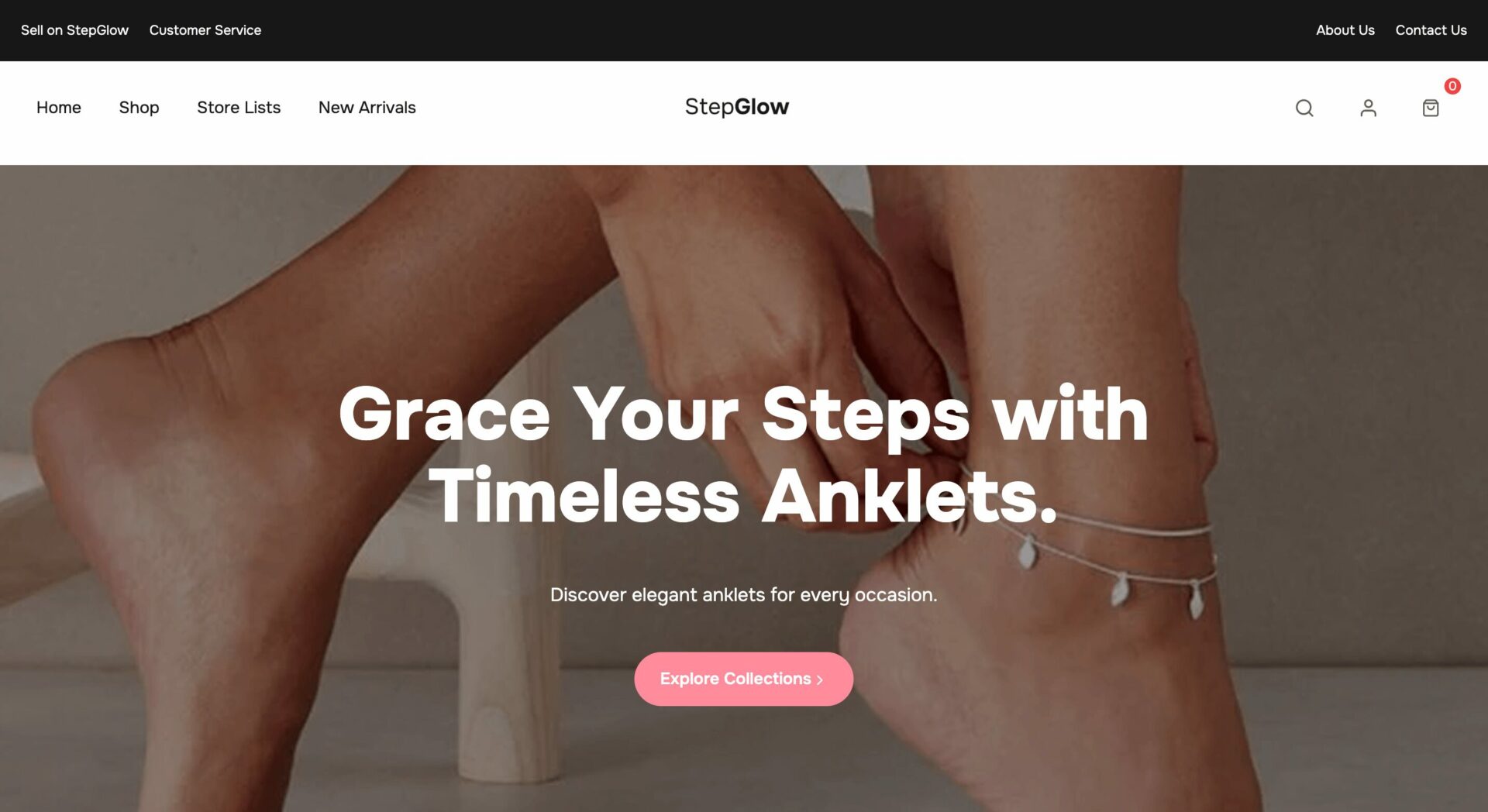
This eCommerce theme features a clean, modern, and user-friendly design with a minimalist and elegant aesthetic.
At the top, the navigation bar includes essential links, a search bar, and a shopping cart for easy browsing.
The Explore Our Collections section organizes products into categories, helping users find the perfect accessories. The Shop Our Bestsellers section highlights top-rated products with high-quality images, reviews, and add-to-cart buttons.
A promotional banner offers discounts, encouraging conversions. Below, a customer testimonials section builds trust by showcasing real reviews. The Why Choose Us section highlights the brand’s unique selling points.
A Style Tips & Trends section provides fashion advice. The Retailers List allows users to purchase from trusted vendors.
35. Dairify
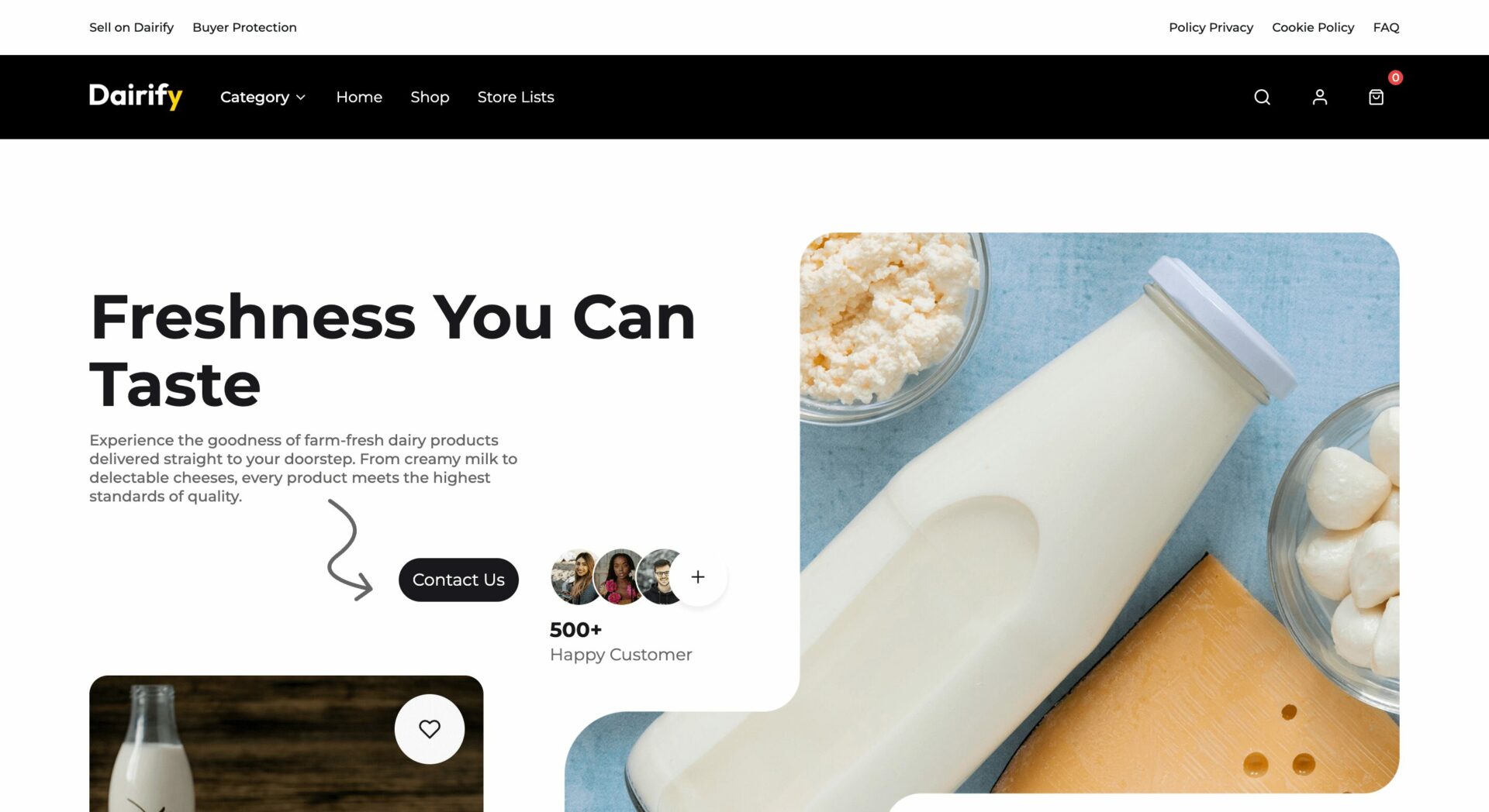
Dairify features a clean, modern, and user-friendly design . The neutral color palette enhances the premium feel, while the structured layout ensures smooth navigation.
At the top, the navigation bar includes essential links, a search bar, and a shopping cart for easy browsing.
The Explore Our Collections section organizes products into categories, helping users find the perfect accessories. The Shop Our Bestsellers section highlights top-rated products.
A promotional banner offers discounts, encouraging conversions. The Why Choose Us section highlights the brand’s unique selling points, such as high-quality products, secure shopping, and customer satisfaction.
36. BoldEdge
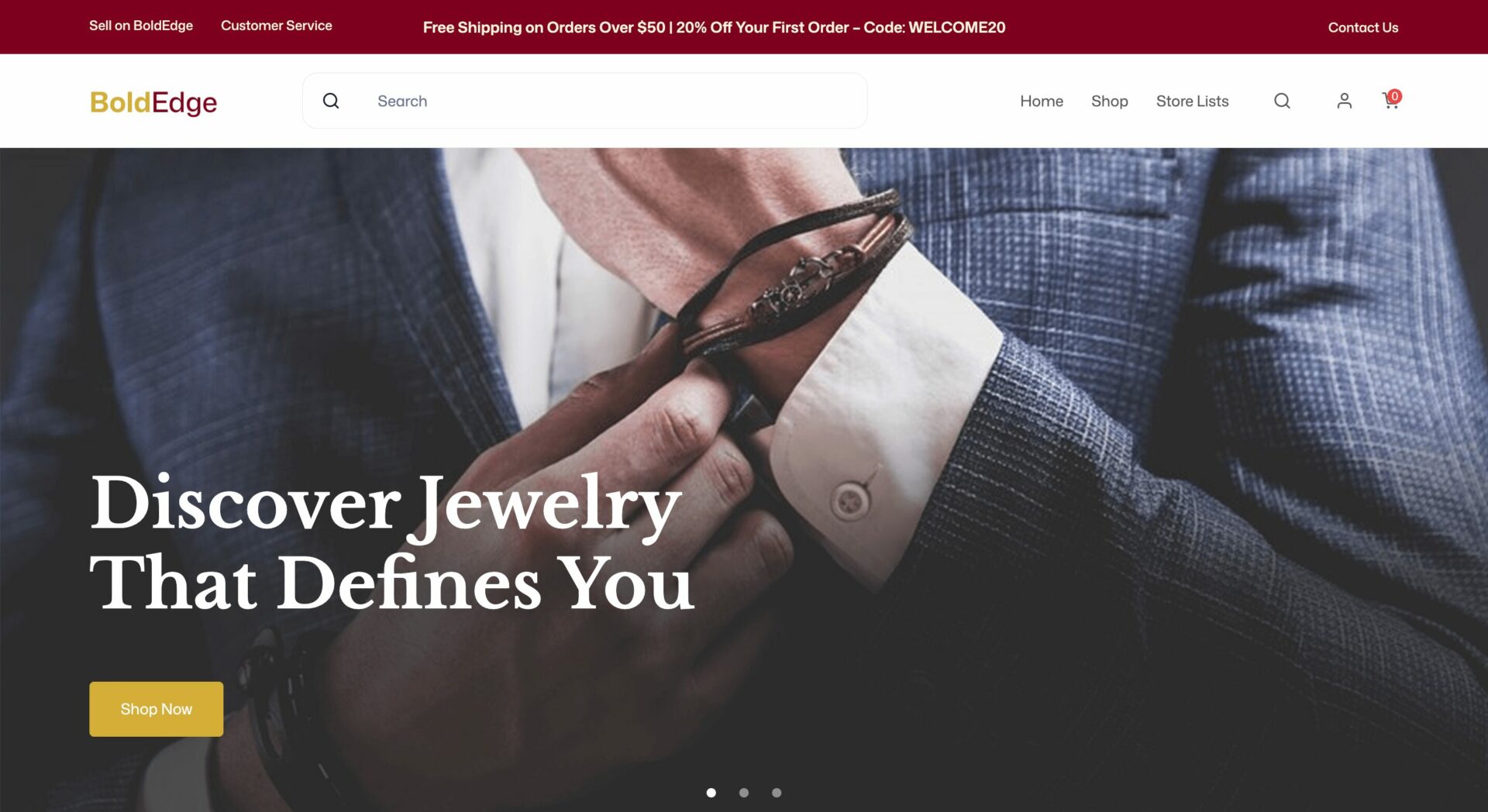
This Dokan Cloud theme gives a bold, modern, and user-friendly design with luxurious and masculine aesthetics. The deep red and black color scheme increases the premium and sophisticated feel.
At the top, the navigation bar includes a search bar, shopping cart, and key category links for easy browsing.
The Best-Selling Collections section highlights products, while the Offers section features attractive discounts. The Products section displays top-rated items with high-quality images, reviews, and add-to-cart buttons for seamless shopping.
A Hot Right Now section showcases trending products, while the Loved by Our Customers section builds trust with authentic testimonials. Below, a subscription banner encourages users to sign up.
The Store Directory helps users find trusted vendors, and the footer provides essential support links, company policies, and social media integration.
37. Ravelli
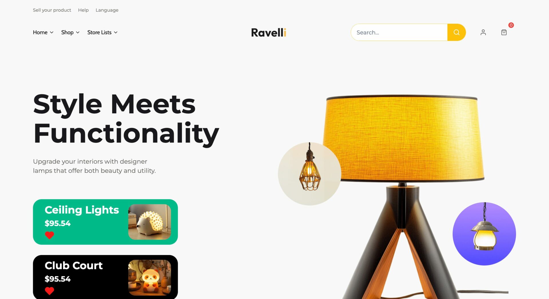
Ravelli has a modern, vibrant, and user-friendly design with a sleek and stylish aesthetic. The bold blue and yellow color increases visibility and engagement.
At the top, the navigation bar includes a search bar, shopping cart, and key category links for easy browsing.
The category navigation bar provides quick access to products. The Facilities for Users section highlights key benefits. The Featured Products section showcases bestsellers with high-quality images, prices, and add-to-cart buttons.
A User Testimonials section builds trust with customer reviews, while the Some Popular Items section highlights trending products. Below, the Best Seller section features trusted vendors and retailers, adding credibility.
The grid-based, responsive layout confirms a smooth shopping experience on all devices, blending aesthetics with practicality.
38. Klyara
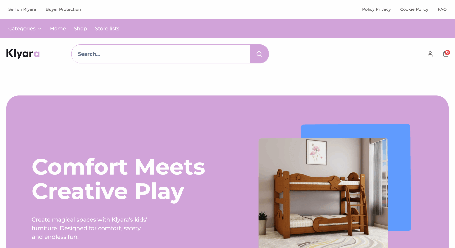
Klyara features a modern, playful, and user-friendly design with a soft pastel color scheme. The lavender and white aesthetic creates a warm and inviting shopping experience while maintaining a clean and structured layout.
A large hero banner showcases the product with a compelling call-to-action (CTA).
The key benefits section highlights features. The category section organizes products into groups for easy navigation. The Featured Products section presents popular items. A lifestyle banner emphasizes the brand’s philosophy.
A customer testimonials section builds trust by showcasing real reviews, while the seller section highlights trusted vendors for additional credibility. At the bottom, a search bar and a newsletter subscription option encourage users to explore new collections and stay updated on offers.
39. Harvestly
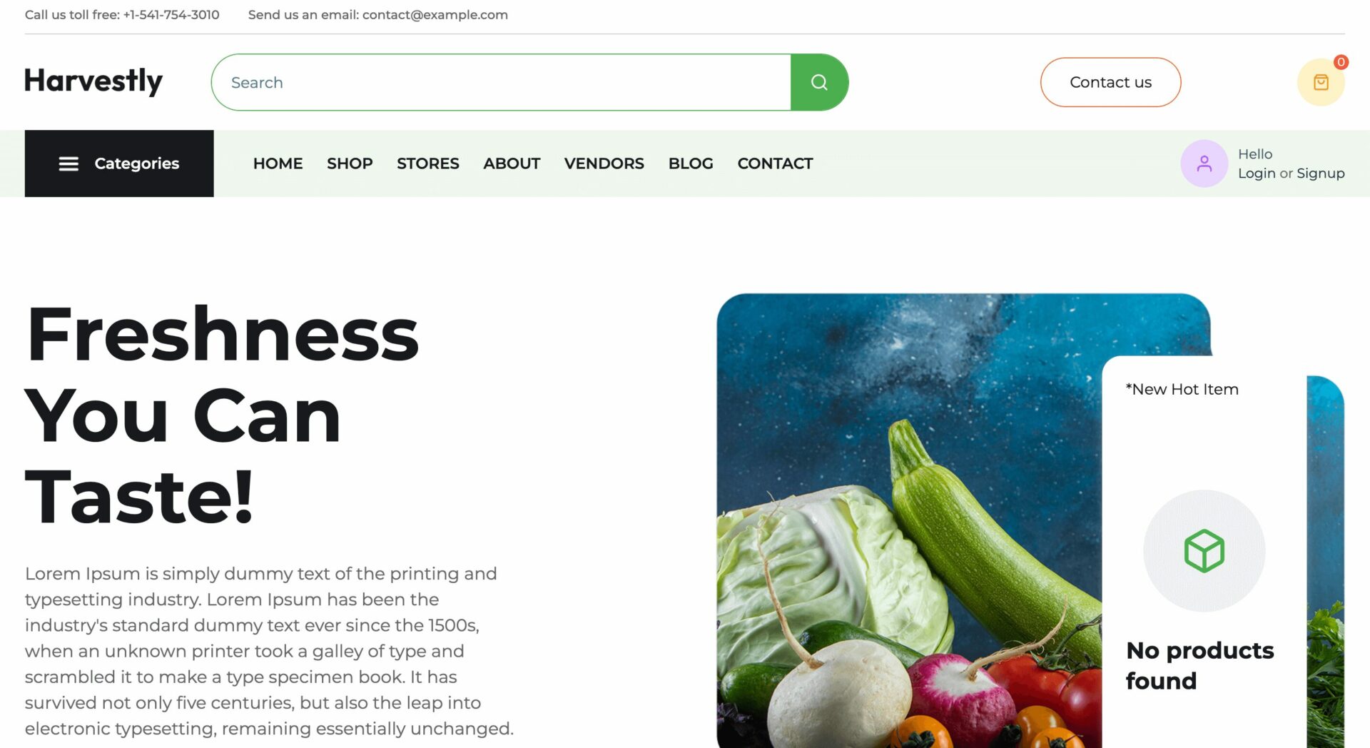
Harvestly has a modern, fresh, and user-friendly design with a green and white color scheme. The clean and structured layout ensures easy navigation and an engaging shopping experience.
At the top, the navigation bar includes a search bar, shopping cart, and key category links for quick access. The category section organizes products into various groups. The Featured Product section highlights bestsellers.
The Latest Auctions section allows users to bid on fresh produce, creating an interactive shopping experience. The User Testimonials section builds credibility by showcasing real customer reviews, while the Popular Seller section highlights trusted vendors.
At the bottom, a newsletter subscription encourages users to explore the product library and receive exclusive offers.
40. Meatify
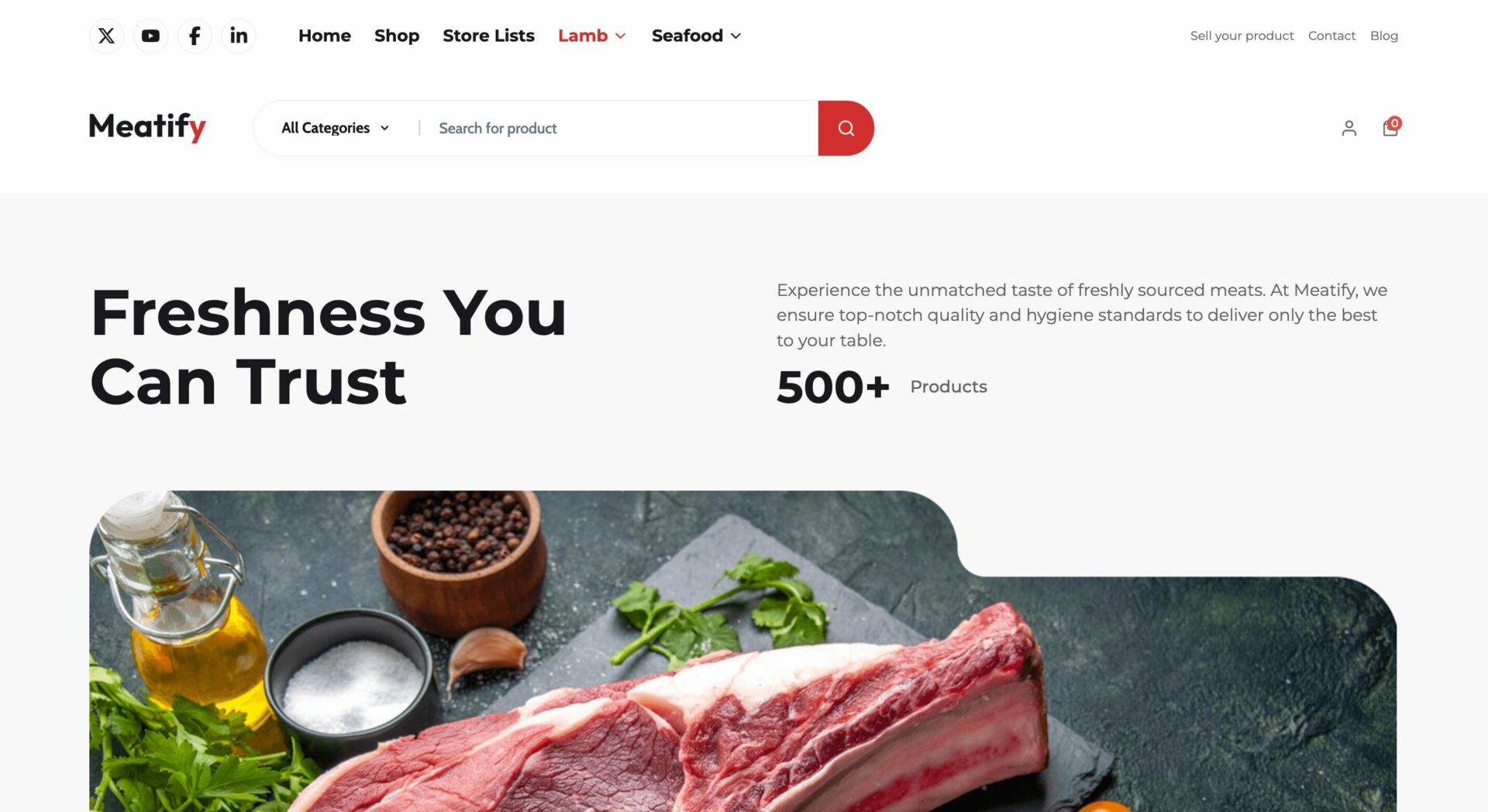
Meatify features a clean, modern, and user-friendly design with a bold and fresh aesthetic. The red, black, and white color scheme increases the premium and trustworthy feel.
At the top, the navigation bar includes a search bar, shopping cart, and key category links for easy browsing. A large hero banner with a strong call-to-action (CTA), emphasizing freshness and trust.
The Main Category section organizes products into groups. The From Farm to Fork section highlights high-quality, fresh-from-the-source meat products.
The Featured and New Collection sections display best-selling and new arrivals with high-quality images, descriptions, and add-to-cart buttons.
The Best Seller section highlights trusted vendors, while User Testimonials build credibility through customer reviews. The footer includes essential links for customer support, resources, and a newsletter subscription option for exclusive deals.
Choose the Best Dokan Cloud Theme for Your eCommerce Store and Marketplace
Themes shape the way how your online store will look. It also decides how your customers will engage with your site.
The Dokan Cloud themes are modern in design and give a very premium vibe. But that doesn’t mean you. are bound to use that design only.
With the amazing Dokan Page builder, you can customize the theme and design it how you want your store to look. Many of our users are already using the page builder in combination with the theme to churn out great designs for their eCommerce stores or marketplaces.
Looking forward to seeing your designs as well. You can share a screenshot of our marketplaces in the comment section.
Subscribe to
Dokan blog
We send weekly newsletters, no spam for sure!


Leave a Reply