When you try to boost product detail pages, it helps to think about how real shoppers behave. We’ve watched people browse online stores many times. They land on a product page. They pause for a second. Then they start scanning. A quick look at the images. A glance at the price. Maybe scroll to the reviews. Their decision forms faster than we expect.
If the page feels empty, confusing, or hard to trust, they move away. But when the information is clear, the images feel real, and the page answers their questions without effort, they stay longer. They explore. They feel ready to buy.
Marketplace owners notice this pattern even more. Every product page carries a story about how well the seller understands their customer. Some pages feel complete. Some feel rushed. And the overall shopping experience rises or falls with these small details.
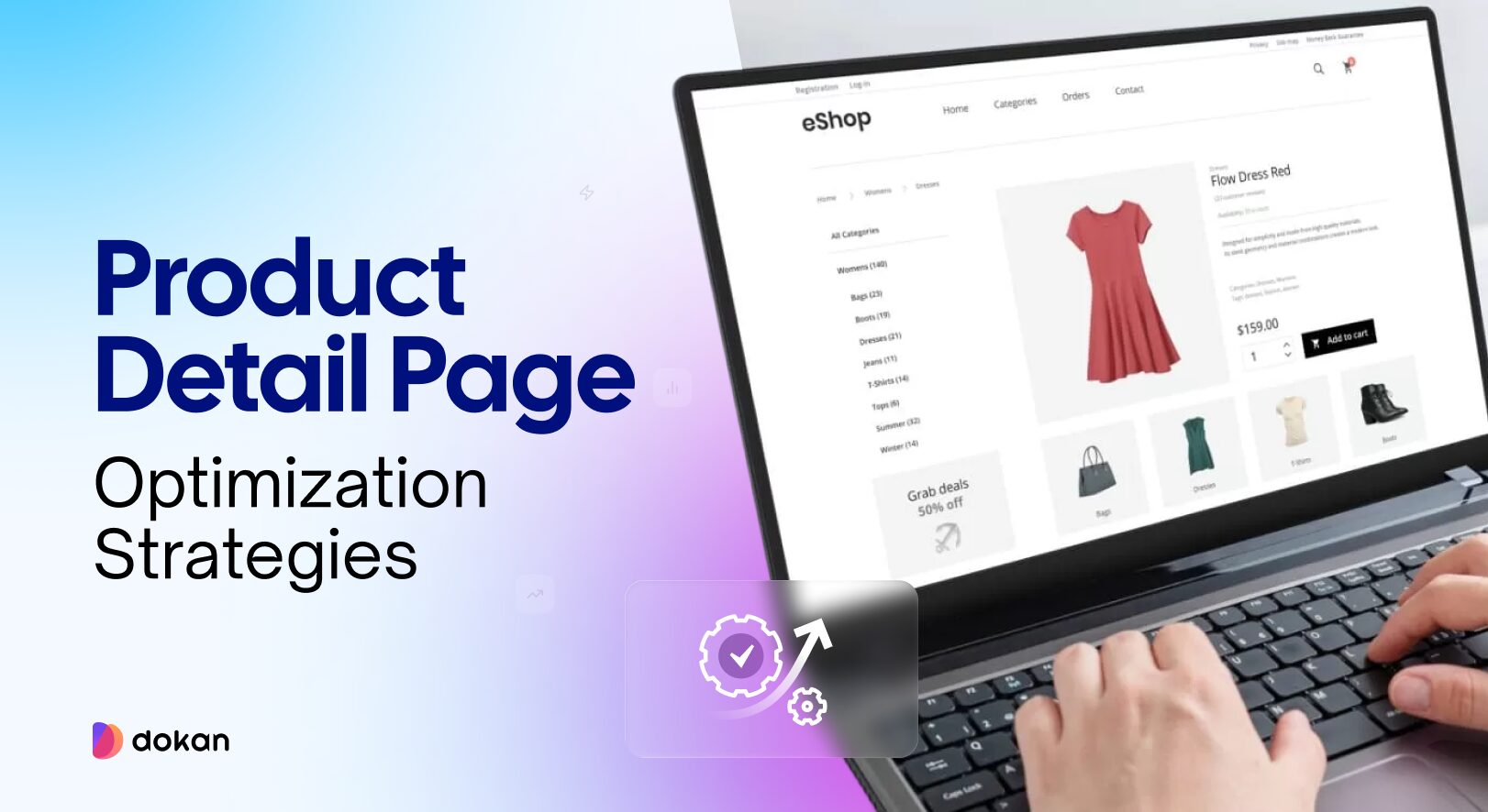
Today we are going to share the strategies you need to follow to boost your product details pages going into the new year!
Proven Ways to Boost Product Detail Pages
A strong product page helps customers understand the product fast. It clears doubts, reduces clicks, and guides them toward the purchase without pressure.
Small improvements can create a better shopping flow and help users trust the page. These changes also help vendors in a marketplace keep their pages clear and consistent.
Here are the key areas you can focus on:
- Test Small Layout Changes that Shape User Behavior
- Place Customer trust Signals Where Users Can see Them Fast
- Use Benefit-focused Copy & Test Different Variations
- Highlight Your Unique Advantages Clearly
- Reduce Bounce Rate with an Exit-Intent Prompt
- Use Clear, High-Quality Images that Load Fast
Let’s see the details-
1. Test Small Layout Changes that Shape User Behavior
Product pages often fail because users cannot find what they need fast. Layout plays a big role here. Small parts of the page guide how customers scan content. When those parts are not in the right place, users skip important information or leave the page early.
You can test things like:
For example, if users scroll a long way to find the add-to-cart button, they may lose interest. If the main image is too small, customers may not trust the product. Each test helps you find what feels natural for your audience.
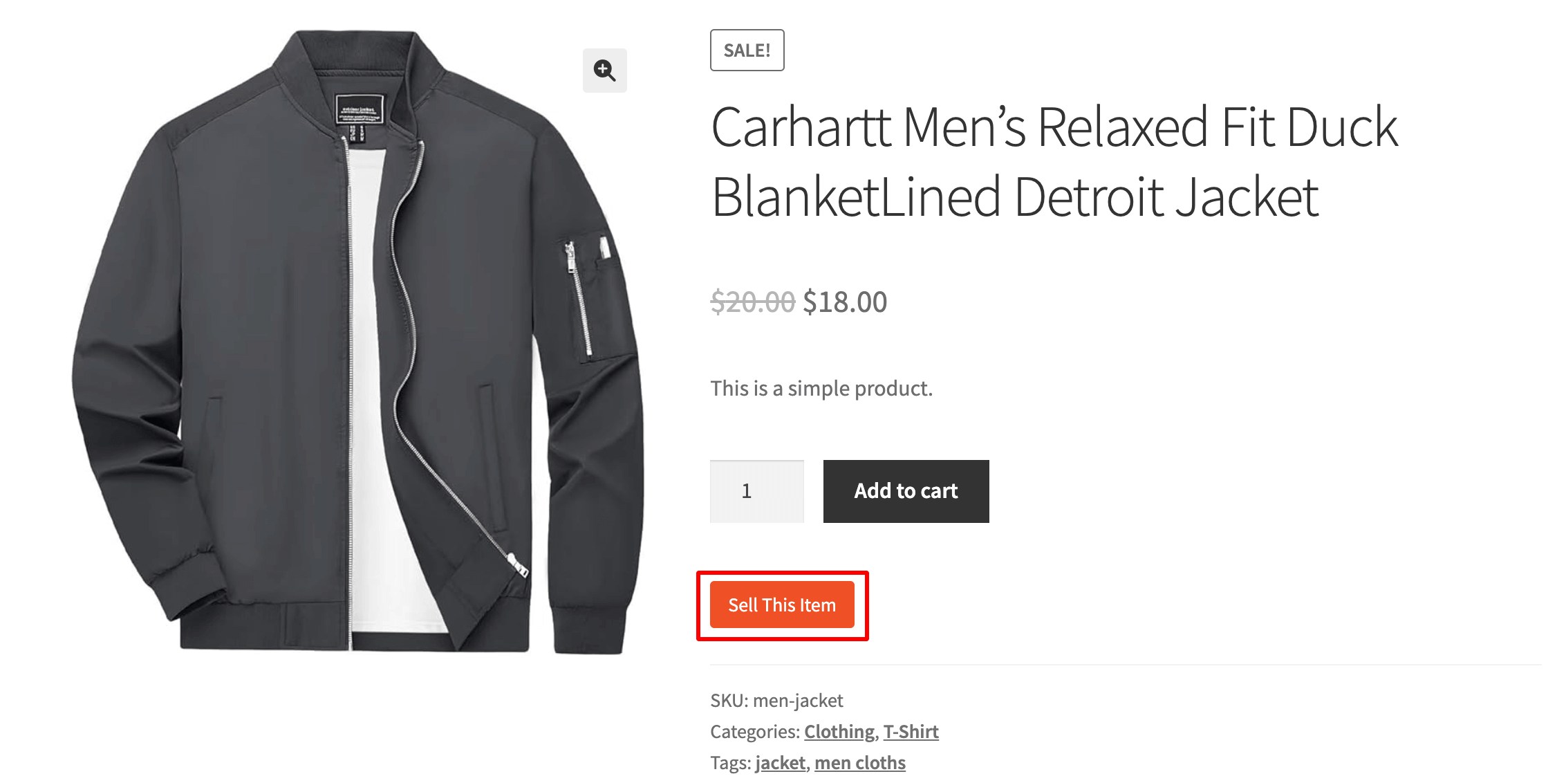
These tests are easy to run in A/B tools. You only change one element at a time. This gives you clear insight into what made the difference.
In a marketplace, each vendor may upload product pages in their own style. This creates uneven layouts and makes testing harder. With Dokan, you control the product page template. Vendors fill in fields, but the layout stays the same. This lets you run tests once and apply the improved layout across the entire marketplace.

2. Place Customer trust Signals Where Users Can see Them Fast
Most shoppers scan a product page in a few seconds before deciding to stay or leave. During this quick scan, trust signals play a big role.
Reviews, ratings, and short quotes from real customers help reduce doubt. When these elements appear too far down the page, many shoppers never see them.
A simple change is to move one strong review or rating summary higher on the page. This is helpful for new buyers who want proof that others had a good UI experience. Even a single short review that highlights comfort, quality, or fit can change how a shopper feels about the product.
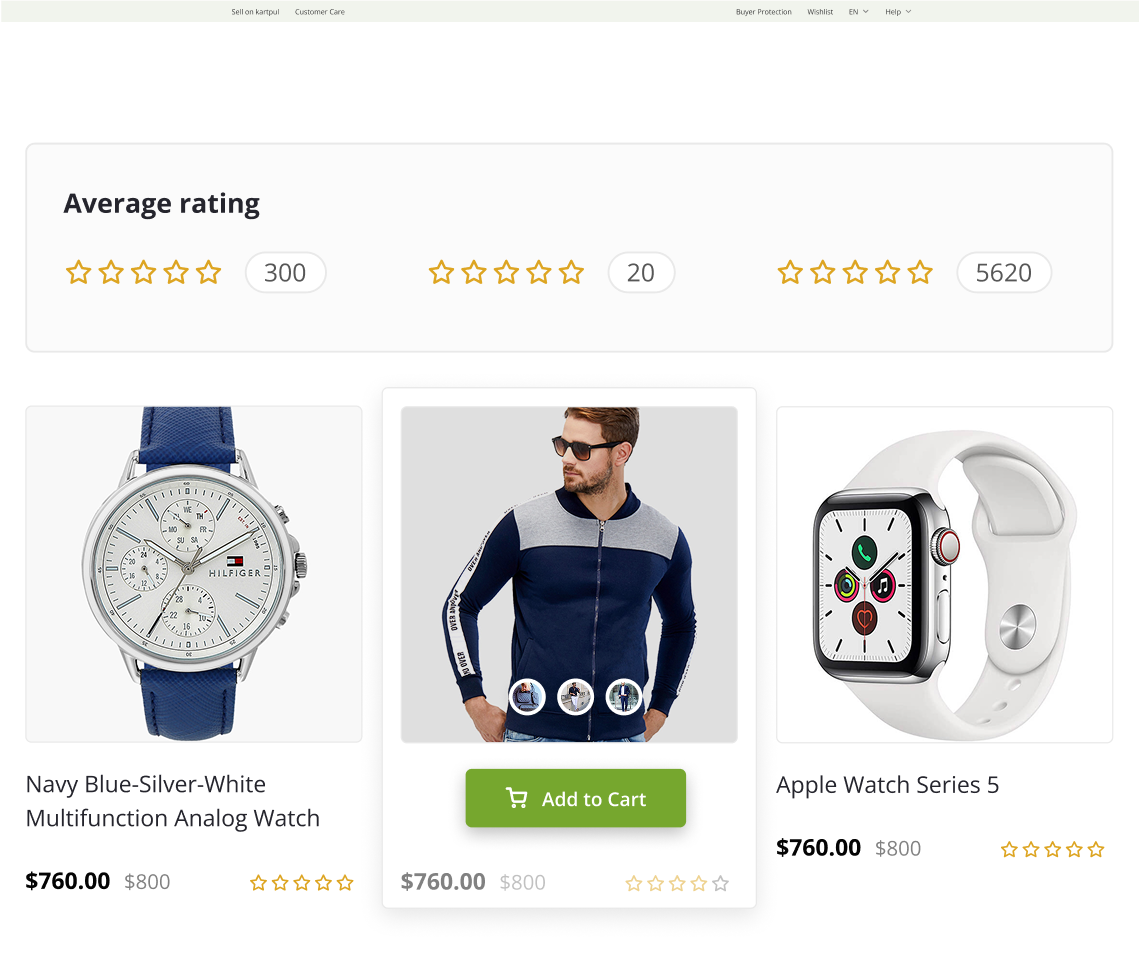
You can also test trust badges like “Verified Seller,” “Fast Delivery,” or “Free Returns.” These small notes help customers feel safe, especially on marketplaces where sellers vary. Some shoppers will even skip the description and go straight to reviews before deciding.
Use heatmaps or scroll-depth tools to see how far users scroll. If most users do not reach the review section, moving trust elements higher can increase conversions without changing the product itself.
In a multi-vendor marketplace, trust matters even more because each vendor has different levels of quality. With Dokan, you can control how vendor ratings and product reviews appear. You can choose to show vendor badges, store ratings, or top reviews above the fold. This helps shoppers feel safe even when browsing new vendors.
3. Use Benefit-focused Copy & Test Different Variations
Product pages often describe features, but customers care more about benefits. A feature tells what the product does. A benefit explains how it helps the customer. When the copy is too technical, users lose interest. When the copy shows real value, users pay attention.
For example:
- Instead of “Made with breathable fabric,” say “Helps you stay cool during long days.”
- Instead of “Fast charging,” say “You can get hours of use with a short charge.”
These small changes help users picture how the product fits into their life.
A/B testing your copy is also important. Try simple variations such as:
- Short vs. long descriptions
- Bullet points vs. short paragraphs
- Direct tone vs. friendly tone
- Highlighting 2 benefits vs. highlighting 5 benefits
This helps you learn what speaks to your customers. Some products do well with short copy. Others need more explanation. There is no universal rule. Testing is the only way to know what your audience responds to.
You can also run tests on calls-to-action. A small change in the button text can shift user behavior. Words like “Add to Cart” vs. “Buy Now” may influence different types of shoppers.
In a marketplace, vendors write their own descriptions. This can lead to mixed quality. With Dokan, you can set required fields, add writing guidelines, or use modules that help vendors structure their product descriptions. This keeps the overall marketplace copy more clear and benefit-focused.
4. Highlight Your Unique Advantages Clearly
Many product pages look the same. They list features, show images, and repeat common phrases. What often gets missed is the unique point that makes the product stand out. This is your USP — the part that makes your product different, better, or more useful than others.
A USP can be:
Your USP should appear early on the page so customers see it without scrolling. It can sit near the product title, under the price, or beside the main image. It should be short and clear. One line is usually enough.
Example:
“Built to last 3x longer than standard cables.”
“Designed for humid weather, so it stays fresh all day.”
When customers understand your USP fast, they stop comparing and start focusing on your product alone.
You can also test different USPs to see which one leads to more clicks or purchases. Some USPs speak to emotional needs (comfort, trust, ease of use). Others speak to practical needs (durability, price, weight). Testing helps you find the stronger message.
5. Reduce Bounce Rate with an Exit-Intent Prompt
Many visitors leave a product page without taking any action. They may feel unsure, not see enough value, or plan to “come back later.” An exit-intent prompt can help you catch these users before they leave.
An exit-intent pop-up appears when the user moves their cursor toward the browser’s close button or back button. This is the moment when they are most likely to leave. The message should be short and helpful, not pushy.
You can show:
For example, if a shopper looked at a product for a long time, the popup can say, “Want to compare similar items?” This keeps them engaged and reduces site abandonment.
Exit-intent prompts work well when they offer something useful. Avoid adding too many fields or heavy text. A simple line and one button work best.
You can also test different versions of the popup. Some products respond better to discounts. Others respond better to extra information or social proof. Testing helps you see what holds users on the page.
6. Use Clear, High-Quality Images that Load Fast
Images are one of the first things customers notice on a product page. Clear, sharp photos help users trust the product. Blurry or low-quality images do the opposite. Good images show details, textures, size, and color. They reduce questions and help customers see what they are paying for.
But quality alone is not enough. Large images that load slowly can create frustration. Slow-loading pages increase bounce rate and interrupt the buying flow. This is why images should be both high-quality and optimized.
You can improve your product images by:
Clear images also help reduce returns because customers know what to expect.
If you run a marketplace, image consistency can be a challenge. Some vendors upload very large images. Others upload small or unclear photos. This creates a mixed shopping experience.
Product Page Optimization FAQ(s)
1. What is a product detail page (PDP)?
A product detail page is the page where customers see all the important information about a product. It includes the title, images, price, description, reviews, and buying options. This page helps shoppers decide if they want to add the product to their cart.
2. Why is product page optimization important?
A well-optimized product page gives customers the information they need without confusion. It reduces bounce rate, improves trust, and increases conversions. Since many buyers decide within a few seconds, a clear and simple page makes a big difference in sales.
3. How can I automate product page optimization?
You can use tools that run A/B tests, track heatmaps, and monitor user behavior. Some plugins also suggest improvements based on data. If you run a marketplace with Dokan, you can automate layout, fields, vendor rules, and product templates. This keeps all vendor pages consistent without manual work.
4. How often should I update my product pages?
You should update pages whenever something changes. This includes new images, updated prices, stock changes, or improved descriptions. It also helps to review pages every few months to fix outdated content or add new user feedback. Regular updates keep the page fresh and useful.
Make Your Product Page Standout in the New Year!
A strong product page helps customers understand the product fast and feel confident about buying it. Small changes in layout, copy, images, and trust signals can make a big difference. Testing also plays a key role because every audience behaves differently.
For marketplace owners, product pages can be harder to manage because many vendors upload content in their own style. With tools like Dokan, you can set rules, guide vendors, and keep the layout consistent. This creates a cleaner experience for shoppers and helps your marketplace grow.
By focusing on clear details, simple copy, and strong visuals, your product pages can stay effective through 2026 and beyond.
Subscribe to
Dokan blog
We send weekly newsletters, no spam for sure!


Leave a Reply