
Trying to figure out how to design an eCommerce store that doesn’t scare away customers? You’re not alone. Many online shops appear impressive, but leave visitors feeling confused. Others are so simple they seem stuck in the early 2000s.
The key to a great eCommerce store design is striking a balance between great looks and smart usability.
When you design an eCommerce store, you need to make it easy for people to browse, click, and buy. If they get confused or don’t trust your site, they’ll leave within seconds.
In this guide, we’ll break down how to design an eCommerce store that works. You’ll learn the basics, discover clever design tips, and see examples to inspire your next move.
Let’s dive in.
3 Essential Elements of Ecommerce Website Design
Creating an eCommerce store that sells well depends on three key things. First, the site must be easy to use and look trustworthy.
Second, it must work well on mobile devices.
Third, the checkout process must be simple and secure. Each of these parts affects how visitors shop and whether they buy from you.
Let’s get into more details-
1. UX and UI Design
User Experience (UX) means how easy your website is for visitors. It covers how simple it is to find products, browse pages, and complete purchases. Many stores have problems here.
The Baymard Institute found that 70% of eCommerce sites have major UX issues. These include unclear menus, missing filters, and confusing layouts. These problems make shoppers leave without buying.
Fixing UX issues can greatly improve sales. For example, ASOS improved its website by making product pages easier to read and simplifying the checkout steps. This change reduced cart abandonment by 20% and increased sales by 15%.
User Interface (UI) is about how your site looks. This includes fonts, colors, spacing, and images. Good UI helps build trust and makes the site pleasant to use. According to Adobe, 38% of visitors will leave a website if the design is unattractive.
To avoid this, use simple fonts that are easy to read. Choose soft colors that do not overwhelm users. Keep the layout clean and consistent. Too many colors or fonts can make a site look messy and confusing.
2. Mobile Responsiveness
More people shop on phones than ever before. In 2024, over 60% of all eCommerce sales happened on mobile devices worldwide. In the US, mobile sales made up 44.6% of total eCommerce that year. If your website is not easy to use on a phone, you risk losing most of your potential customers.
Mobile-friendly design means your site changes its layout to fit smaller screens. Buttons need to be big enough to tap with a finger. Text should be large enough to read without zooming. Pages must load fast because users expect quick results. Google reports that 40% of visitors will leave if a page takes more than 3 seconds to load on mobile.
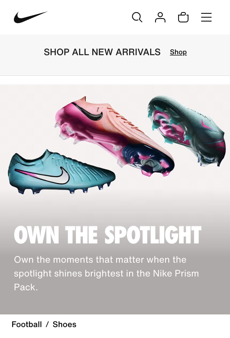
A good example is Nike’s mobile website. It loads quickly, has big, clear product images, and easy filters to help shoppers find what they want. This makes the shopping experience smooth and enjoyable on phones.
3. Secure and Easy Checkout Process
The checkout is the last and most important step. If it is hard or feels unsafe, many customers will leave without buying. Research from Baymard Institute shows 17% of shoppers abandon carts because the checkout process takes too long or is confusing.
Another 18% leave because they do not trust the site with their payment details.
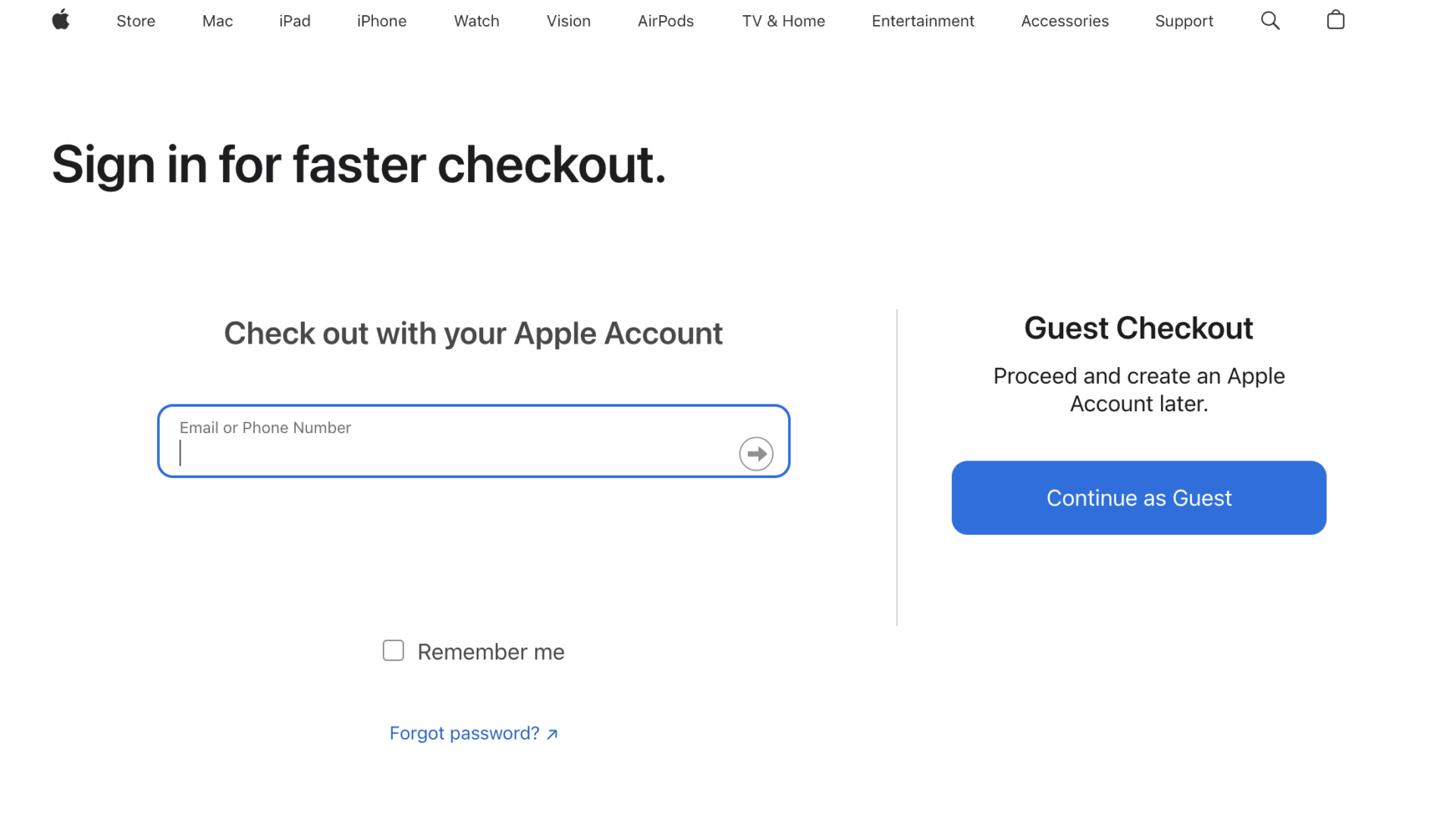
To fix this, allow customers to buy without making an account. This is called guest checkout, and it speeds up the process. Keep forms short and only ask for essential information.
Offer many payment options like credit cards, PayPal, Apple Pay, or buy-now-pay-later services. Also, show security badges like padlocks or trusted payment logos to reassure buyers that their information is safe.
Apple’s online store is a great example. It uses a simple one-step checkout that makes it quick and easy for customers to finish their purchase. This reduces problems and helps more people complete their orders.
Ecommerce Website Design Best Practices
Designing your eCommerce store with the customer in mind helps visitors find what they want and feel confident buying.
Here are five key best practices to improve your store’s usability and trust.
1. Design a Simple Navigation
Navigation should be clear and easy to use. Visitors want to find products quickly without getting lost.
This means organizing your menu with straightforward categories like “Men,” “Women,” or “New Arrivals.” Avoid overwhelming users with too many options or nested submenus, which can increase bounce rates.
A clean navigation bar that stays consistent across pages helps visitors explore your site smoothly. For example, fashion retailer Zara uses simple, clear menus that guide shoppers directly to the right collections, helping them stay longer and browse more products.

When customers can find what they want fast, they are more likely to make a purchase.
2. Provide Filtering Options
Filters allow shoppers to narrow down large product selections based on preferences like size, color, price, or brand.
Without filters, users can feel overwhelmed and frustrated, which often leads to leaving the site. Studies show that 26% of shoppers abandon sites that lack useful filtering tools.
Amazon’s success partly comes from its detailed filters that let customers quickly find products matching their exact needs. When filters work well, shoppers spend less time searching and more time considering buying. This convenience increases the chance of conversions.
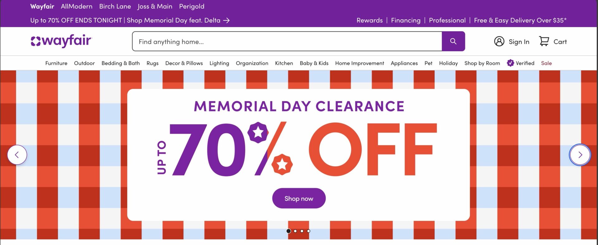
3. Use High-Quality Visuals and Product Images
Images are the closest shoppers get to seeing a product in person. High-resolution photos from different angles, zoom features, and even 360-degree views help customers understand product details and quality.
Research finds that 67% of customers consider good product photos very important when deciding to buy. For example,
Wayfair’s large, clear images allow buyers to picture furniture in their homes, reducing doubts and returns. Providing excellent visuals makes your products more appealing and builds trust, which drives sales.
4. Create Compelling Call to Action (CTA) Buttons
A clear and attractive call to action directs shoppers to the next step, such as adding items to their cart or making a purchase. Use simple, action-focused text like “Add to Cart” or “Buy Now.”
The buttons should stand out with colors that contrast the background and be large enough to tap on mobile devices. Placement matters too; position CTAs close to product details and images so they are easy to find.
Brands like Glossier use bright, noticeable buttons that draw attention immediately, helping reduce hesitation and increase conversions. Testing different colors and phrases can help you find what works best for your audience.
5. Incorporate Social Proof
Showing reviews, ratings, and testimonials helps build customer trust. Most shoppers (93%) say reviews influence their buying decisions. Display star ratings and written feedback on product pages so visitors can see what others think.
Including customer photos or videos makes reviews even more powerful. Sephora, for example, integrates real customer images and detailed reviews that help new buyers feel confident about their purchases.

Social proof reduces doubts and makes people more comfortable completing their order.
SEO Considerations for Your Ecommerce Website
SEO is essential for bringing organic traffic to your eCommerce store. The higher you rank on search engines, the more potential customers find your products. Here are important SEO areas to focus on, along with practical solutions:
Optimize H1 Tags
The H1 tag is the main title on a page. It tells search engines and users what that page is about. Proper use of H1 tags helps your pages rank better.
- Use one unique H1 tag per page that clearly describes the content.
- Include main keywords relevant to the page, like “Women’s Waterproof Jackets.”
- Avoid multiple H1 tags on the same page, which can confuse search engines.
- Keep the H1 clear and natural, not stuffed with keywords.
Add Alt Text for Images
Alt text helps search engines understand your images. It also improves accessibility for users who use screen readers.
- Write descriptive alt text that explains what the image shows.
- Include relevant keywords naturally, but avoid keyword stuffing.
- Use alt text for all product images, banners, and icons.
- For complex images, describe key details briefly but clearly.
Improve Page Speed
Fast page loading improves user experience and SEO rankings. Slow sites lead to lost customers and lower search rankings.
- Compress images using tools like TinyPNG or ShortPixel to reduce file size without losing quality.
- Use a content delivery network (CDN) like Cloudflare to speed up global access.
- Enable browser caching so repeat visitors load pages faster.
- Choose fast and reliable hosting optimized for WordPress or your platform.
- Minimize the use of heavy plugins and scripts that slow down loading.
Optimize Title Tags and Meta Descriptions
These elements appear in search engine results and influence clicks.
- Write unique title tags for every page with relevant keywords at the beginning.
- Keep titles under 60 characters to avoid truncation in results.
- Create meta descriptions that summarize the page clearly and include keywords.
- Use calls to action in meta descriptions like “Shop now” or “Free shipping.”
- Avoid duplicate titles or meta descriptions across pages.
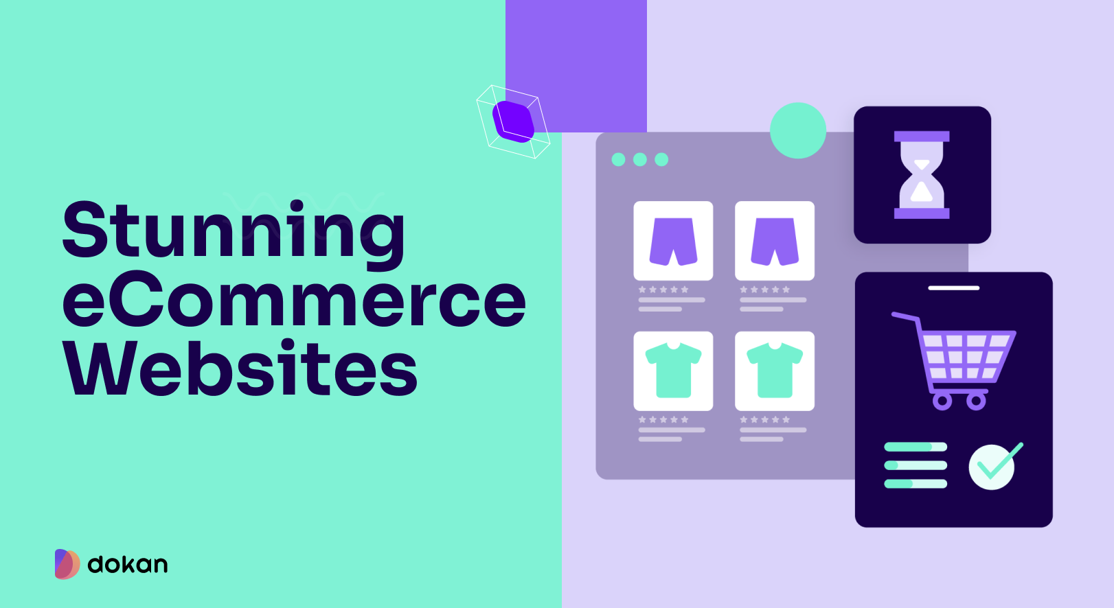
Stunning Ecommerce Websites That Will Inspire You
Seeing examples of well-designed eCommerce sites can help you understand what works and spark ideas for your own store. Here are a few websites known for excellent design, user experience, and strong sales performance, along with what makes them successful.
You can read about them in detail from our article on stunning eCommerce websites.
Ready to Design Your Ecommerce Website?
Designing an eCommerce store that sells takes time and attention to detail. Focus on creating a smooth user experience with clear navigation and appealing visuals. Make sure your site works perfectly on mobile devices.
Simplify the checkout process to keep customers confident and reduce cart abandonment. Don’t forget SEO basics to help shoppers find your store in search engines.
Remember, a great eCommerce site is always evolving. Track how visitors behave and adjust your design to improve sales. With the right approach, you can build an online store that not only attracts customers but turns them into loyal buyers.
Subscribe to
Dokan blog
We send weekly newsletters, no spam for sure!


Leave a Reply