Dokan is not just a marketplace plugin, it’s a complete solution to run your online business like a pro.
For the past 10 years, Dokan has been empowering more than 65,000 online businesses around the world. It supports many advanced and trendy features to make your marketplace robust and powerful.
Dokan lite lets you build a fully functional online marketplace almost free of cost. But you have the flexibility to unlock premium features for your growing marketplace and take your business to the next level.
There are 40 premium Dokan modules in different categories. Today we’ll talk about Dokan Color Scheme Customizer.
What is the Dokan Color Scheme Customizer?
Dokan Color Scheme Customizer is a premium module that allows you to change the color of the Vendor Dashboard.
Suppose you’re using a third-party theme with the Dokan plugin. It gives the vendor dashboard a default color pattern. But you want to modify the color layout and match it with your branding.
Dokan Color Scheme Customizer lets you do that by picking a relevant color pattern. This will make the dashboard more appealing and attractive to your users.
Note: Only admins have access to this tool. Vendors don’t have the permission to make the changes.
Let’s show you how to use this module on your Dokan Marketplace-
Pre-requisite for Dokan Vendor Dashboard Color Customization
As this is a premium module of Dokan, you have to buy Dokan Pro first. Dokan offers 4 premium packages and you’ll find this module with all the packages.
We’re assuming that you are a pro user of Dokan and have already set up your marketplace.
For new users here is a detailed guide to 5 Steps to Build an Online Marketplace with WordPress and Dokan Multivendor.
Once you are done with the basic Dokan Pro settings, then it’s time to configure the advanced functionalities of your site.
If you aren’t sure enough about how to set up Dokan Pro, you can check our step-by-step documentation to set up Dokan Pro on your site.
How to Change Vendor Dashboard Color for Dokan Marketplace

As a premium user of Dokan, you can easily modify the color of the vendor dashboard. During this vendor dashboard color customization, you should remember that the color must-
- Resemble your brand
- Eye soothing
- Easily readable
- Match your industry concept
Fortunately, the Dokan multivendor plugin offers 7 different color patterns to choose from. Also, gives you the options for custom colors.
Below are the steps to pick your desired color and modify your vendor dashboard accordingly-

Subscribe to
Dokan blog
Step 1: Enable the Dokan Color Scheme Customizer
From your WordPress dashboard, go to – WP Admin Dashboard → Dokan → Modules
Now, turn on the toggle button beside the Color Scheme Customizer.

Now, you can enjoy all the Color Scheme Customizer features on your marketplace.
Step 2: Configure Your Dokan Color Scheme Customizer
To set up the Dokan Color Scheme Customizer, navigate to – WP Admin Dashboard → Dokan → Settings → Colors.
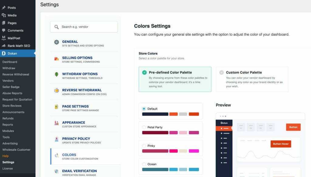
In the Colors tab, you will find various settings related to the Dokan Color Scheme. Now, you can customize the colors for different elements.
Here are the options you can modify:
- Button Text: Change the color of the text on the buttons.
- Button Background: Modify the background color of buttons.
- Button Border: Adjust the border color of buttons.
- Button Hover Text: Set the color of text on buttons during hover.
- Button Hover Background: Choose the background color of buttons during hover.
- Button Hover Border: Define the border color of buttons during hover.
- Dashboard Sidebar Menu Text: Customize the text color of menu items in the dashboard sidebar.
- Dashboard Sidebar Background: Change the background color of the dashboard sidebar.
- Dashboard Sidebar Active/Hover Menu Text: Set the text color for active or hovered menu items in the dashboard sidebar.
- Dashboard Sidebar Active Menu Background: Define the background color for active menu items in the dashboard sidebar.
Here, you can adjust the color settings according to your preferences.
Step 3: Modify the Dashboard Color
The Dokan Color Scheme Customizer gives you two options for changing the color of the vendor dashboard:
- Pre-defined Color Palette
- Custom Color Palette
(i) Apply Pre-defined Color Palette
The Dokan Color Scheme Customizer by default offers you 7 pre-defined color palettes. Each color palette includes multiple color combinations.
As an admin, you can review the available pre-defined color palettes and choose the one that aligns with the existing theme used on your website.
It could be an easy solution for your vendor dashboard color customization.
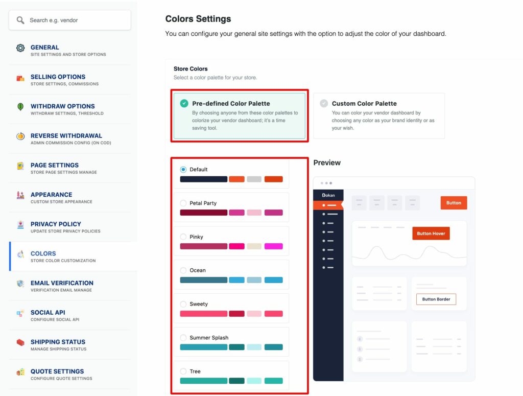
(ii) Apply Custom Color Palette
Besides the Pre-defined Color Palette, Dokan also allows you to apply custom colors on your vendor dashboard. It’s a great flexibility to match your vendor dashboard with the overall presentation of your website.
For a completely personalized touch, you can individually modify the colors for various elements like button text, background, borders, navigation text, and more. Simply click on the element you want to change and pick your desired color using the color picker. Alternatively, enter the color code.
Finally, save the changes.
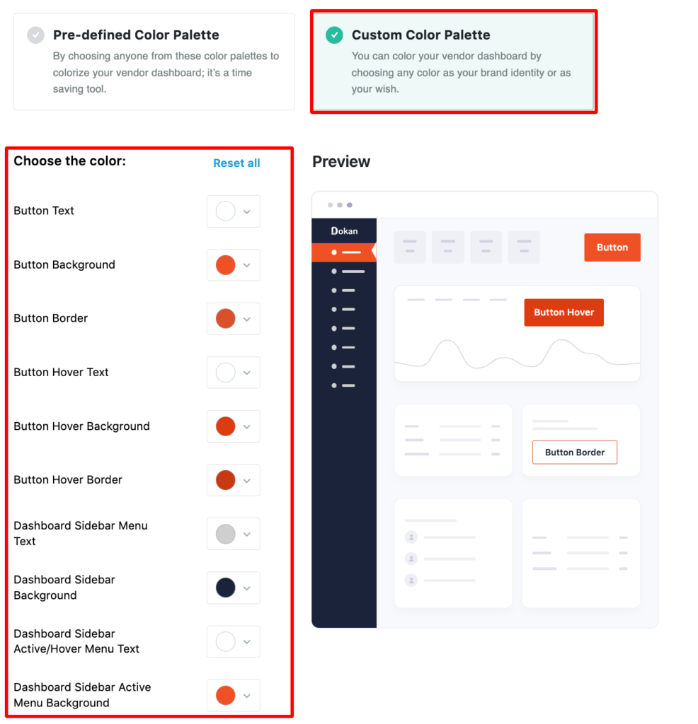
Below are the areas where you can add custom colors:
- Button Text
- Button Background
- Button Border
- Button Hover Text
- Button Hover Background
- Button Hover Border
- Dashboard Sidebar Menu Text
- Dashboard Sidebar Background
- Dashboard Sidebar Active/Hover Menu Text
- Dashboard Sidebar Active Menu Background
By modifying the color of these elements, you can easily give your vendor dashboard a sleek and professional look. It’ll make the dashboard visually appealing and enhance your user experience.
Bonus Step: How to Add a Custom Color for a Specific Element
In this step, we’ll show how you can customize the color of a particular element.
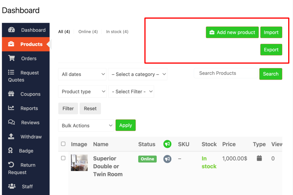
On the color setting page, you’ll find several elements to change color. Find the thing you want to change and click on the color box next to it. You can either type in the color code you want or pick a color from the options. This makes it easy to make the dashboard look how you want it.
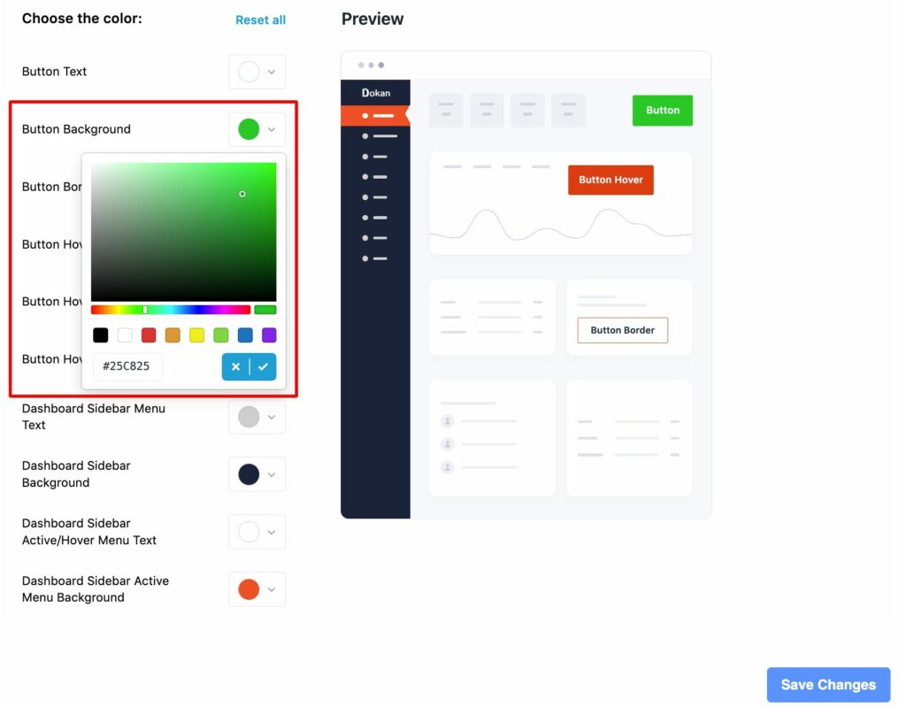
After you’ve picked your color, click the checkmark symbol to lock your decision.
Make sure to scroll down to the bottom of the page and click on the “Save Changes” button to apply the new color scheme.
Now, when you go to the vendor dashboard, you’ll see your chosen colors. It makes the dashboard look nice and suits your style.
Note: If you ever want to go back to the original colors, the settings let you do that too. Just choose the option to reset, and it will go back to how it was before.
For other setting options, you can check our Official documentation or the video tutorial on how to set the Dokan Color Scheme Customizer on your Marketplace.
Besides, Dokan offers many useful features and niche-based modules to take your online marketplace to the next level.
Why You Should Change the Vendor Dashboard Color of Your Marketplace?
Changing the vendor dashboard color of your marketplace is an easy yet impactful way to enhance user experience, reinforce brand identity, and potentially increase user engagement and satisfaction.
Here are several reasons why this modification can be advantageous:
1. Improves User Experience (UX)
Aesthetics play a crucial role in UX. An appealing color scheme can make the dashboard more pleasant to use. It’ll encourage vendors to spend more time on your platform. Also, different colors can help differentiate between sections or functions. This can lead to a reduction in user errors and frustration.
2. Strengthen Brand Identity
Aligning the dashboard colors with your brand’s color scheme creates a cohesive user experience across your platform. This consistency helps promote your brand identity among your vendors. On the other hand, colors evoke emotions and can influence how users perceive your brand. Choosing colors that align with your brand’s values can boost the desired brand image.
3. Improve Clarity and Focus
Using color strategically can draw attention to key information or actions you want vendors to notice and act upon. Individual colors for different types of notifications or statuses (like pending, approved, or declined) can help vendors quickly assess their situation.
4. Increases Engagement and Satisfaction
Colors have a psychological impact on people. For example, blue can evoke feelings of trust and security, while green is often associated with growth and prosperity. Choosing colors that align with the emotions you want to evoke can positively influence user engagement and satisfaction.
5. Sets You Apart from Competitors
In a crowded marketplace, standing out is crucial. A unique and well-thought-out dashboard color scheme can set your platform apart from competitors. This will make your platform more memorable and appealing to potential vendors.
6. Encourages Positive Behavior
Certain colors can motivate vendors to be more active on your platform. For example, using a color that evokes a sense of urgency might encourage quicker decision-making, while a calming color could help reduce stress and increase productivity.
Changing the vendor dashboard color of your marketplace can be more than just regular customization. It has practical benefits for user experience, branding, and overall satisfaction.

Important Considerations Before Applying New Color to Your Vendor Dashboard
Here are some crucial things to consider before changing the vendor dashboard color of your marketplace:
- Clarity and Readability: Ensure the new color scheme maintains good contrast between text and background elements for optimal readability.
- Consistency: Maintain consistency with your overall marketplace branding. The vendor dashboard should feel like an integrated part of the larger platform.
- Testing: Thoroughly test the new color scheme across different devices and browsers to ensure consistent rendering and functionality.
- User Feedback: Before implementing a major change, gather feedback from a representative group of vendors to understand their preferences and potential concerns about the new color scheme.
It is also important to consider your industry type and product categories before finalizing the color of your vendor dashboard. Every color has its language and evokes a particular emotion.
Below we list down some generic suggestions to set up your dashboard color for different niches and product types-
- Professional Services (Finance, Law, etc.): Opt for colors conveying professionalism, trust, and security, such as blue, navy, or green. Avoid overly vibrant or playful hues.
- Creative Industries (Design, Fashion, etc.): More creative and bold color schemes can be appropriate that reflect the industry’s vibrancy.
- Technology: Modern and tech-centric colors like blue, teal, or purple can be suitable. Consider the specific sub-industry (e.g., blue for enterprise software, green for environmental technology).
- Luxury Goods: Colors associated with luxury, such as black, gold, or silver, might be appropriate to convey perceived value and exclusivity.
- Children’s Products: Bright, playful, and engaging colors might be perfect to set an energetic mood.
- Health & Wellness: Calming and soothing colors like light blue, green, or lavender may be appropriate to promote feelings of well-being and tranquility.
The specific color choices should ultimately align with your overall brand identity and be culturally appropriate for your target audience. By understanding the industry and product line, you can make informed decisions about the vendor dashboard color scheme that resonates with your vendors and fosters a positive user experience.
Dokan has seamless integration with Elementor page builder. With the duo of Dokan + Elementor, you can build a fully functional marketplace without having any prior experience & coding knowledge. Now, design and customize your Dokan multivendor marketplace with Elementor.
Wrapping up the Vendor Dashboard Color Customization
After creating an online marketplace, our main focus would be making the platform more user-friendly and engaging.
To make your marketplace more interactive for the sellers, you can consider changing the vendor dashboard color. Strategic color choices can enhance readability, visual appeal, and overall user satisfaction with the dashboard.
If you’re using Dokan to operate your multivendor marketplace, it’ll give several customization options to modify your vendor dashboard color customization.
Dokan Multivendor Color Scheme Customizer is a module that allows you to change the color scheme of your Dokan vendor dashboard. This enables you to personalize the vendor experience and potentially improve brand alignment.
However, if the default color scheme is already functional and aligns with your brand to a reasonable extent, it might not be necessary to invest resources in changing it.
Do you have any further queries regarding vendor dashboard color customization? Use the comment section below to let us know your queries!
Subscribe to
Dokan blog
We send weekly newsletters, no spam for sure!







Leave a Reply