With Dokan Cloud’s amazing page builder, you can customize the Shop Page to your liking. You will find all the necessary widgets to redesign the shop page to match your brand.
Along with all the basic widgets, you will get other widgets including-
- Breadcrumb (General Block)
- Availability Filter
- Rating Filter
- Price Filter
- Product Grid
- Collection Grid
- Dropdown (General Block)
Lets see how they work-
Breadcrumb
Breadcrumbs are a navigational tool on websites that help users understand their location within the site’s hierarchy and easily navigate back to previous pages. They are typically displayed as a horizontal trail of links at the top of a page, showing the path from the homepage to the current page.
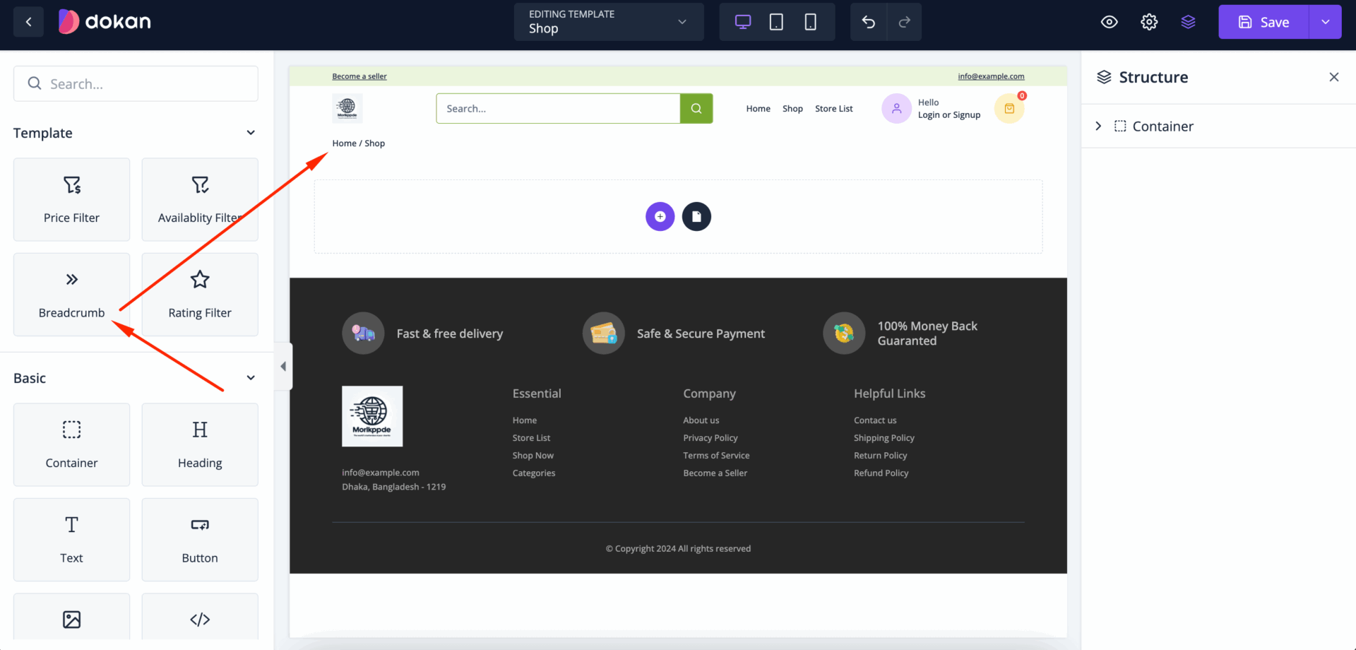
To set up navigation on your store, drag the Breadcrumb widget to the editor-
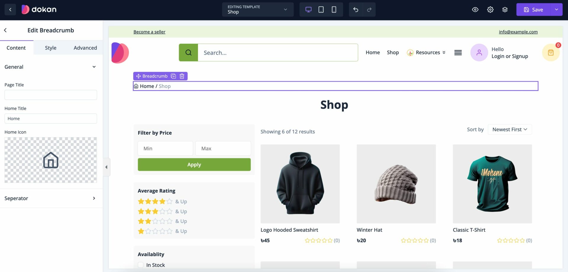
Next you will find all the options to customize the breadcrumb. In the General section you can change the Page Title and Home Title. Also, change the icon of the separator as well-
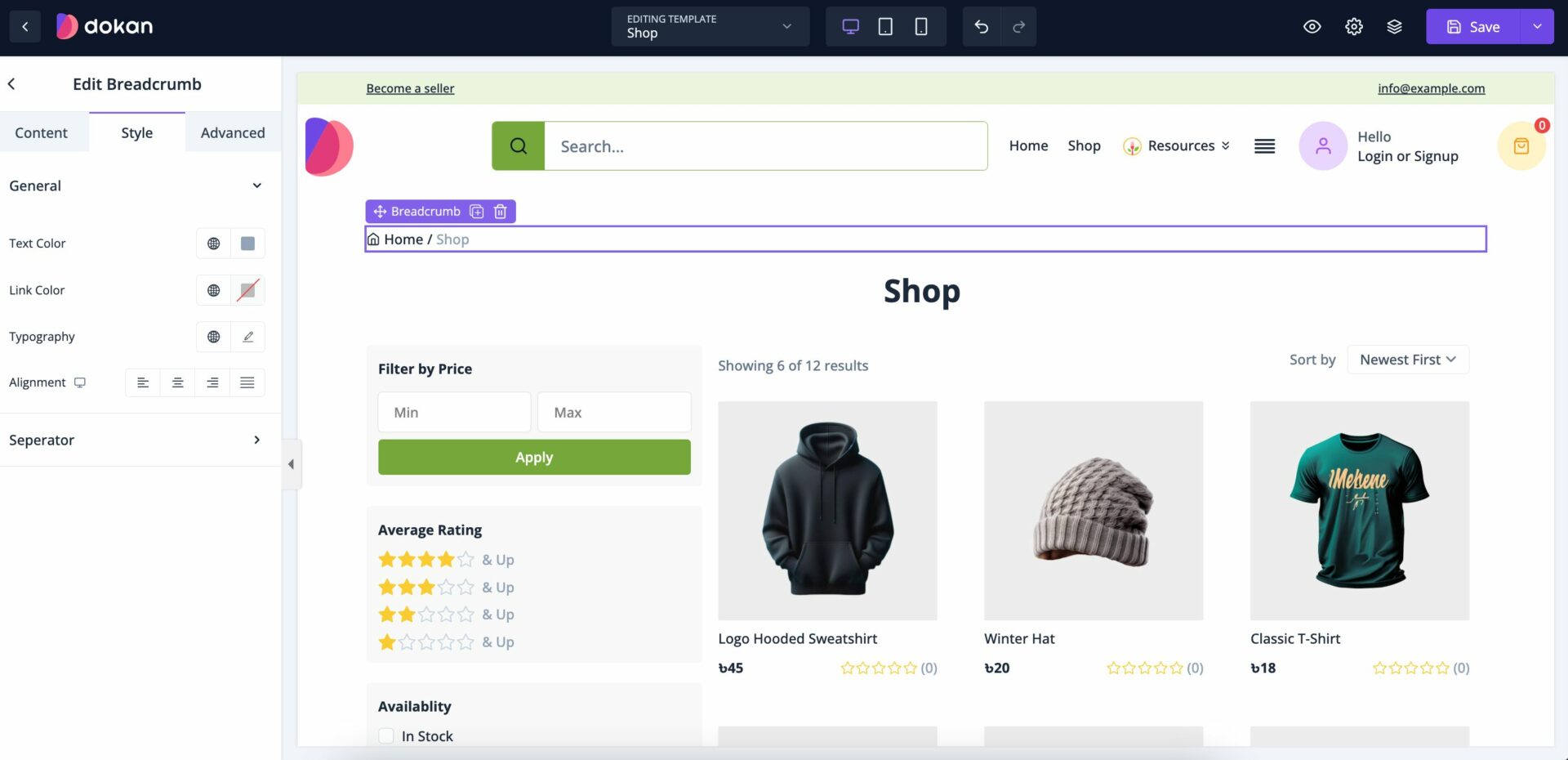
In the Style section, you can customize the text and link color, customize the typograpghy and adjust the alignment of the Breadcrumb-
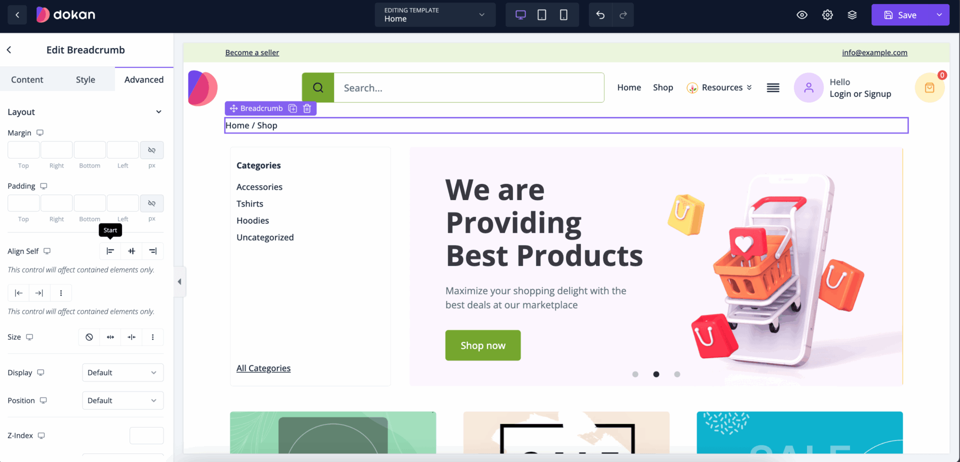
Also, you can control the padding, margin, size, position, custom codes, background, etc from the Advanced section-
This is how you can customize the Breadrumb widget to redesign your shop page.
Availability Filter
An Availability Filter is a feature commonly used in eCommerce websites, booking platforms, or marketplaces to allow users to filter items, products, or services based on their availability. This filter helps users quickly find what is currently in stock, available for booking, or ready for immediate use.
To add an availability filter in the Shop Page, just drag and drop the widget into the editor-
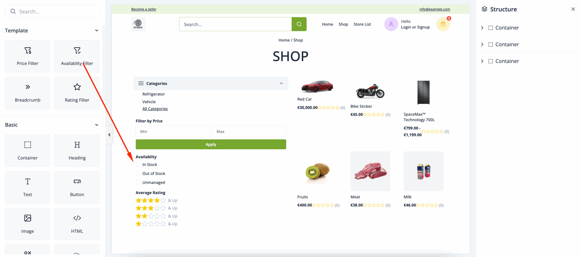
In the General section you can change the name of the filter-
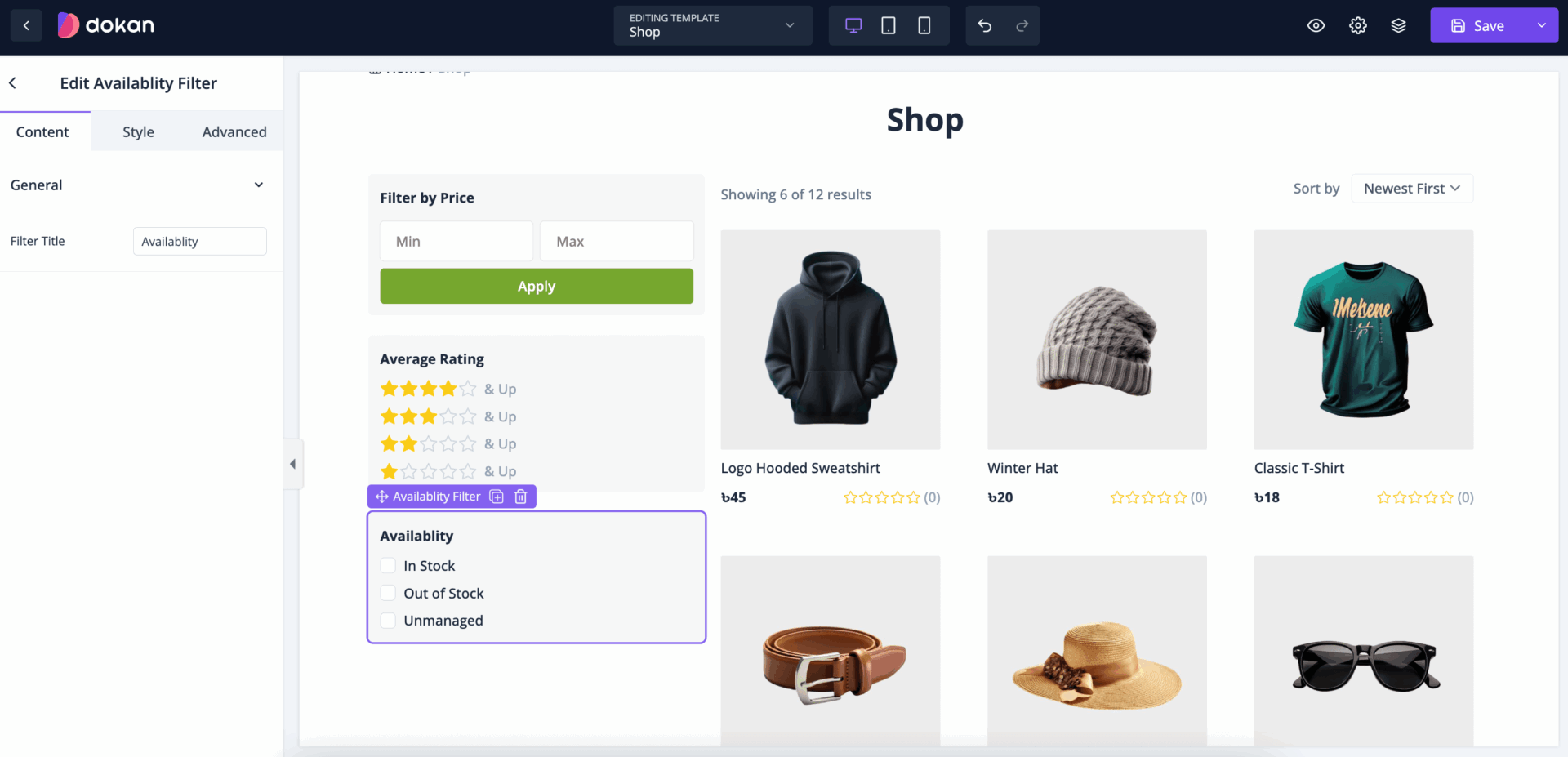
You can update padding, margin, background, etc-update from the style section-

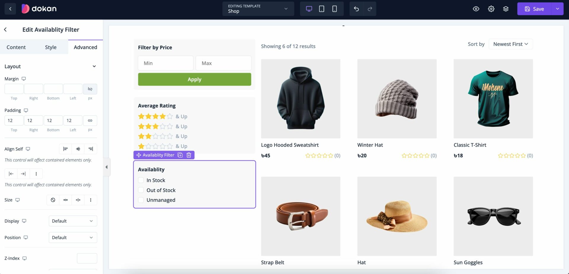
Also, you can control the padding, margin, size, position, custom codes, background, responsiveness etc from the Advanced section-
Rating Filter
A Rating Filter is a feature commonly found on eCommerce websites, service marketplaces, review platforms, and other online services that allow users to sort or filter products, services, or content based on customer ratings or reviews. This filter enables users to view items that meet or exceed a specific rating threshold, such as products with 4 stars and above.
Drag and Drop the Rating Filter widget into the editor-
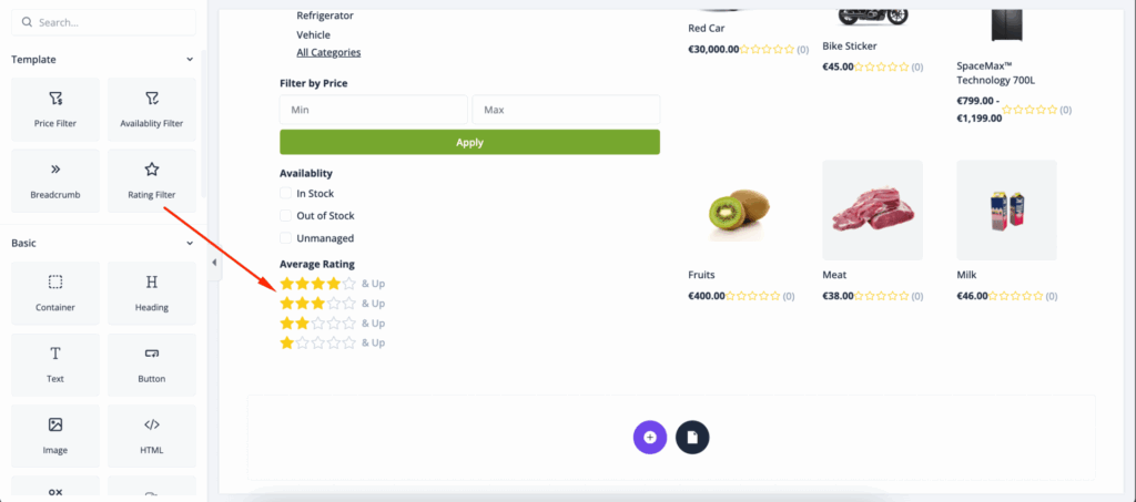
In the General section you can change the name of the filter-

You can update padding, margin, background, etc-update from the style section-

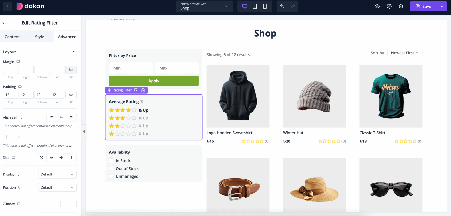
Also, you can control the padding, margin, size, position, custom codes, background, responsiveness etc from the Advanced section-
Price Filter
A Price Filter is a commonly used feature on eCommerce websites, marketplaces, and service platforms that allows users to sort or filter products or services based on their price range. This feature enables users to view items within their budget or a specific price range, enhancing the shopping experience by making it easier to find affordable options.
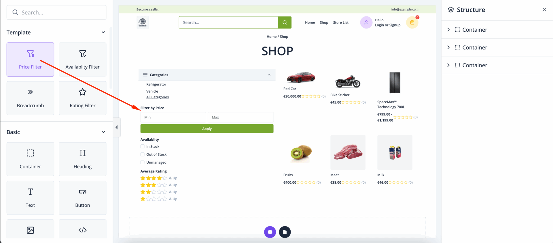
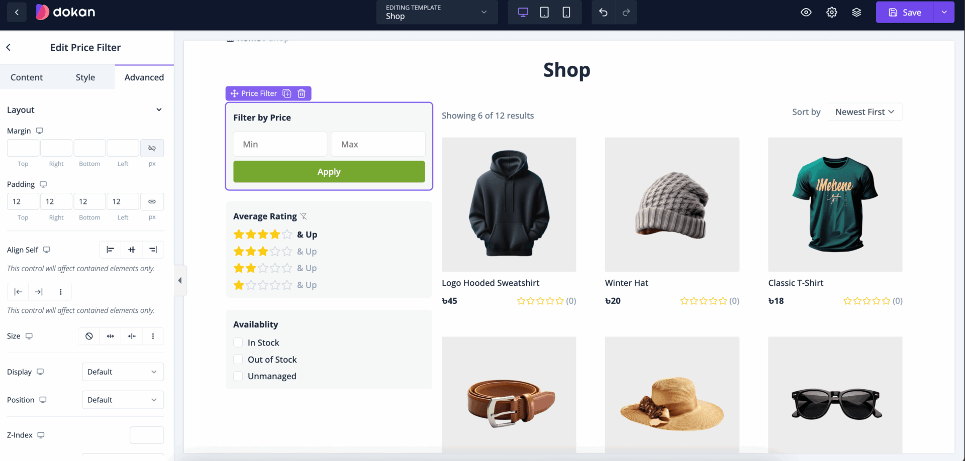
Just drag and drop the price filter into the editor-
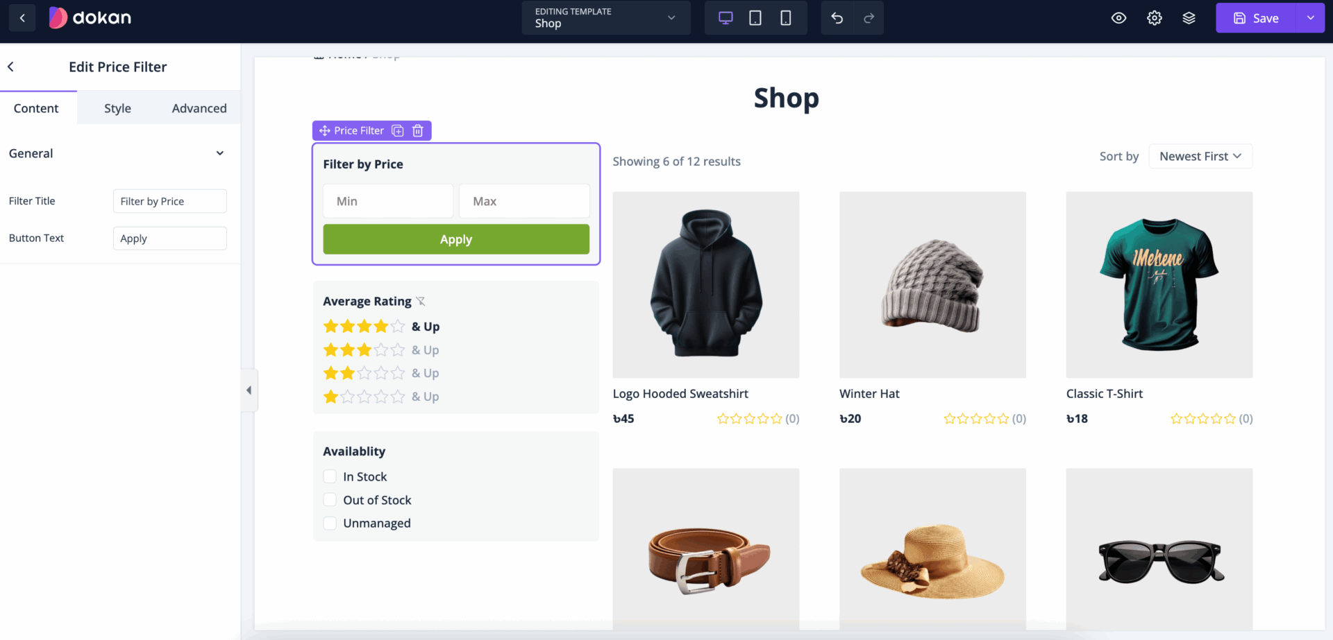
You can change the price filter title and button text from the general section-
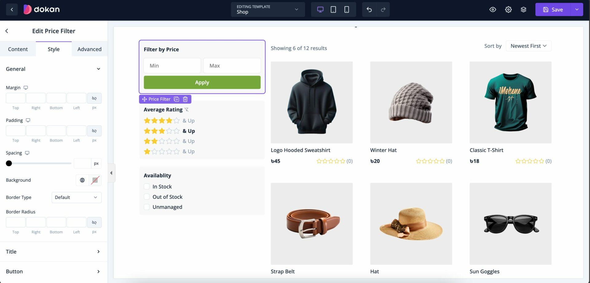
You can update padding, margin, background, etc-update from the style section-
Also, you can control the padding, margin, size, position, custom codes, background, responsiveness etc from the Advanced section-
Product Grid
A Product Grid is a layout design used on eCommerce websites, online marketplaces, and product catalog pages to display multiple products in a visually organized grid format. Each product in the grid usually includes essential information like an image, title, price, rating, and a brief description, making it easy for users to browse and compare items at a glance.
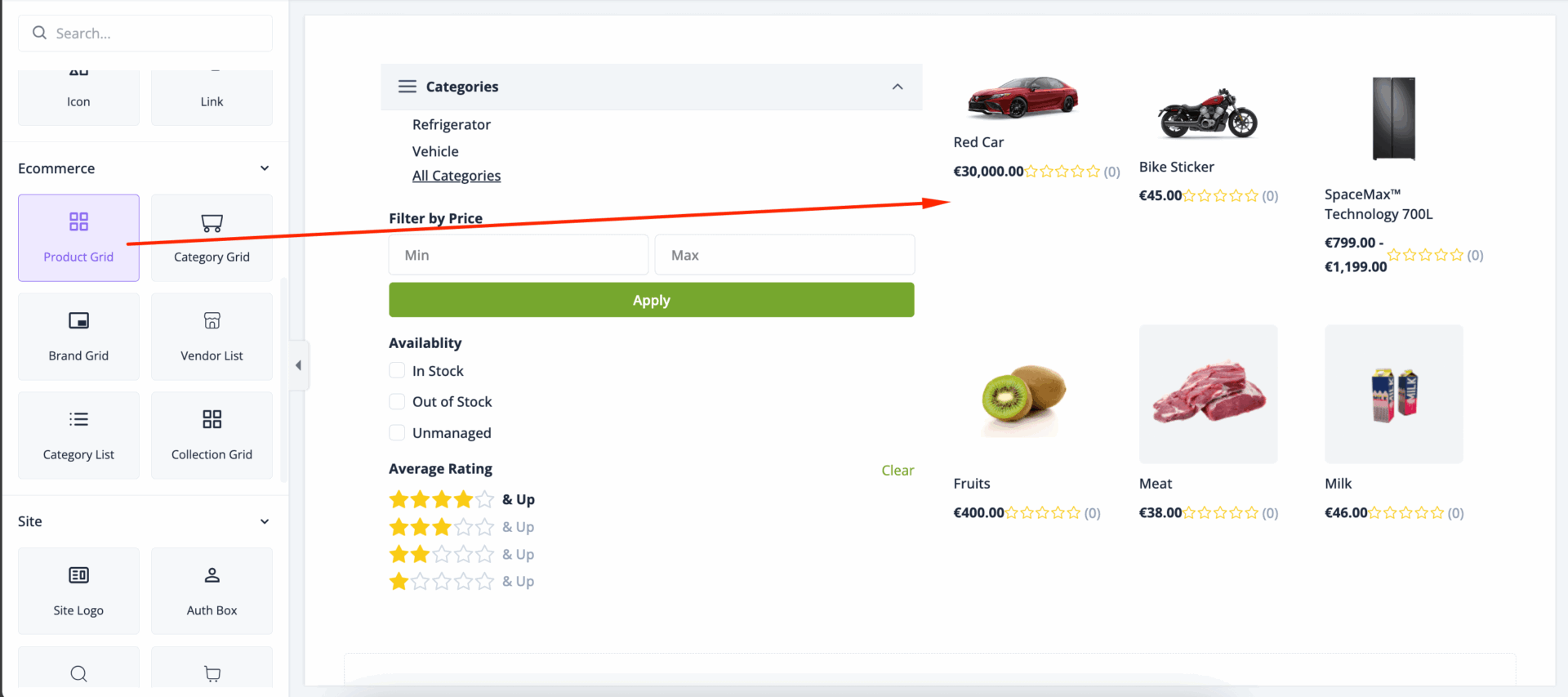
Drag and Drop the Product Grid to the editor-
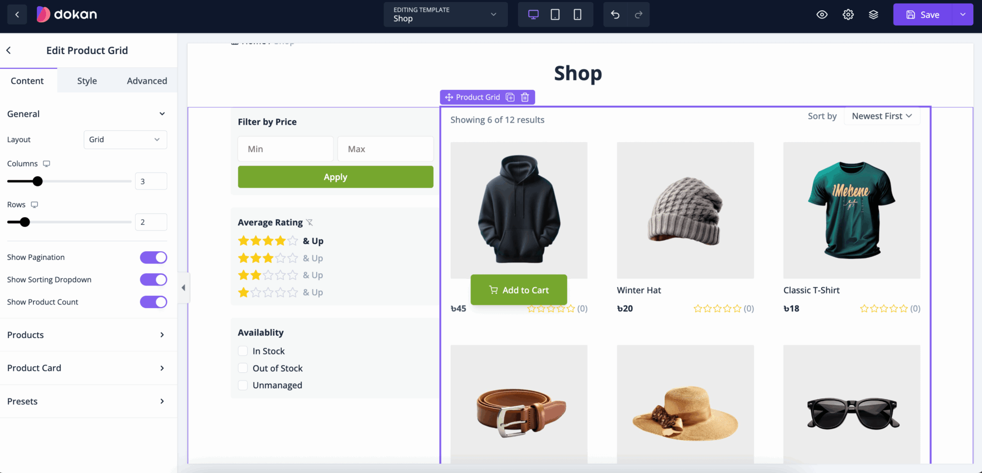
You will find many options to cusotmize the product grid layout. In the content section, you can select the layout, choose the number of columns and rows, enable pagination, sorting dropdown, product count-
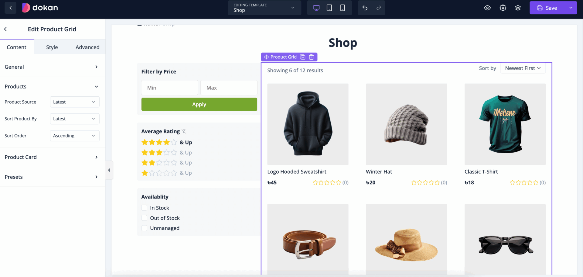
In the Products section, select product source, sort product in order of Latest, Popularity, price, ascending and descending-
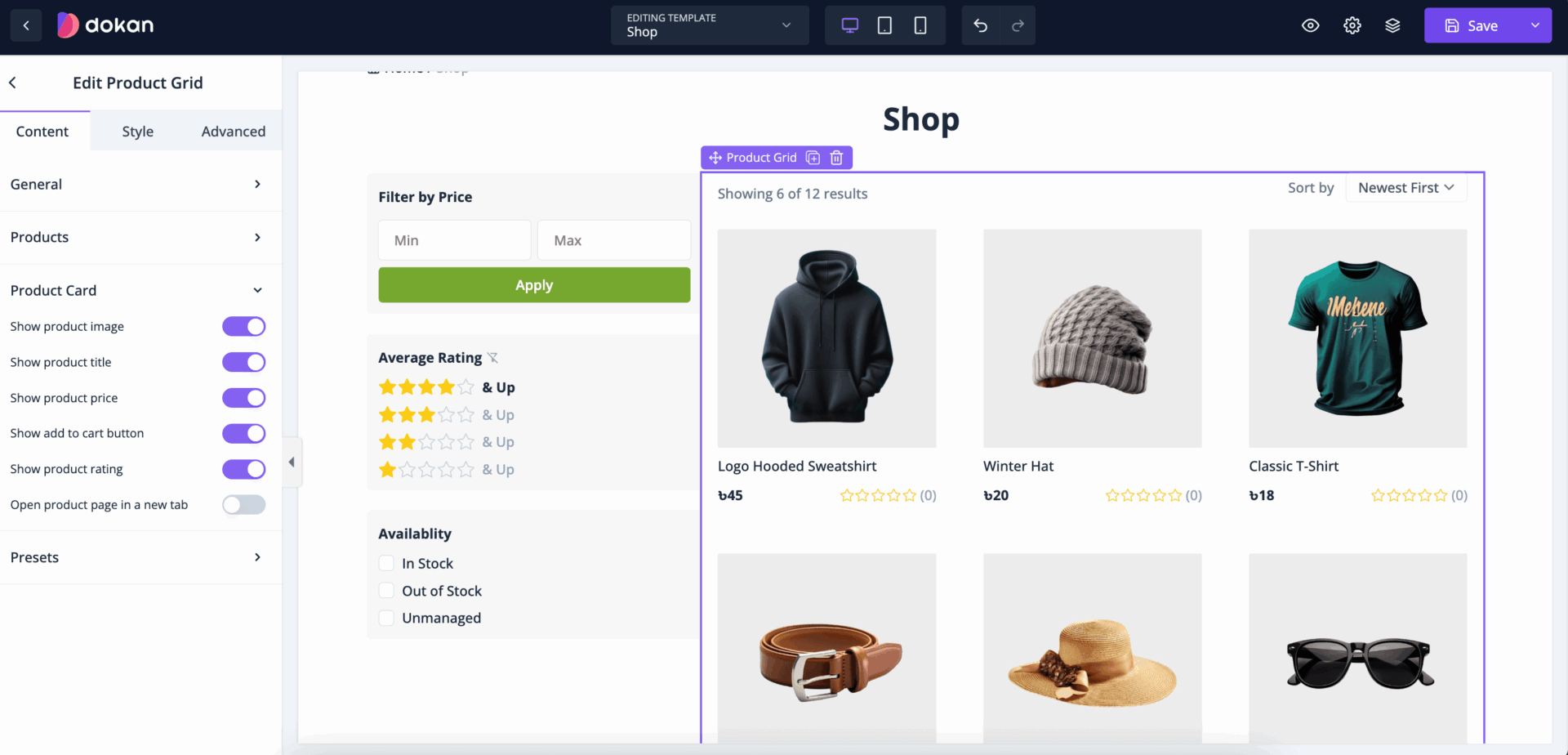
In the Product Card section, you can-
- Show product image
- Show product title
- Show product price
- Show add to cart button
- Show product rating
- Open product page in a new tab
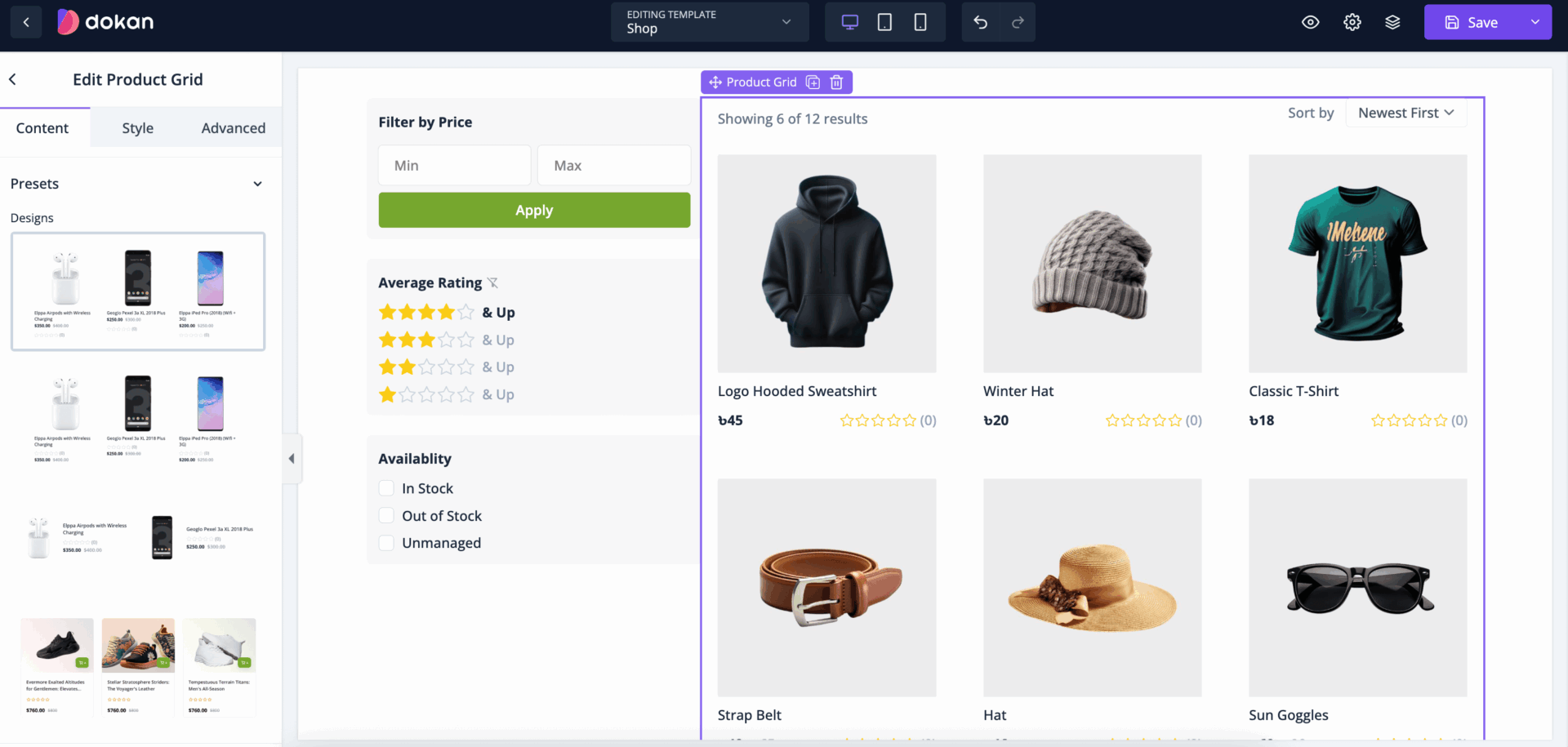
You will also find Presets to design the product grid layout-
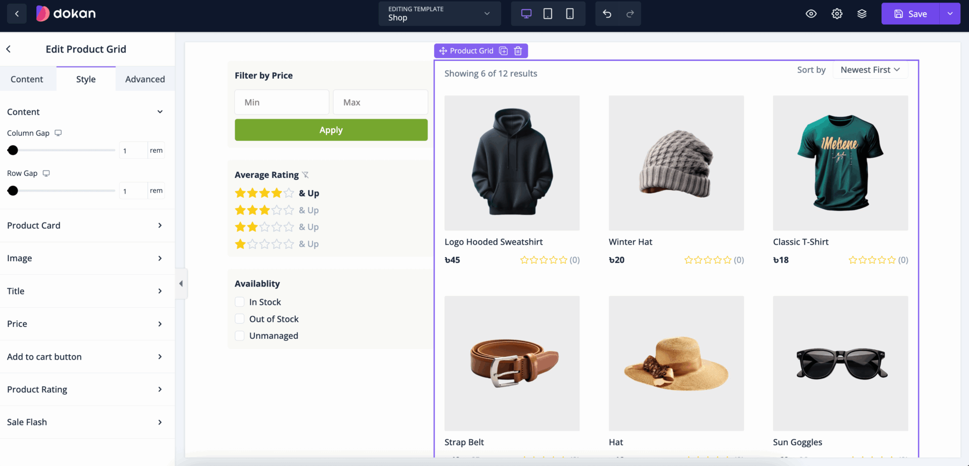
In the Style section, you can select Column gap and Row Gap-
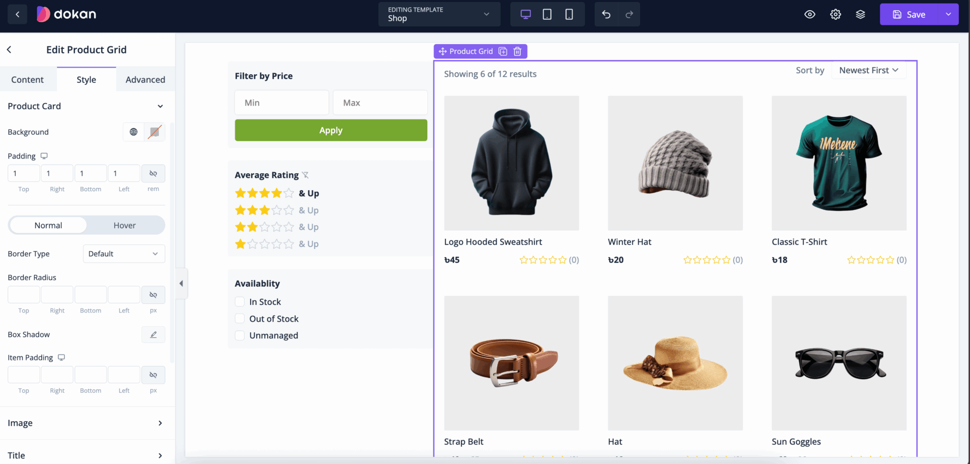
You can customize the product card with padding, margin, border, border radius, box-shadow-
For the product images, you can customize aspect ratio, border, border radius, box shadow-
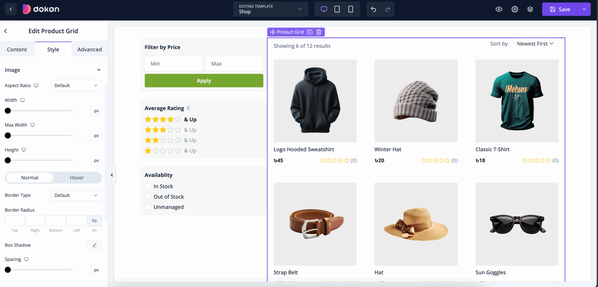
You can also change the color, select typography, and adjust the spacing of the Title-

You can change the color, choose typography, and adjust the spacing of the Price-

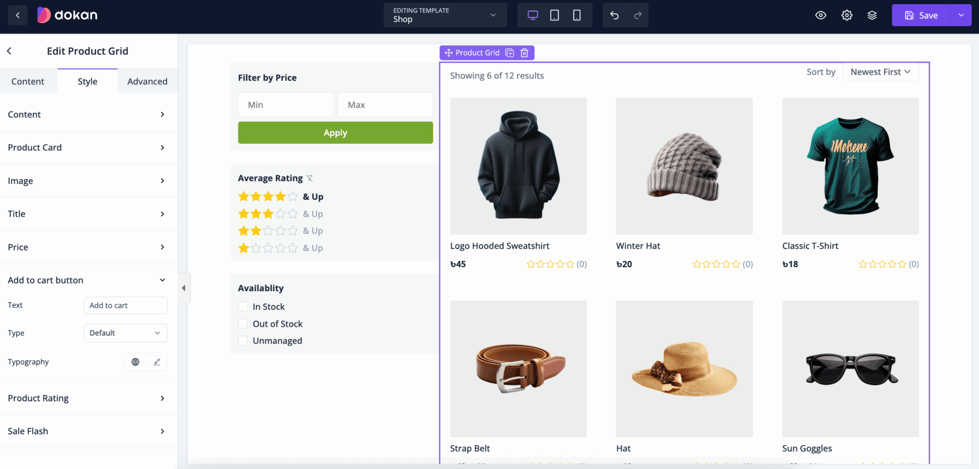
You can change the color, choose typography, and adjust the spacing of the Add to Cart Button-
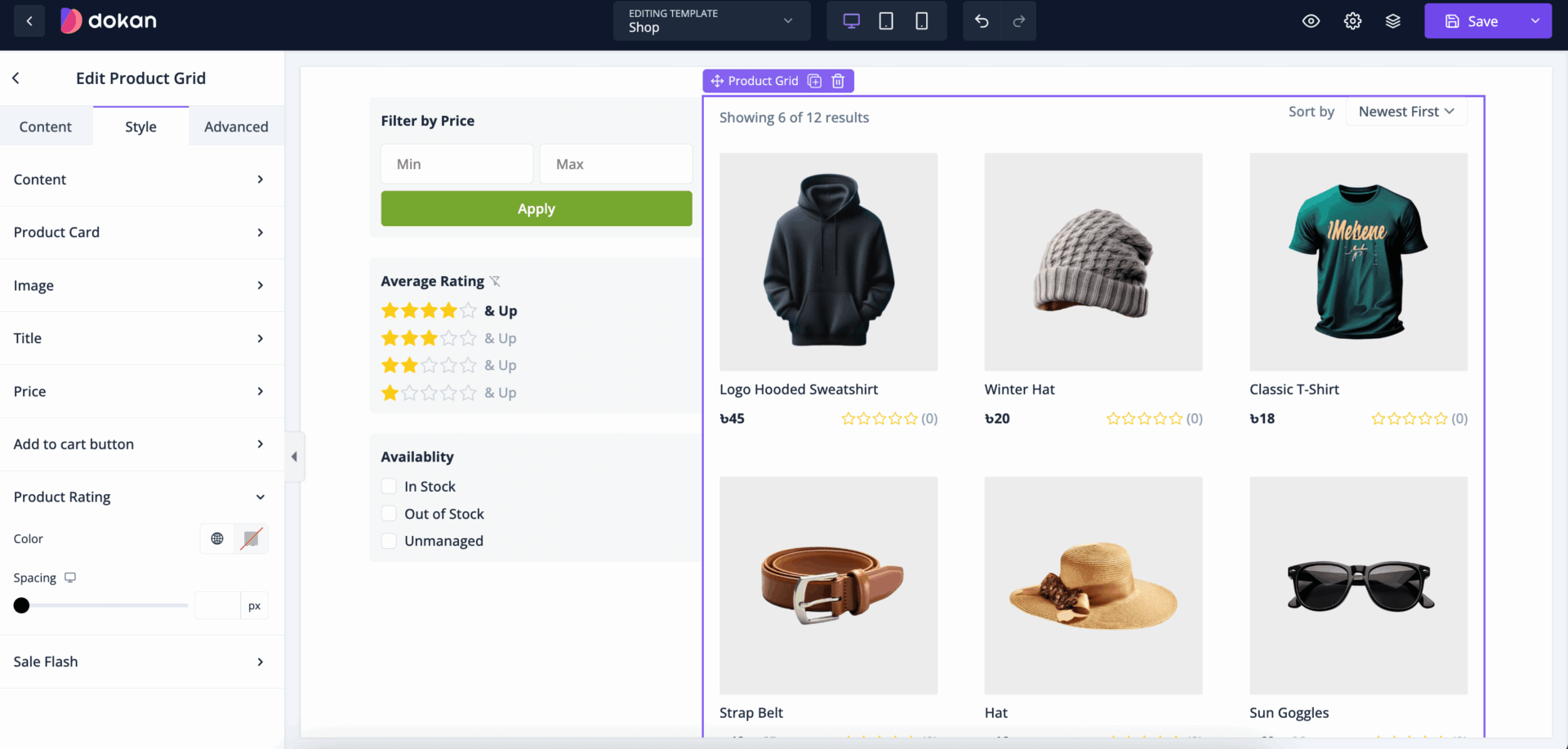
You can change the color, and adjust the spacing of the Product Rating-
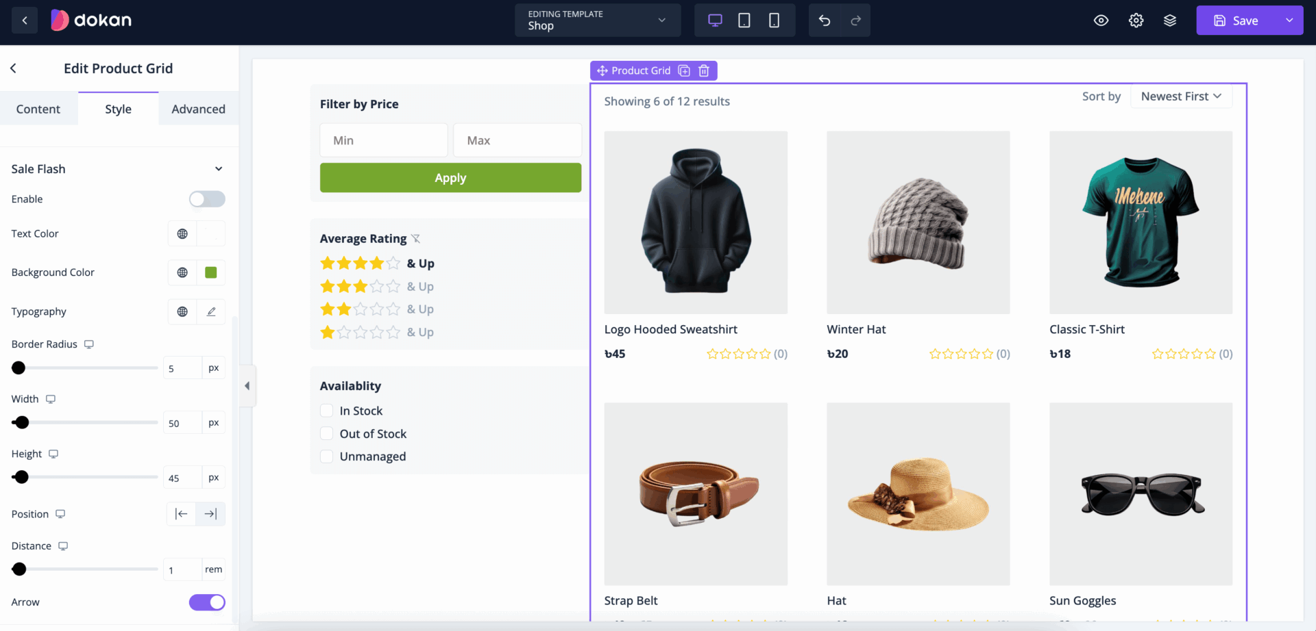
You can customize the Sale Flash with Text Color, Background Color, padding, margin, border radius, position-
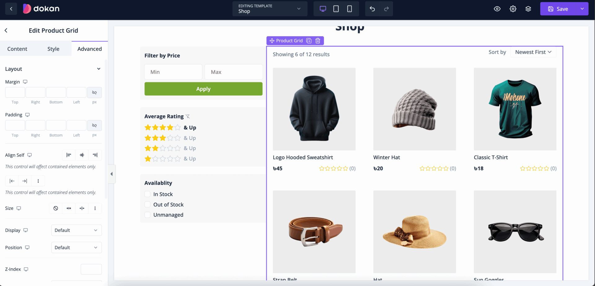
Also, you can control the padding, margin, size, position, custom codes, background, responsiveness etc from the Advanced section-
Collection Grid
A Collection Grid in eCommerce and online retail refers to a curated group of products that share a common theme, category, or purpose. Collections are designed to help customers discover products in an organized and meaningful way, making it easier to browse related items in one place. Collections are commonly used to feature seasonal items, product categories, themed items, or bestsellers, enhancing the shopping experience by guiding users through various segments of a product catalog.
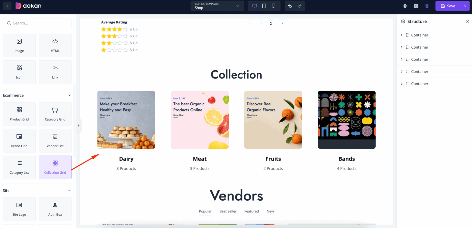
Drag and drop the Collection widget in the editor-
In the content section you can set Layout, set columns and rows-

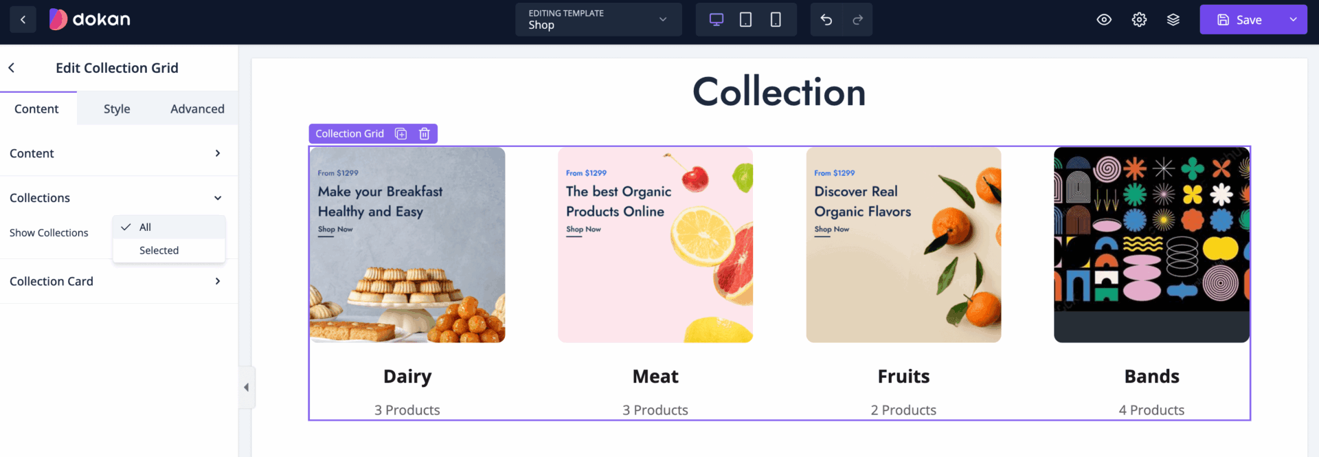
For collection section you can select to show all collection or selected collection-
Also, you can enable-
- Show Image
- Show Title
- Show Products Count

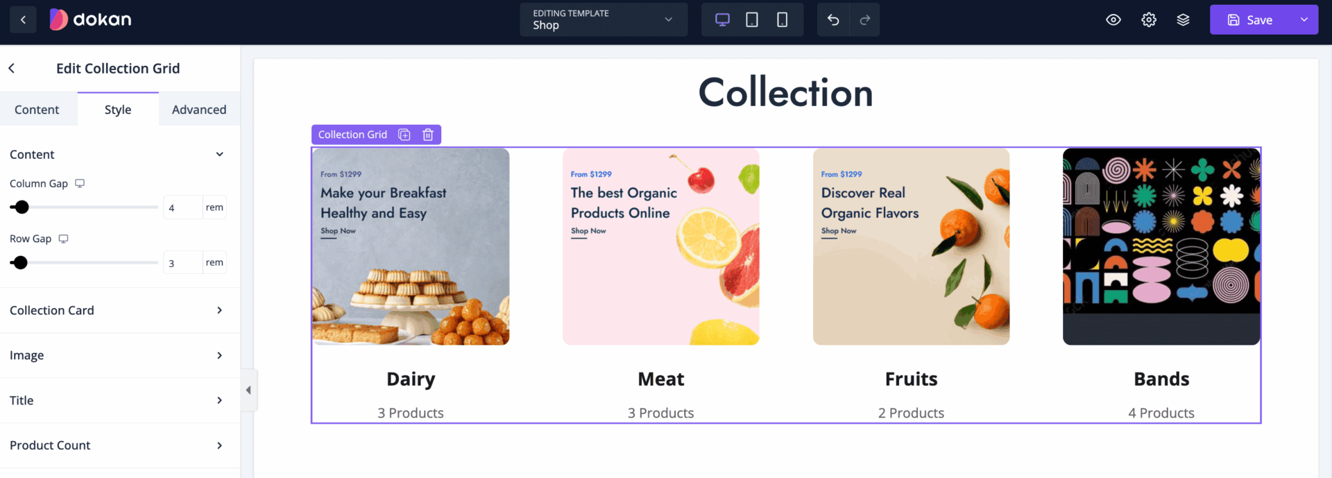
In the style section, you can set the column gap and row gap-
For collection card, you can set alignment, Background Color, padding, margin, border radius,-
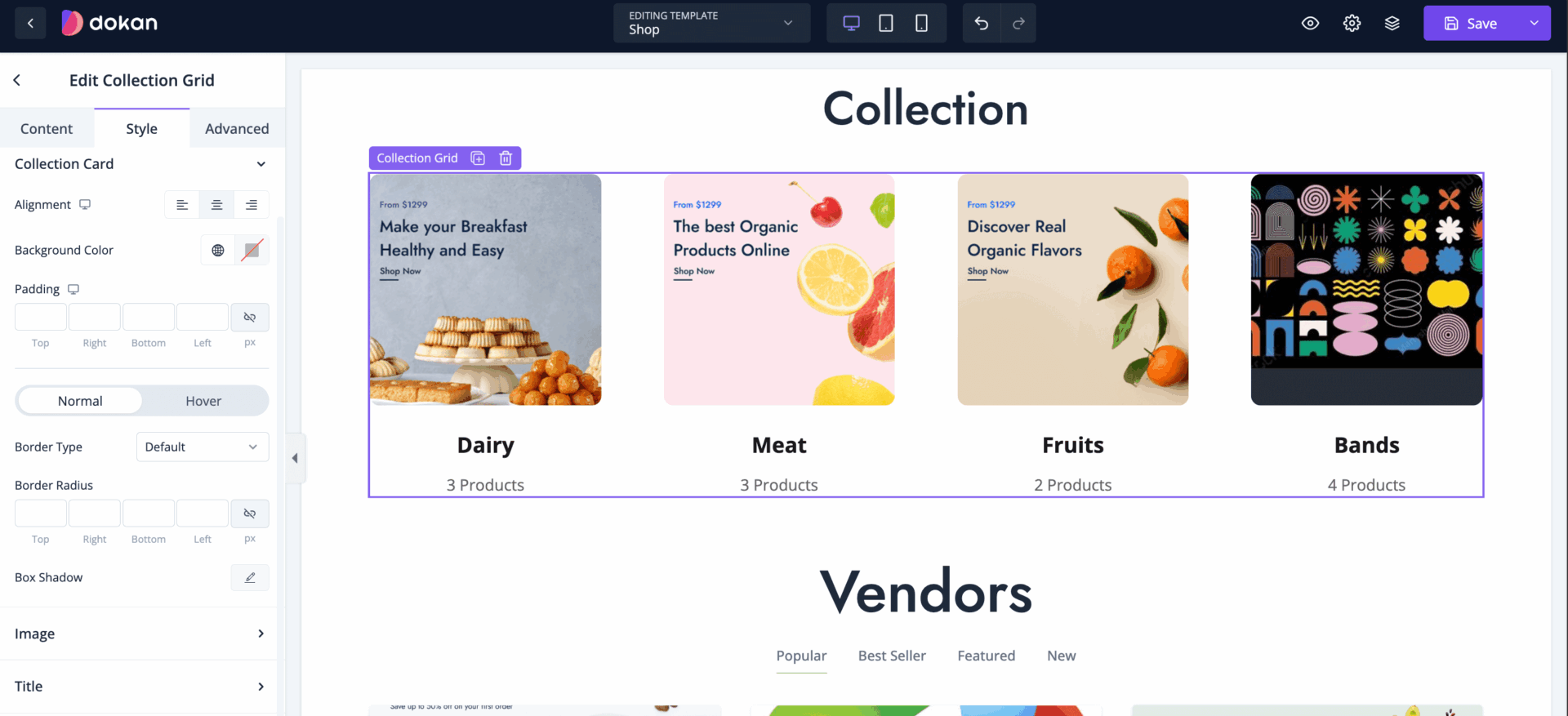
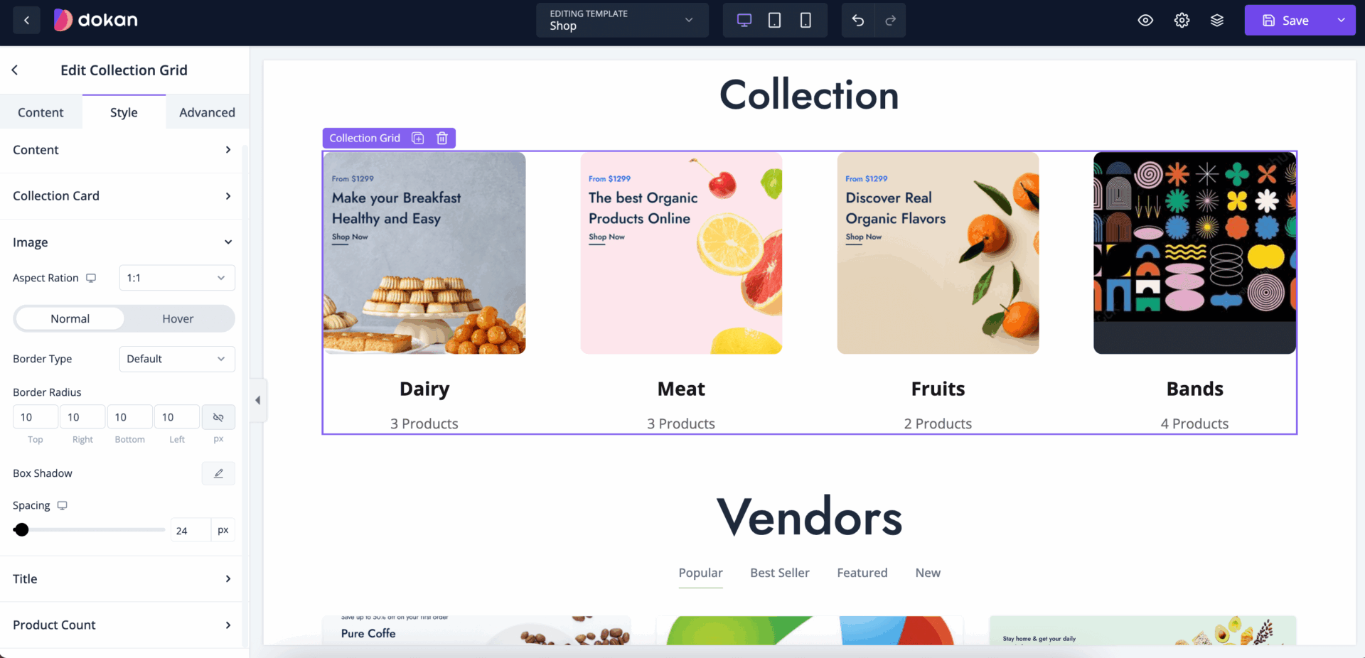
For the product images, you can customize aspect ratio, border, border radius, box shadow, spacing-
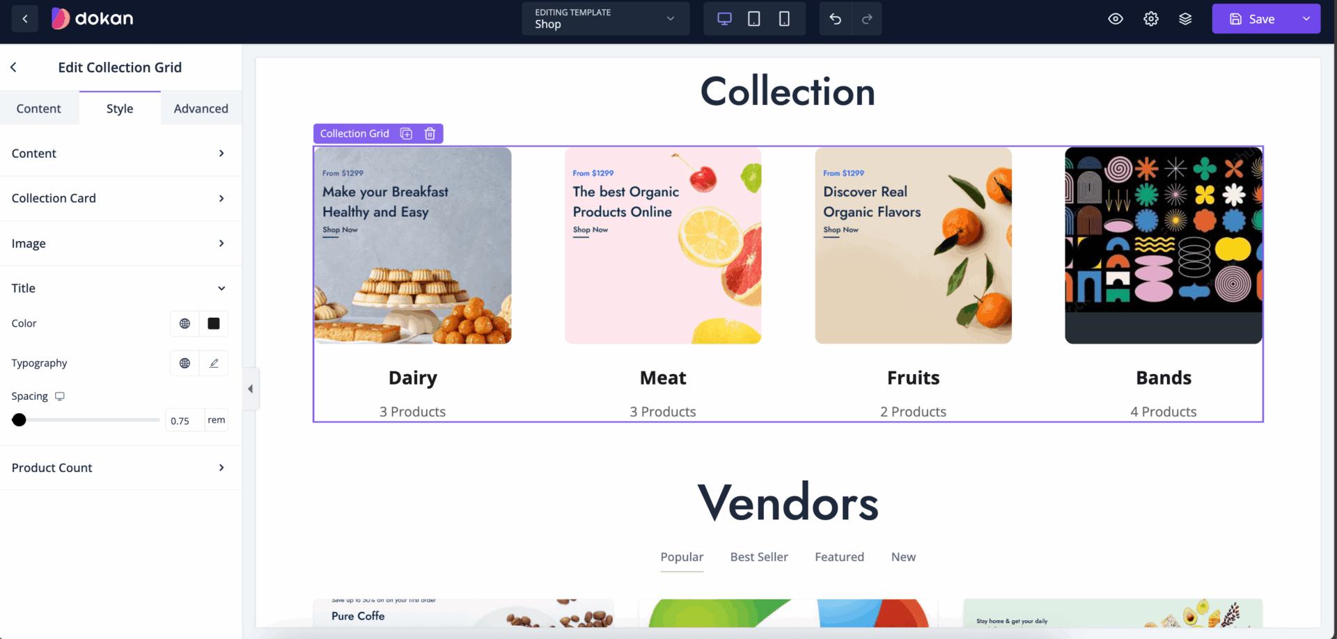
You can control the color, typography and spacing of the Title-
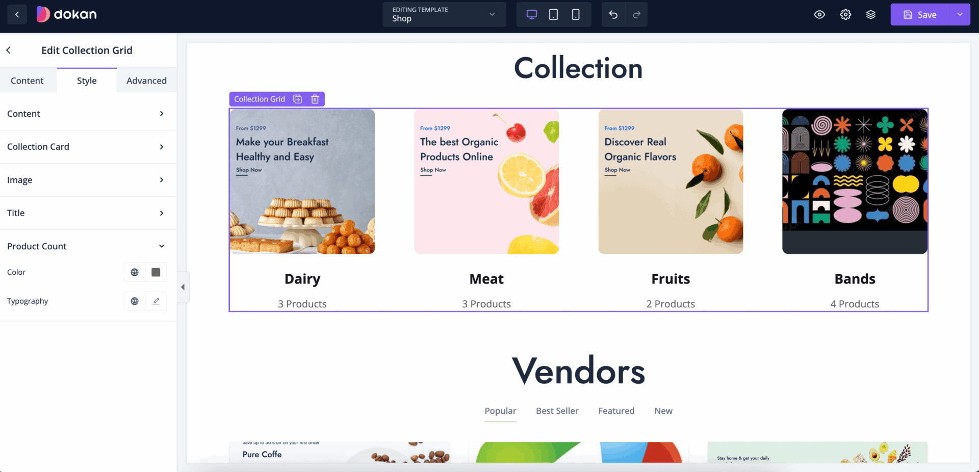
Control the typography and color of the product count-
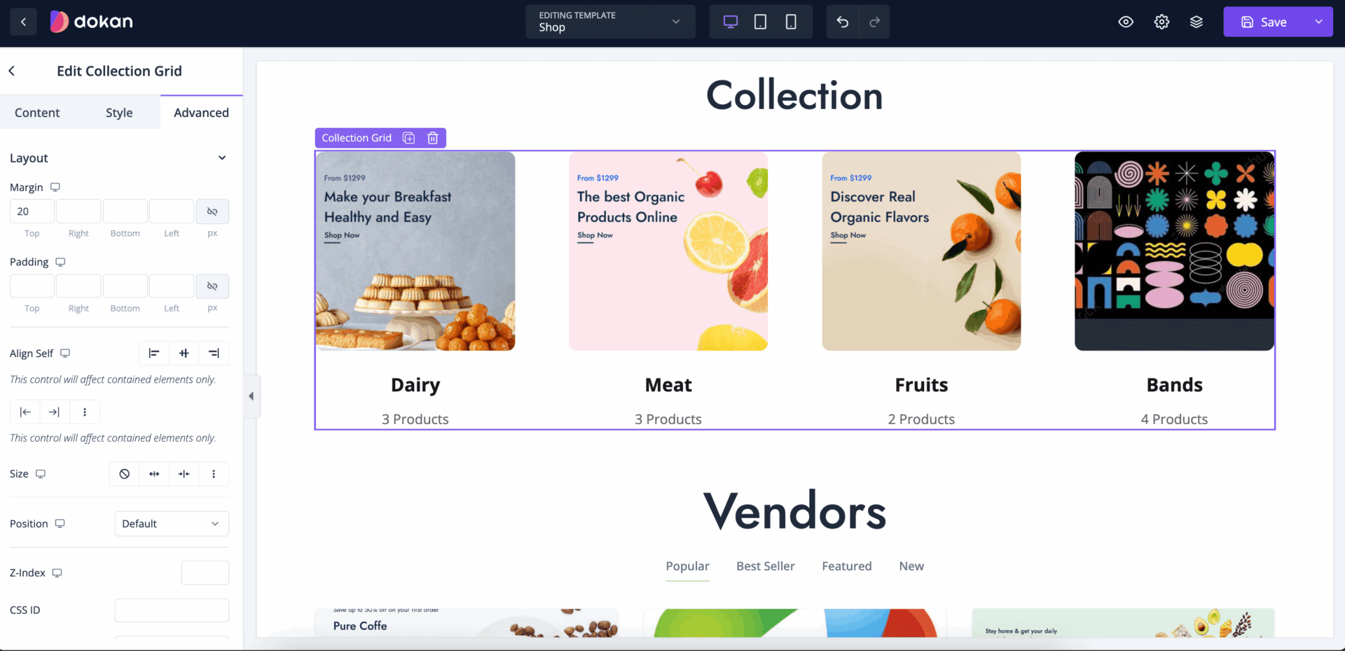
Also, you can control the padding, margin, size, position, custom codes, background, responsiveness, etc from the Advanced section-
Vendor List for Marketplace
If you are using the marketplace version of Dokan Cloud, then you can show your vendors on the shop page using the Vendor List widget.
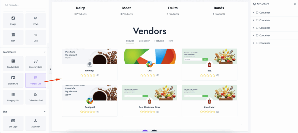
Just drag and drop the Vendor List to the editor-
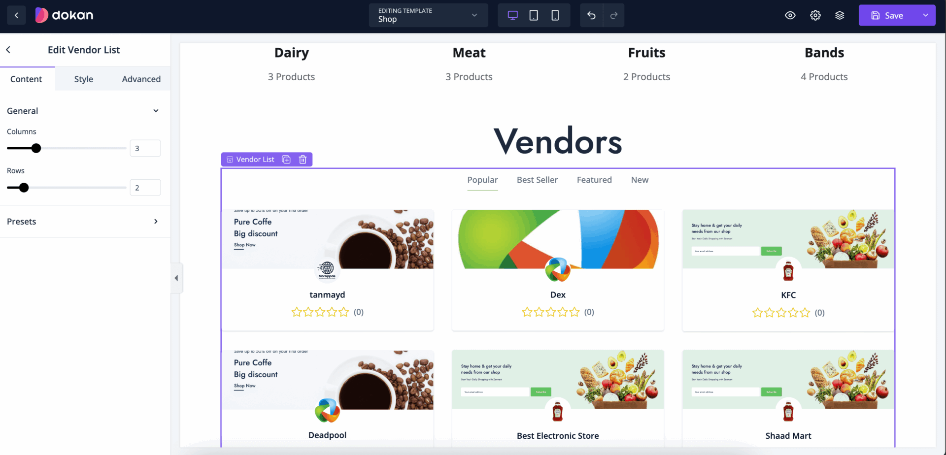
In the content section you can set rows and columns-
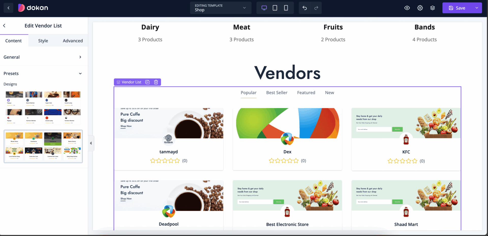
Also, you will find presets that will help you design the vendor list quickly-
In the style section, you can set column gap and row gap-
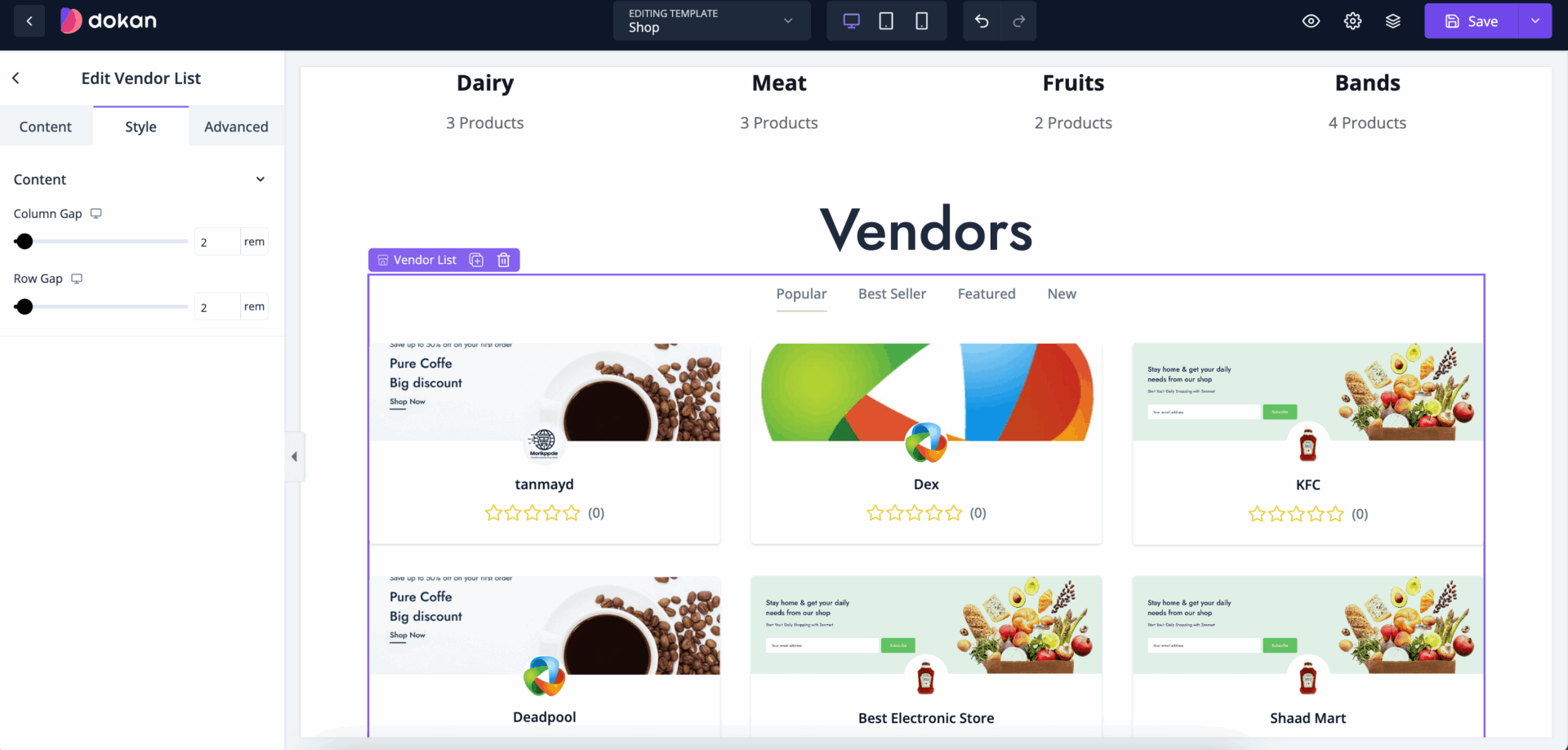
Also, you can control the padding, margin, size, position, custom codes, background, responsiveness, etc from the Advanced section-
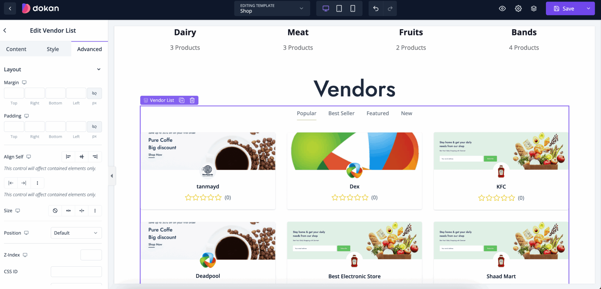
You can use these widgets to customize the shop page.
Dropdown
The dropdown widget is a versatile tool for eCommerce stores, designed to streamline navigation and enhance the user experience. It allows customers to access various categories, subcategories, and functions with minimal effort, reducing clutter on the page while keeping essential options just a click away. Here’s a detailed look at the benefits, uses, and best practices for utilizing a dropdown widget in your eCommerce store.
Drag and drop the Dropdown widget in the editor-
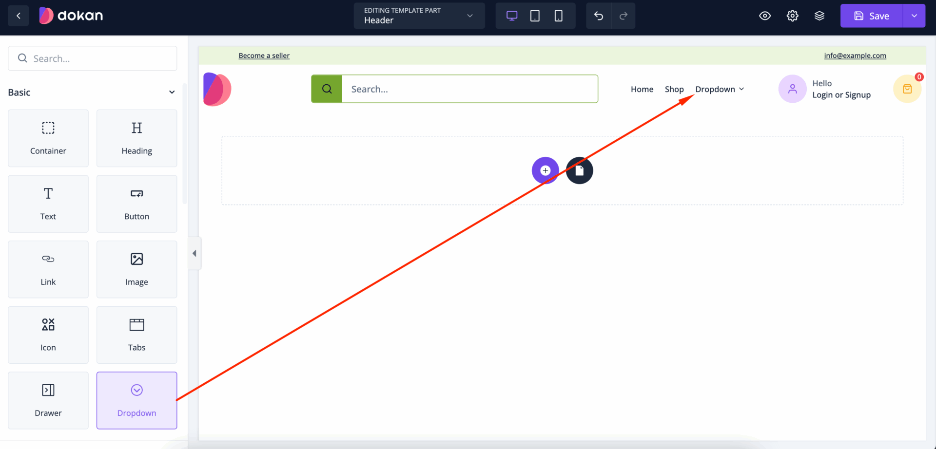
You can add different widgets in the Dropdown section. But normally the Dropdown is used to show menus. To do that, you can use the Link widget from the menu-
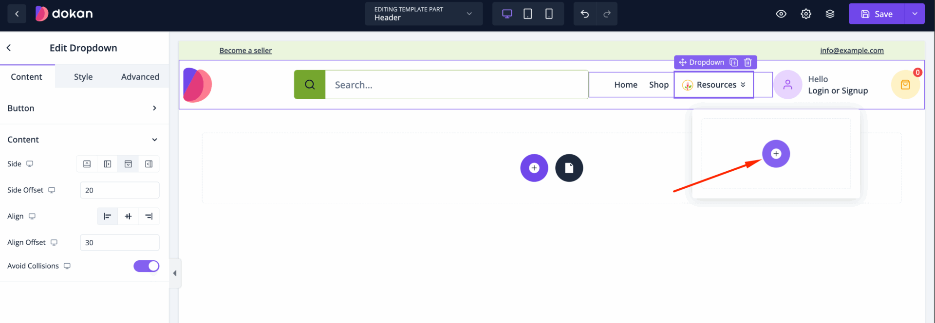
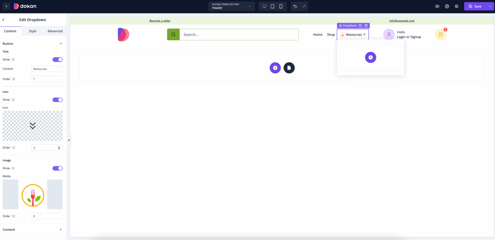
In the content section, you can show text, icon and images-
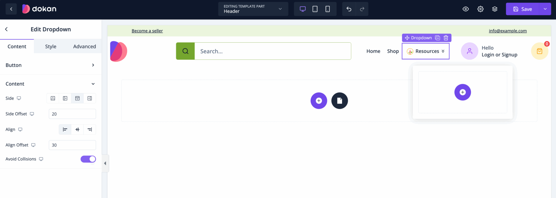
Also, you can select sides, side offset (where you want the Dropdown menu to appear after clicking), alignment, and align offset. Also, you can enable the avoid collision option so that the Dropdown doesn’t interfere with the your website design-
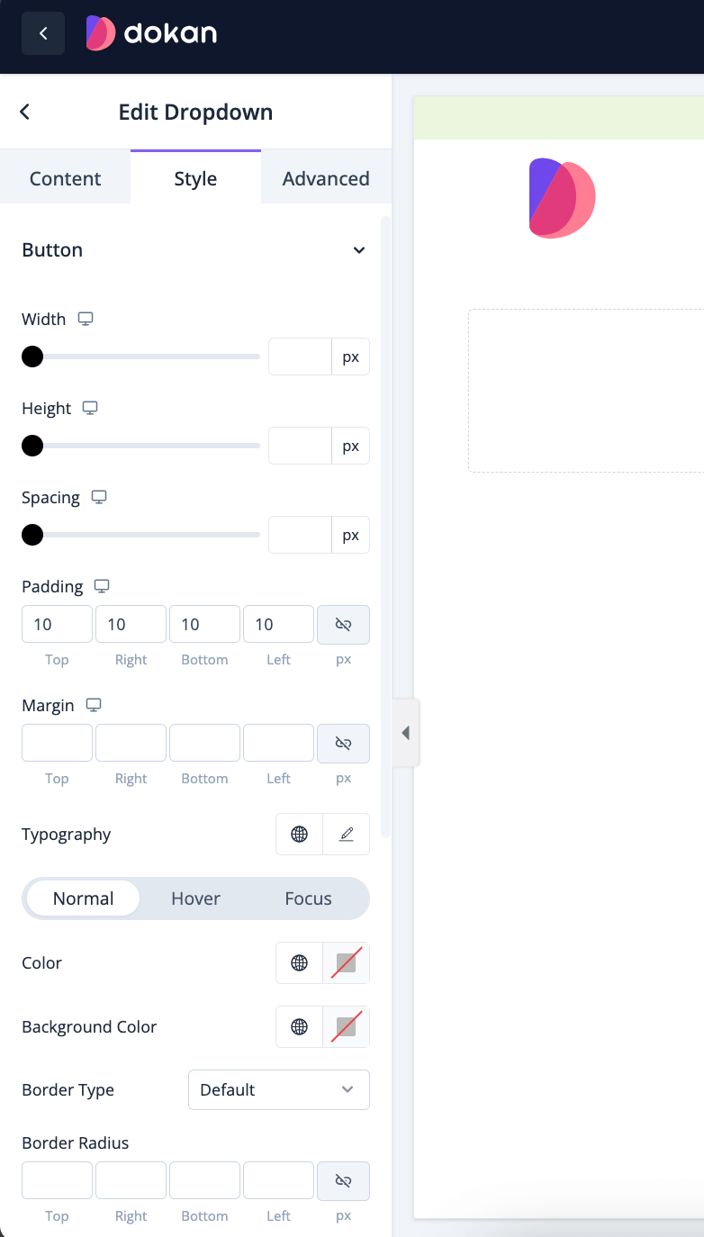
In the style section, you can manage height, width, spacing, padding, margin, typography of the button-
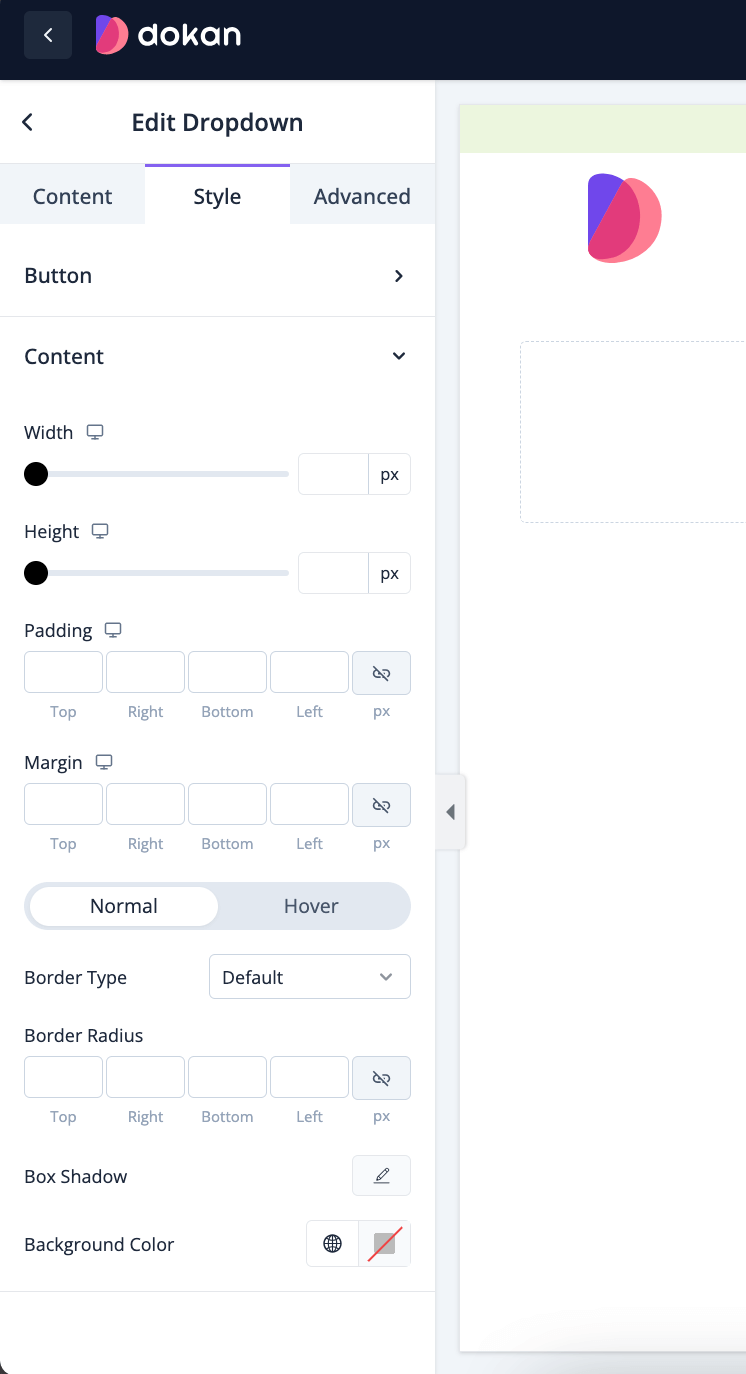
You can do the same for the content section as well-
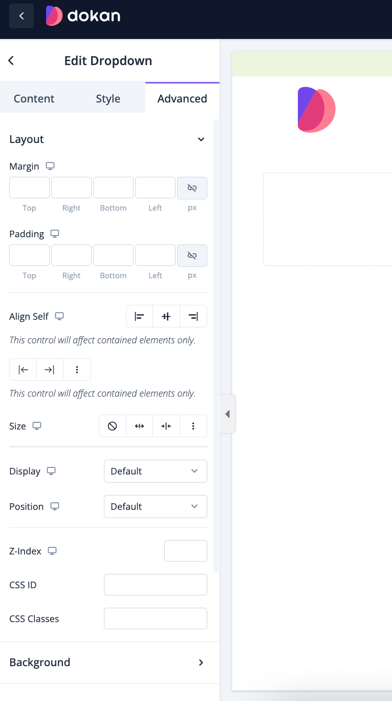
Also, you can control the padding, margin, size, position, custom codes, background, responsiveness, etc from the Advanced section-
Here is the preview of what it may look like-

That’s it.